Preview image. Unlock full-res
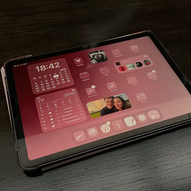
Tablet UI mixing deep magenta overlays and warm tones on dark background, organizing data—time, calendar, weather, photos, social apps—into a grid of glass-morphic cards.
Summary
Tablet homescreen dashboard overlaying data widgets—analog clock, calendar, weather, photo album, and app shortcuts—on a dark background tinted with warm magenta glass-morphic card surfaces.
Visual description
Dark, nearly black background with prominent magenta-pink overlay panels creating a sense of floating, translucent cards. Upper left features a large analog clock widget showing 18:42 with calendar date grid below. Upper right holds a large photo frame and smaller app icon tiles (social apps, utilities) in semi-transparent magenta panels. A colorful photo of two people occupies the center-right. Bottom row and right margin continue the grid pattern with more widget previews, all unified by the warm pink color cast and glassmorphism treatment. Typography is clean sans-serif in white and light text for high contrast against dark. Overall mood is intimate and sophisticated.
Key takeaway
Warm color overlay unifies disparate widget types. The magenta-on-dark tone conveys personalization without feeling chaotic. Translucent card treatment with subtle borders creates visual depth. The mixed scale of widgets (large analog clock, smaller app tiles, full-width photo) creates visual rhythm while maintaining grid alignment.
Reuse notes
Excellent for personal dashboards, health-tracking apps, or media-forward homescreen designs. The warm magenta works particularly well for intimate, personal-use interfaces. The dark-mode glass-morphic approach reduces eye strain on tablet screens in low light. Avoid this pattern if your brand is corporate or cool-toned; the warmth is distinctive.