Preview image. Unlock full-res
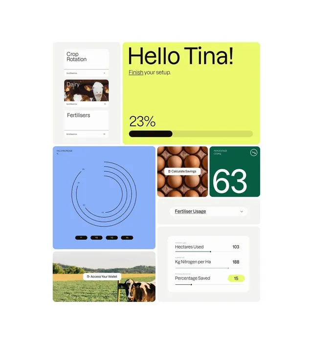
Onboarding dashboard for a farming-management app using pastel lime, blue, and deep green cards to display setup steps, yield calculations, and fertilizer metrics.
Summary
Onboarding dashboard for a farming-management app using pastel lime, blue, and deep green cards to display setup steps, yield calculations, and fertilizer metrics.
Visual description
Vertical layout mixing several distinct cards on a light background. Top-left shows a setup menu ("Crop Rotation", "Fertilisers") with a thumbnail image of produce. Top-right contains a bold lime-yellow card with large "Hello Tina!" heading and "Finish your setup" instruction, a "23%" metric in black, and a filled progress bar. Bottom section presents four smaller tiles: a blue circular radial diagram labeled "Yield Increase" with small numbered controls, a tile with eggs and "Calculate Savings" button overlay, a dark green card with large white "63" (percentage), and below those a full-width card listing "Hectares Used: 103", "Kg Nitrogen per Ha: 188", and "Percentage Saved: 15" in a light accent pill. A bottom card shows a field photograph with a cow and "Access Your Wallet" call-to-action.
Key takeaway
The color system: a tight palette of lime, deep green, and cool blue giving distinct zones visual weight without clutter. Progress bars and percentage displays built into cards themselves rather than dedicated controls. Real agricultural imagery (fields, cattle, produce) used sparingly but purposefully to ground the domain.
Reuse notes
Strong reference for agri-tech, farming software, or utilities targeting rural/agriculture sectors. Works well when the domain is specific (not generic SaaS). The onboarding flow pattern scales across setup/wizard flows. Lime and deep-green pairing unusual; verify it works with your brand before reuse.