Preview image. Unlock full-res
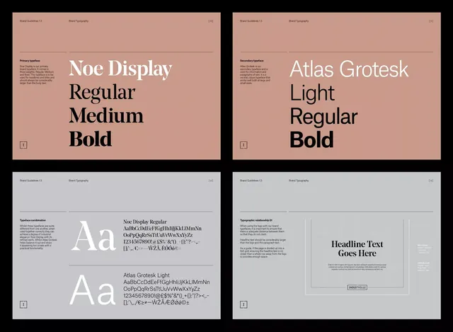
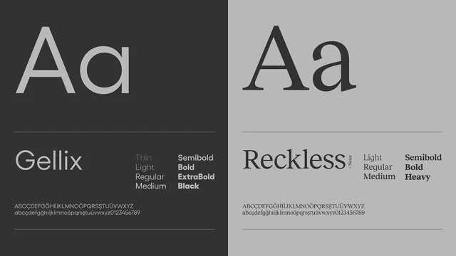
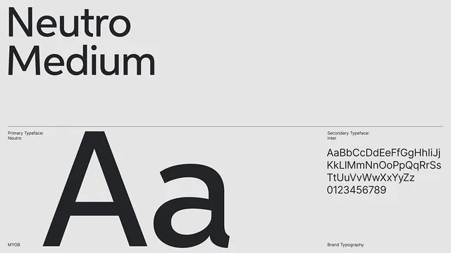
A minimalist type specification sheet displaying a heavy modern sans-serif (Neutro) and a lighter paired secondary sans (Inter), on a light gray background with ruled horizontal dividers.
Summary
A typography-focused design document pairing the heavy-weight Neutro serif-less display face with the lighter Inter face for body and secondary text, all on a light ground with horizontal rule divisions.
Visual description
The composition is split vertically: a dominant left side featuring the letterforms "A" and "a" set large and bold in Neutro, and a right side showing Inter's full character set (uppercase, lowercase, numerals). A light gray background provides maximum contrast with black letterforms. Horizontal ruled lines separate distinct zones: a heading area with "Neutro Medium" and "MYOB" labels at the top, the specimen area in the center, and metadata text at the bottom labeling each face and noting "Brand Typography." The spacing is generous and grid-aligned, emphasizing precision and readability.
Key takeaway
The split-screen layout pairing primary and secondary typefaces without redundant explanation. The generous negative space and horizontal divisions creating a professional, spec-sheet aesthetic. Using actual letterforms as the primary visual rather than ornamental background, allowing the type to speak directly.
Reuse notes
Ideal for brand guidelines, design-system documentation, or pitch decks showcasing font choices. Works especially well when you need to establish a typographic hierarchy across multiple weights or families. The minimalist approach reads corporate and trustworthy; pair with other refined elements rather than playful graphics. This layout is compact enough to fit in multi-page specs but readable at a glance.