Preview image. Unlock full-res
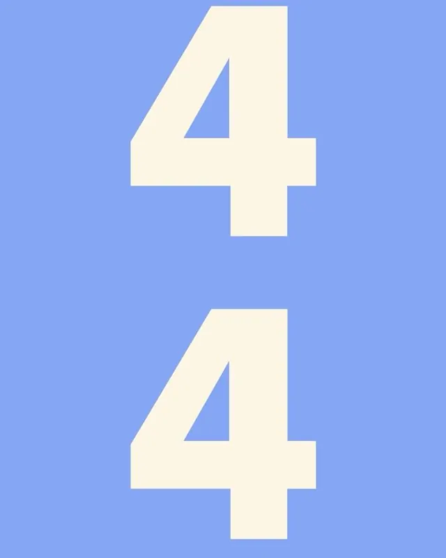
Two large, cream-white numerals '4' stacked vertically on a vibrant periwinkle blue background, demonstrating bold geometric typography with high contrast.
Summary
Two identical oversized numerals rendered in cream white on a vibrant periwinkle background, showcasing a minimalist geometric approach to numeric display typography.
Visual description
A square-format composition dominated by a bright periwinkle blue (approximately #85A6F5). Two identical, large cream-white numerals '4' are centered and stacked vertically, with significant breathing room between them. The numerals use a bold, sans-serif geometric typeface with uniform stroke weight and no serifs; the shapes read clearly as positive forms against the background. The top '4' sits in the upper third; the bottom '4' mirrors its position in the lower third, creating a symmetrical, balanced layout. No other UI elements, text, or ornamentation interrupt the composition. The contrast ratio between the cream and periwinkle is high, prioritizing legibility and visual impact.
Key takeaway
The color pairing of periwinkle and cream is high-contrast and fresh without feeling harsh. Overscaled numerals command attention and read as design-forward rather than utilitarian. The symmetry and vertical stacking create a sense of order while maintaining visual interest through repetition.
Reuse notes
Strong for display-focused dashboards, hero sections, or numeric showcases that prioritize simplicity and color contrast. The periwinkle-cream palette pairs well with white or light-grey supporting text. Works best in square or portrait formats; avoid cramping the vertically stacked elements. The geometric sans suits tech products, analytics tools, or modern SaaS brands.