Preview image. Unlock full-res
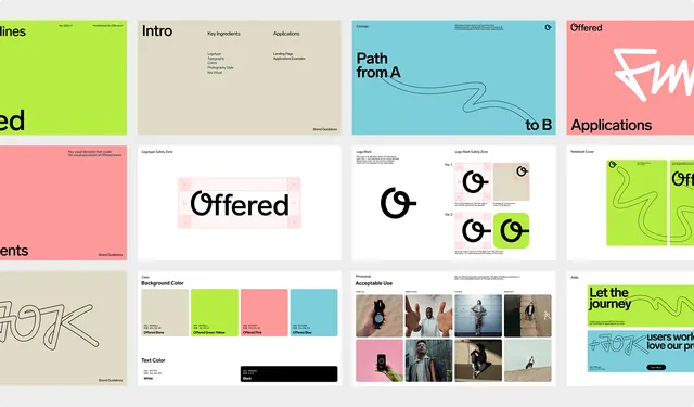
A design system showcase with organic curved dividers, pastel colors, and a bold logotype, spanning intro, applications, and brand guidelines.
Summary
A multi-page design system guide with organic wave dividers, a bold "Offered" wordmark, and five light-mode pages spanning intro, color, typography, applications, and brand assets.
Visual description
A 3x3 grid of system pages rendered at thumbnail scale. Top row: lime-green intro card (Key ingredients, Applications), cream Offered logotype page, and teal Path from A to B page with a subtle curved line graphic. Middle row: pink-coral Offered card, beige page with bold O logotype at center, and multi-box layout for guidelines. Bottom row: tan page with italic font specimen, beige accessibility page with a 3x3 photo grid, and teal Let the journey content page. All cards feature soft shadows, rounded corners, and organic S-curve wave dividers between sections. Typography is clean sans-serif, favoring whitespace.
Key takeaway
The organic wave divider pattern (the flowing S-curves) as a refreshing alternative to straight lines. A limited, cohesive pastel palette (pink, blue, green, cream) applied per page rather than globally. The balance between minimalist content and decorative curved details.
Reuse notes
Excellent for creative-field design systems (design studios, branding agencies, portfolios). The waves work best at large scale; at very small sizes they lose impact. Works for modern SaaS or web-app style guides. Avoid if the brand needs maximum formality.