Preview image. Unlock full-res
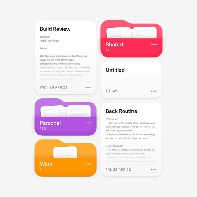
A four-card task-management interface with neon rounded containers in pink, magenta, orange, and blue stacked in a 2x2 grid against a light gray background.
Summary
A four-card task organizer with neon-bright rounded containers in pink, orange, magenta, and blue, each labeled with a category (Shared, Untitled, Personal, Work) and task/activity details, arranged in a 2x2 grid on a light gray background.
Visual description
Two rows of two rounded-rectangle cards, each with a bold solid-color background in a different hue. Top left is pale cream with a "Build Review" text label and review content. Top right is bright pink/red with white text "Shared 12" and a folded-corner icon mimicking a file folder. Bottom left is purple with white text "Personal 123" and a small folder icon. Bottom right is orange with white "Work" text. Between them on the right side is a white card labeled "Untitled" with a gray "TODAY" label, and below that a second white card with "Back Routine" activities listed with checkbox items and a date "FRI, 28 APR 23". All cards use a clean sans-serif typeface and are separated by whitespace. Light gray fills the background canvas.
Key takeaway
The color-coded card strategy: each container gets a distinct bright hue, making category scanning instant even at a glance. The rounded-rectangle border radius (likely 20+ px) softens utility UI without sacrificing legibility. The two-column symmetric grid paired with white detail cards off to the side allows high information density while maintaining visual calm.
Reuse notes
Ideal for multi-category dashboards, habit trackers, and productivity apps where users juggle parallel workflows. Each card's color becomes a visual shorthand for category identity. Works equally well in mobile and tablet layouts. Pair with icons or count badges (like the "123" label) to add scannable metadata without typography overhead.