Preview image. Unlock full-res
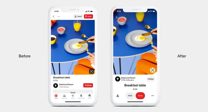
Side-by-side iPhone mockups comparing old and new Pinterest mobile app interface using a breakfast table photo scene.

Summary
Side-by-side iPhone mockups comparing old and new Pinterest mobile app interface using a breakfast table photo scene.
Visual description
Two white iPhones shown on light gray. Left labeled "Before": Pinterest feed with photo of breakfast on blue table, bottom nav with "Home" "Create" etc, profile info. Right labeled "After": updated UI with cleaner header, larger "Save" button, different bottom bar with "Save" prominent, updated profile header and navigation. The main photo content is similar but framing and UI elements differ.
Key takeaway
Clear before/after comparison that highlights refinements in navigation, button hierarchy, and overall visual cleanliness in a mobile app redesign.
Reuse notes
Excellent reference for UI redesign case studies, mobile app patterns, and button/ navigation evolution. Use when showing iterative design improvements.