Preview image. Unlock full-res
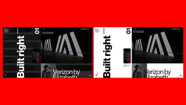
Red-field presentation comparing dark and light versions of a Verizon grid layout with phone mockup and photography panels.
Summary
Red-field presentation comparing dark and light versions of a Verizon grid layout with phone mockup and photography panels.
Visual description
Two side-by-side panels on saturated red. Each shows a split layout: left column with vertical Built right headline, small forward label, large 01, and Verizon checkmark; right column stacks a light-installation photo and a VR headset portrait. Black smartphone mockup centered on left column displays a large red 5. Left panel is white type on black; right panel inverts to black on white.
Key takeaway
Showing dark and light skins on one red stage proves system flexibility. Oversized numerals and vertical type carry the brand without photography clutter.
Reuse notes
Telecom or enterprise sites documenting design systems. Requires strict red-black-white discipline.