Preview image. Unlock full-res
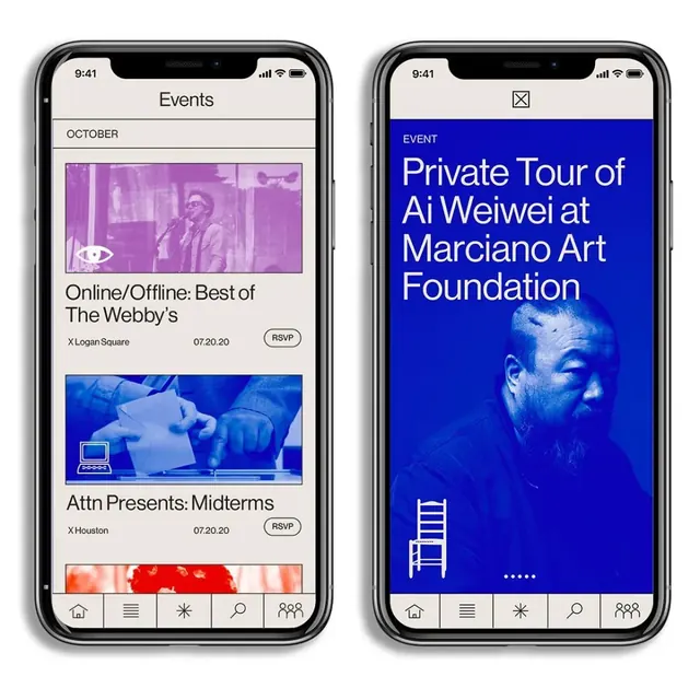
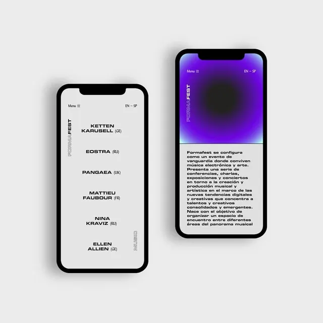
Two mobile phone mockups side by side—one with light interface, one with a vibrant purple dark mode—displaying event information and navigation menus.

Summary
A side-by-side comparison of mobile app screens showing light and dark mode versions—the left with a clean white interface and the right featuring a deep purple dark mode with vibrant gradient.
Visual description
Two iPhone mockups displayed side by side on a light gray background. Left screen: light theme with white background, sans-serif type listing "KETTEN KARUSELL", "EOSTRA", "PANGAEA", "MATTIEU FAUBOUR", "NINA KRAVIZ", "ELLEN ALLIEN". Right screen: dark purple theme with gradient, Spanish event description text visible. Both screens share navigation elements and logo placement demonstrating design consistency across themes.
Key takeaway
Dark mode and light mode variants should maintain consistent hierarchy and component structure while adapting color relationships for readability and brand presence.
Reuse notes
Excellent reference for app design systems requiring both light and dark modes. The purple dark mode demonstrates how saturated accent colors maintain vibrancy in dark contexts while the light mode shows clean, minimal UI principles.