Preview image. Unlock full-res
A 33-slide research report from IKEA on the role of play at home, built on a white editorial grid with bold black sans headlines, IKEA's primary-color geometric shapes, and full-bleed lifestyle photography.
Summary
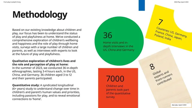
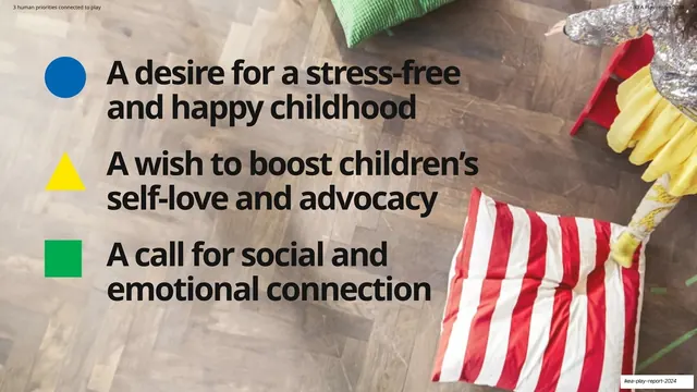
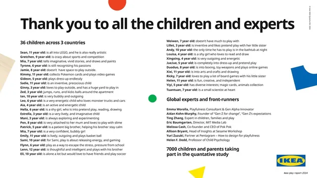
IKEA's annual Play Report for 2024, a 33-slide research document on play and playfulness at home drawing on 7,000 participants across seven countries. Its personality is the IKEA brand system applied to a report: a clean white editorial grid, heavy black sans-serif headlines, and the brand's primary colors (green, yellow, red, blue) deployed as flat geometric shapes (circle, triangle, square) that recur as a visual signature throughout.
Visual description
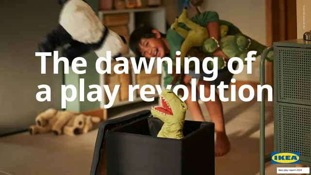
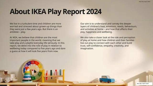
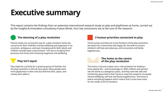
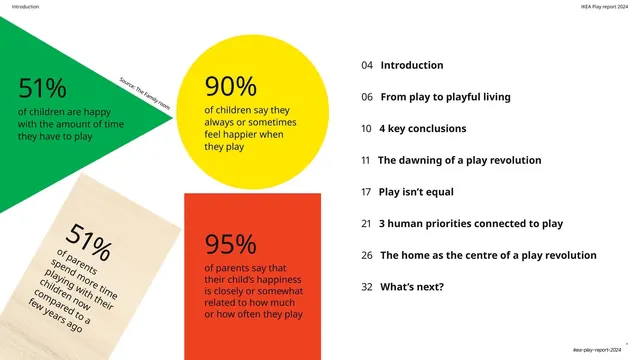
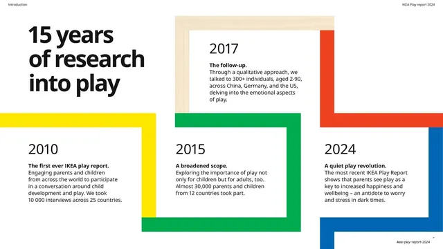
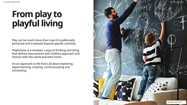
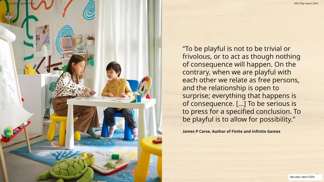
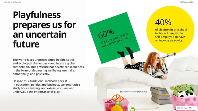
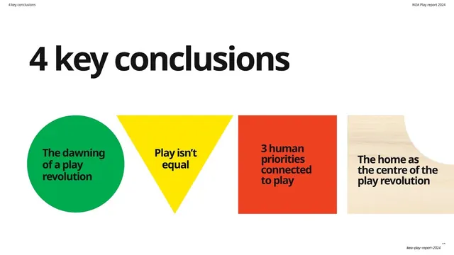
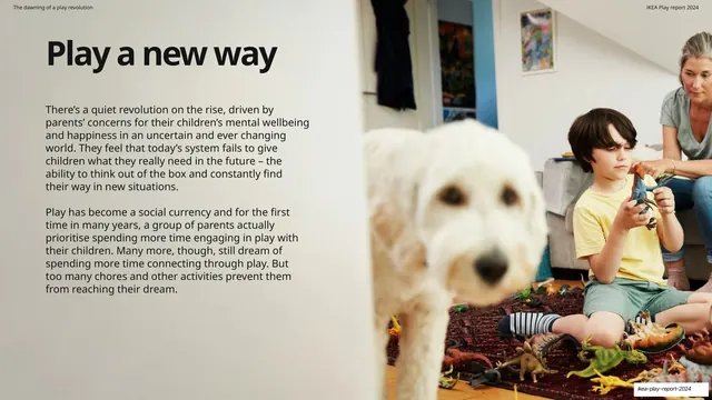
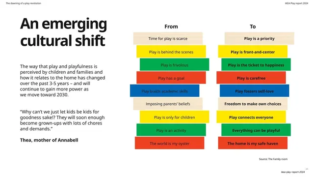
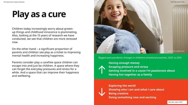
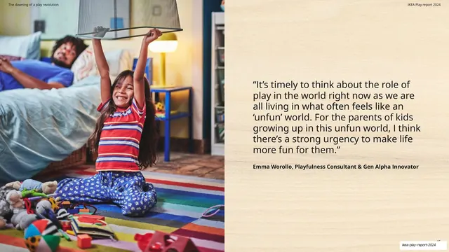
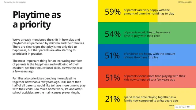
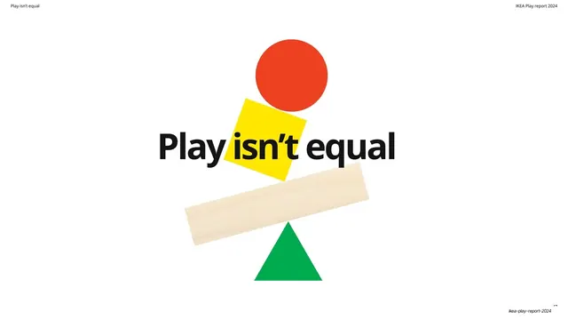
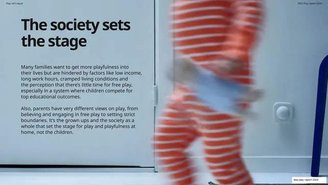
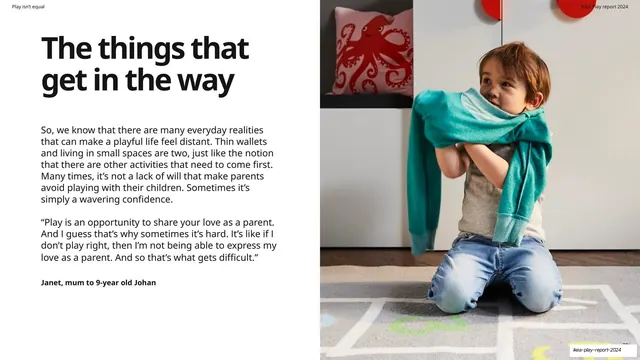
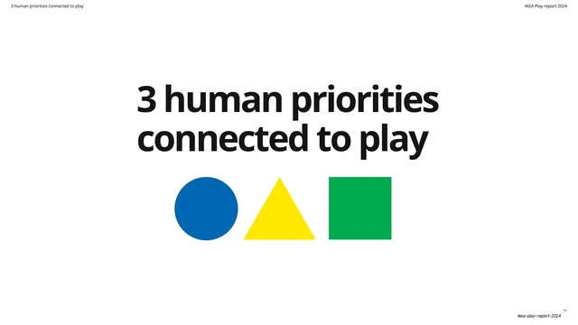
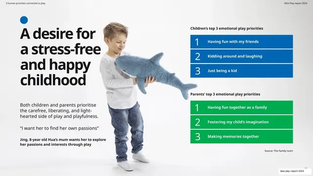
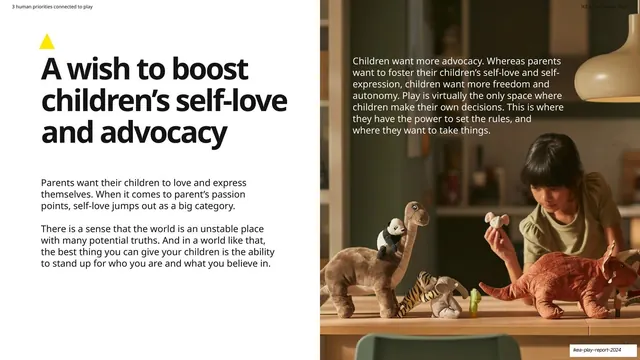
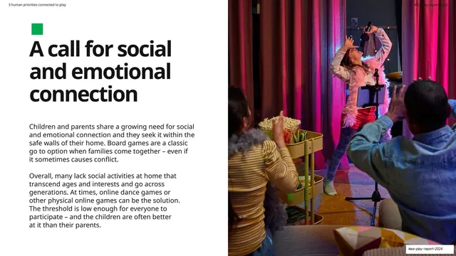
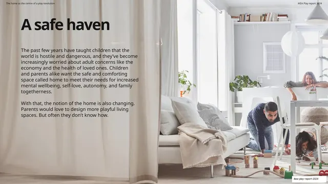
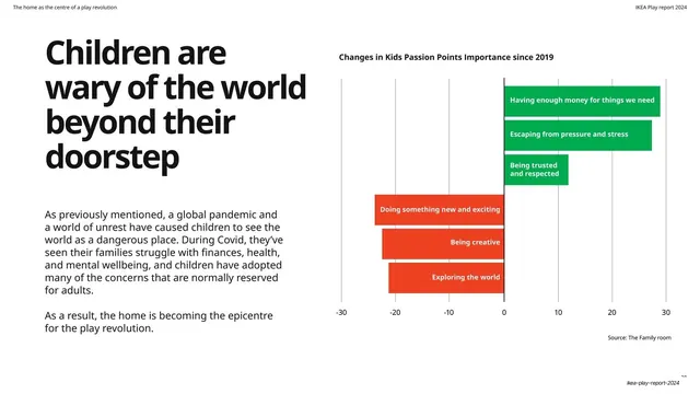
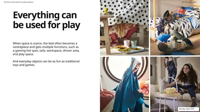
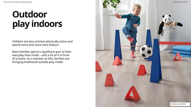
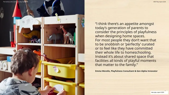
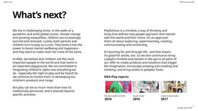
Slides run 16:9 on a predominantly white ground. Headlines are an oversized bold black sans-serif (Helvetica-style) set lowercase-after-cap, sitting top-left on content spreads or centered on section dividers. A tiny running header repeats on most slides: the section name in the top-left, "IKEA Play report 2024" in the top-right, on no rule. The IKEA brand palette does all the color work: green (#008542), yellow (#FBD914), red-orange (#E94E1B), and blue (#0058A3), plus a recurring pale wood-grain texture fill used as a fifth "material" swatch. The three core shapes (circle, triangle, square) appear as section markers, stat containers, and a repeated circle-triangle-square trio standing for the report's three human priorities. Recurring layouts: split text-left / full-bleed-photo-right content spreads; a cream or wood-grain right-hand quote panel with the quote in a warm-toned serif-ish weight and an attributed name in bold; section dividers built entirely from scattered or stacked color shapes around a centered headline; data slides where percentages sit inside colored circles, triangles, squares and rotated wood blocks; a milestone timeline made of overlapping color-framed boxes; a five-band color-coded percentage list; and from/to comparison columns in stacked color bars. Lifestyle photography is warm, naturalistic, and shows children and parents playing in IKEA-furnished homes, often bleeding to the full slide edge.
Key takeaway
Turning a fixed brand palette into a whole layout system: four primary colors plus one wood-grain "material" become shapes, stat holders, dividers, and chart bars, so the deck reads unmistakably as one brand across 33 varied slides with zero extra decoration. The circle-triangle-square trio as a repeating semantic motif (it stands for the three priorities and reappears as pure ornament) is a clean way to thread a long report together. And the discipline of one big black headline against an otherwise white slide keeps a data-heavy report feeling calm.
Reuse notes
A strong reference for brand-led research reports, annual reports, trend reports, and any long-form deck that needs to stay legible and on-brand across many content types (prose spreads, quotes, data, photography). The split-text-photo spread and the cream/wood quote panel are directly reusable templates. The primary-color-shapes system depends on owning a strong, simple palette; it would flatten with muddy or numerous brand colors. Needs genuinely good lifestyle photography to carry the full-bleed image halves.