Preview image. Unlock full-res
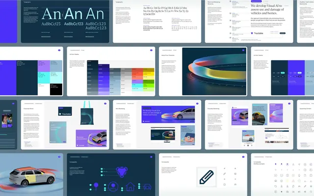
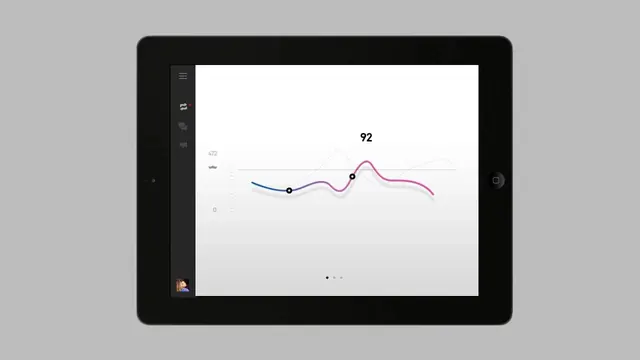
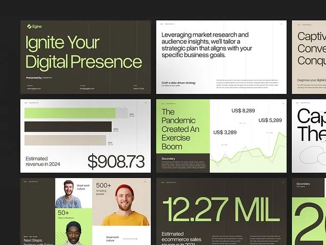
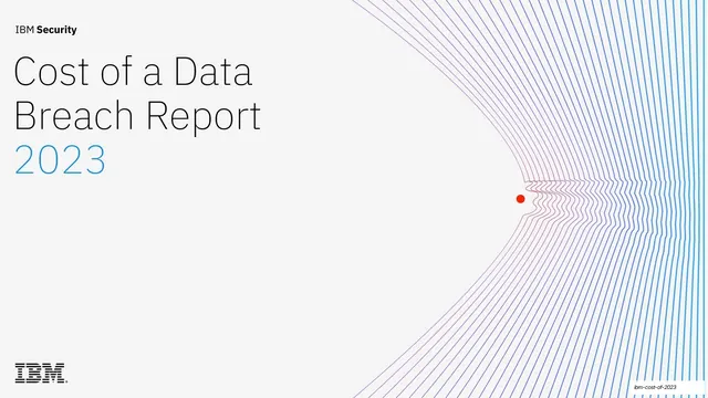
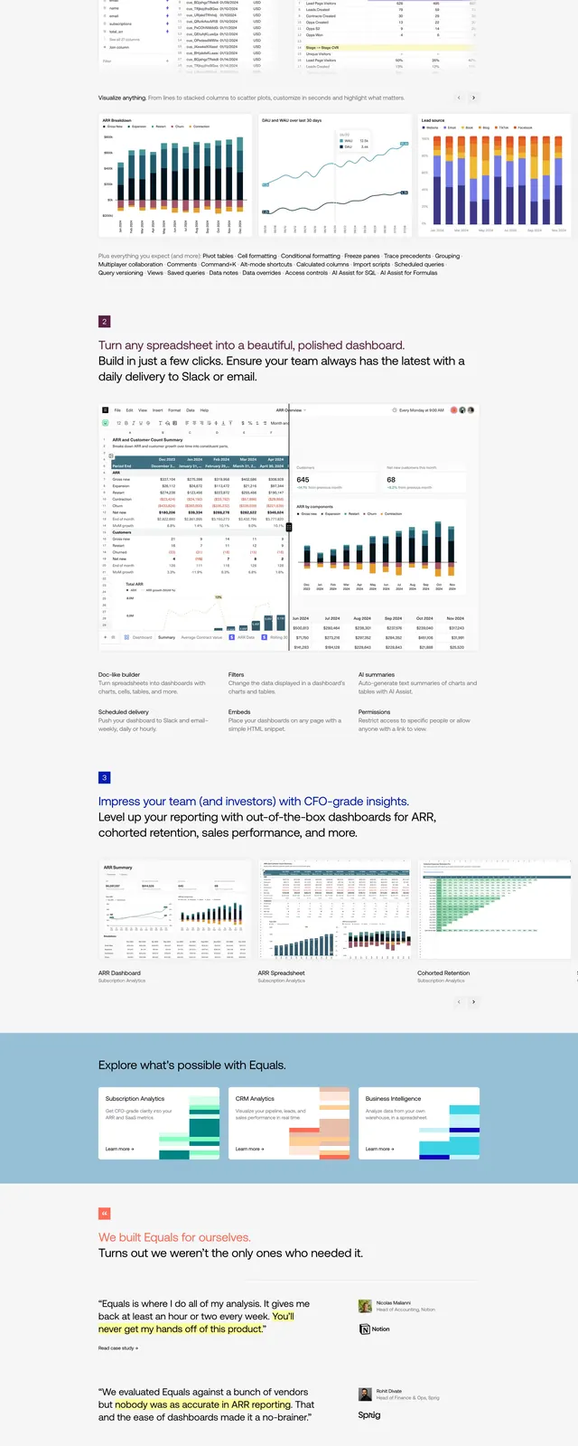
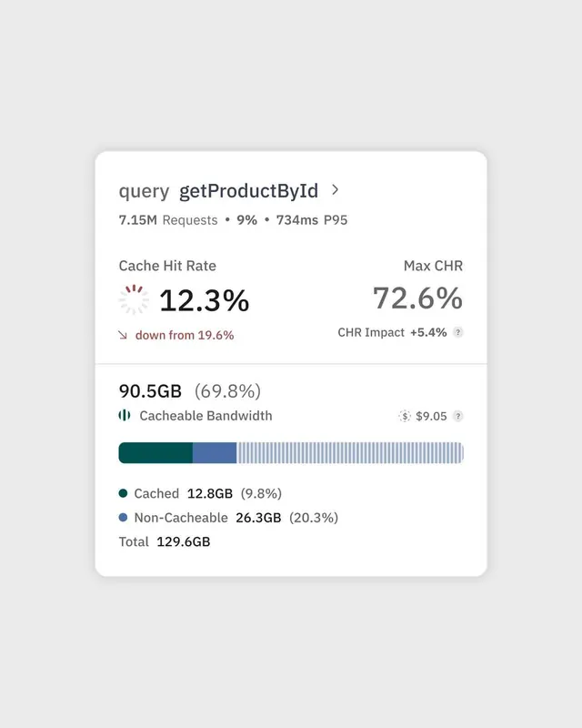
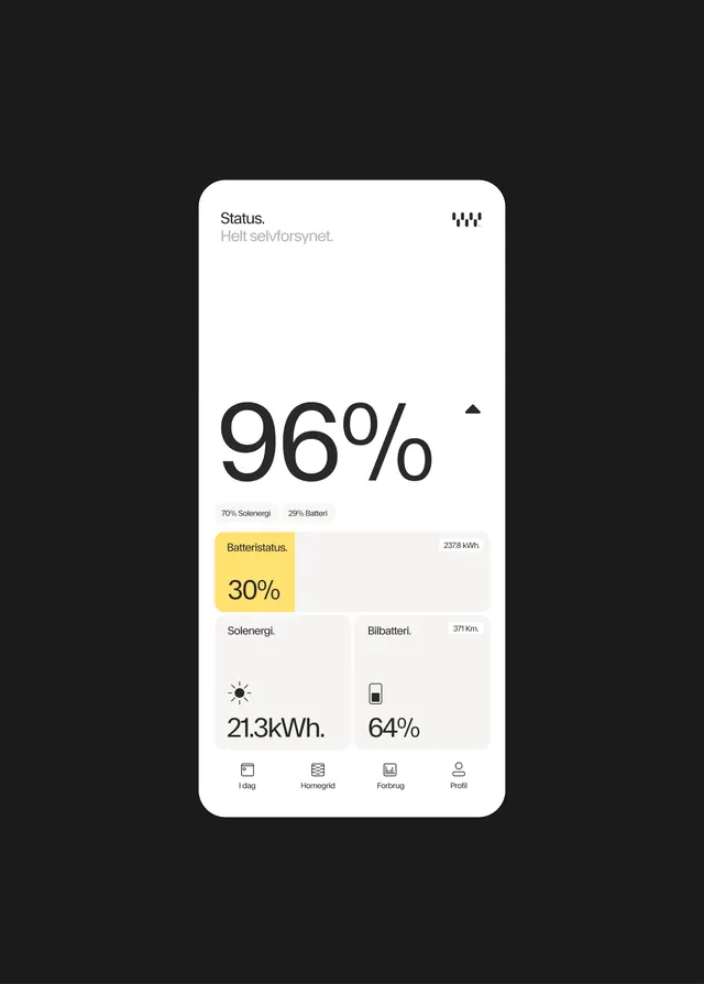
A clean data dashboard layout with multiple metric cards, line charts, and color-coded information panels arranged in a grid system.
Summary
A structured data dashboard showing multiple metrics, charts, and performance indicators arranged in a grid layout with a clean sans-serif typography system.
Visual description
The dashboard is organized in a 3-column grid with white cards on a light background. Each card contains a metric title, a numerical value, and supporting visualization (line chart, progress bar, or icon). Color coding in blue and red highlights positive and negative trends. Text hierarchy is clear, with large numbers for key metrics and smaller labels for context. The overall layout is spacious and scannable.
Key takeaway
The grid-based layout and consistent card hierarchy make complex data readable at a glance. Color coding and size differentiation guide attention to key metrics without overwhelming the viewer.
Reuse notes
Perfect for analytics, SaaS dashboards, or business intelligence interfaces. The clean card system is easily adaptable to different data sets. Works well for responsive layouts since cards can stack. Good reference for dashboard design systems.