Preview image. Unlock full-res
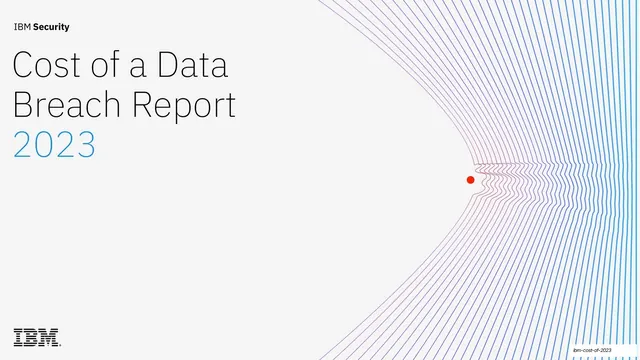
A 78-slide IBM Security research report deck in a clean light-mode corporate system, built on IBM Plex type, blue accent numerals, IBM-styled charts, and a recurring blue-to-red generative line motif.
Summary
The 18th annual IBM Security and Ponemon Institute research report on data breach costs, laid out as a 78-slide light-mode corporate deck. Its identity comes from three things: a strict IBM design system (IBM Plex type, a single blue accent, generous white space), data-forward layouts that pair multi-column body text with IBM-styled charts, and a recurring generative line graphic in a blue-to-red gradient anchored by a red dot.
Visual description
Slides run 16:9 on a near-white field that alternates between pure white and a pale gray (#F4F4F4) for the executive-summary spreads. Type is IBM Plex Sans, a geometric grotesque, set small and left-aligned for body copy and used at large display sizes for blue (#0F62FE) statistic numerals like "USD 4.45M". Section dividers carry a two-digit blue number ("01", "02") with an arrow, a sentence-case heading, and a large generative line illustration: dozens of thin parallel strokes that flow and bend across a blue-to-purple-to-red gradient, pinched around a single red dot focal point, rendered variously as a starburst, a topographic contour blob, or a layered ridge field. Recurring layouts: a four-column table-of-contents; split heading-left / body-right text slides; multi-column key-findings rows that pair an oversized blue figure with a bold lead-in and explanatory paragraph; and chart slides that place two or three body columns on the left against a boxed chart panel on the right. Charts are IBM-standard: horizontal and vertical bar charts in blue/indigo/violet series, line charts with labeled points, donut charts, and stacked area charts, each with a bold sentence-case title and a small "Figure N. Measured in..." caption. A consistent running header shows the section number top-left and the section name centered; a footer carries left/right "Previous section / Next section" navigation with a page number bottom-right. Editorial stock photography (people in data centers, retail, pharmacy) appears in plain rectangular crops.
Key takeaway
The discipline of a single blue accent against black text on white, doing all the emphasis work across 78 slides without decoration. The generative line graphic that gives a dry research report a memorable, ownable visual signature and reappears as section punctuation. And the key-findings pattern: a huge colored statistic beside a tight bold-lead paragraph, which makes numbers scannable.
Reuse notes
A strong reference for research reports, annual reports, benchmark studies, and any long, data-heavy B2B or security deck that must stay credible and legible. The chart system and the figure-plus-paragraph findings layout are directly reusable. The generative line motif needs custom illustration or a plotting tool to reproduce; it is what lifts this above a generic corporate template. Built for print-style density, so it rewards a reader, not a presenter clicking through quickly.
From this deck: IBM Cost of a Data Breach Report 2023
View deck