Preview image. Unlock full-res
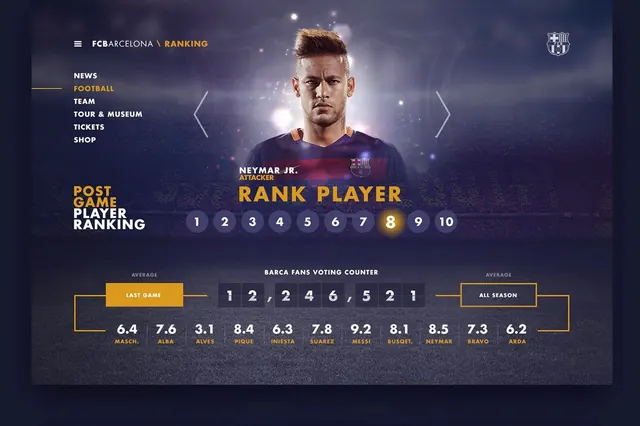
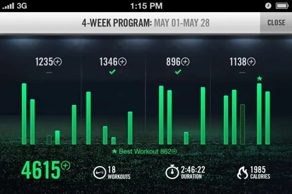
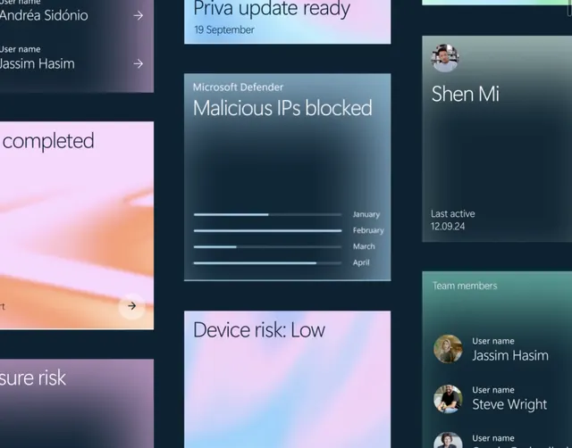
A complex data visualization dashboard using cool blues and technical typography, presenting multiple data streams and metrics.
Summary
A complex data visualization dashboard using cool blues and technical typography, presenting multiple data streams and metrics.
Visual description
Dark navy background with electric blue accents and slate gray secondary elements. Multiple data graphs, line charts, and metric cards arranged in a 4-column grid. Monospace and clean sans-serif typography. Dense information with clear visual hierarchy.
Key takeaway
Cool color palette on dark background for technical clarity. Grid layout and consistent spacing manage complexity.
Reuse notes
Reference for dashboards and analytics tools. Color scheme works for SaaS, fintech, or developer tools.