Preview image. Unlock full-res
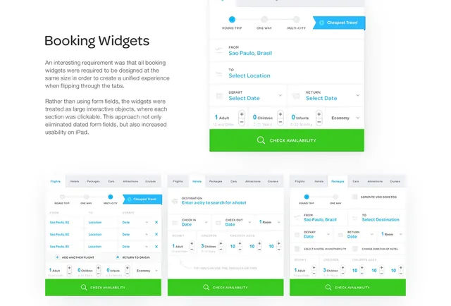
Documentation page showing multiple travel booking widget variants and a phone preview with interactive form elements.
Summary
UI design documentation for travel booking widgets with explanatory text, a mobile preview panel, and three example widget states.
Visual description
Left side has heading "Booking Widgets" and two paragraphs of body text about design requirements for uniform sizing and clickable widgets. Right side shows a smartphone preview with tabbed trip types (multi-city active), location and date inputs, passenger counters, and bright green "CHECK AVAILABILITY" button. Below are three side-by-side desktop widget mockups with tabs for Flights/Hotels/Packages and form fields in light gray and cyan accents on white.
Key takeaway
Treating form sections as large tappable interactive objects instead of traditional inputs creates a consistent experience across breakpoints and improves usability on touch devices.
Reuse notes
Useful reference for multi-state form UI patterns in travel or booking apps. The uniform widget sizing and prominent green CTAs work across web and mobile previews. Clean light palette with teal/cyan accents.