Preview image. Unlock full-res
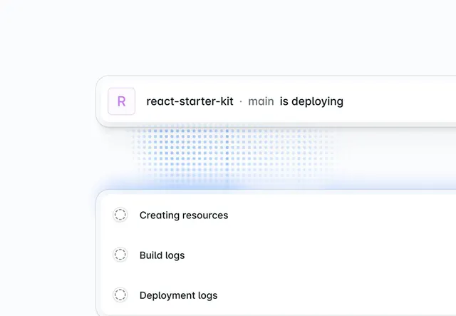
A clean developer UI showing deployment status: a header banner announcing 'react-starter-kit main is deploying' with a dot-grid progress bar, followed by three step items (Creating resources, Build logs, Deployment logs) marked with animated spinners.
Summary
A developer-facing deployment status screen with a banner header, dot-grid progress indicator, and a three-step status list marked with spinner icons.
Visual description
White background with a soft gray accent bar at the bottom. The top half contains a rectangular banner with rounded corners and a subtle drop shadow. Inside: a small purple 'R' icon badge on the left, followed by black body text "react-starter-kit . main is deploying". Below the banner, a field of light blue dots arranged in a grid pattern, suggesting progress or incremental work. The bottom half is a white card with a left border and three list items. Each item has a dashed-circle spinner icon on the left (light gray) and bold sans-serif label text: "Creating resources", "Build logs", "Deployment logs". Generous vertical spacing between items, right-aligned within the card boundary.
Key takeaway
The two-part layout (status announcement + progress grid + sequential steps) clearly separates "what is happening" from "what comes next". Dashed spinners convey activity without animation in a still. The soft palette and open spacing prevent visual fatigue in a developer's workflow.
Reuse notes
Ideal for long-running async processes (CI/CD, data sync, bulk operations) where users need confidence that work is progressing. The step-list pattern works for any ordered sequence. Pairs well with a toast or notification if a step fails. Keep text labels short and action-focused.