Preview image. Unlock full-res
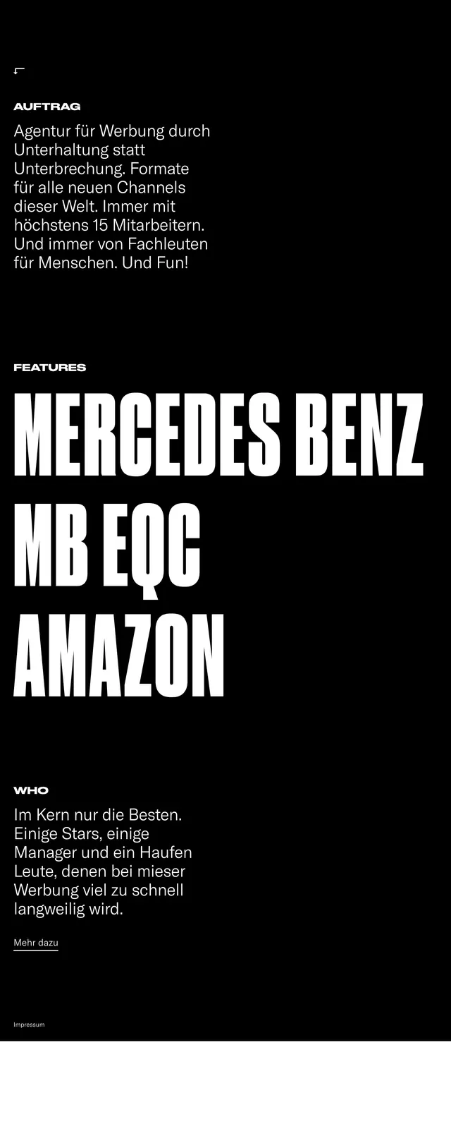
A high-contrast, bold consultancy website featuring oversized typography and a stark monochrome palette.
Summary
A high-contrast, bold consultancy website featuring oversized typography and a stark monochrome palette.
Visual description
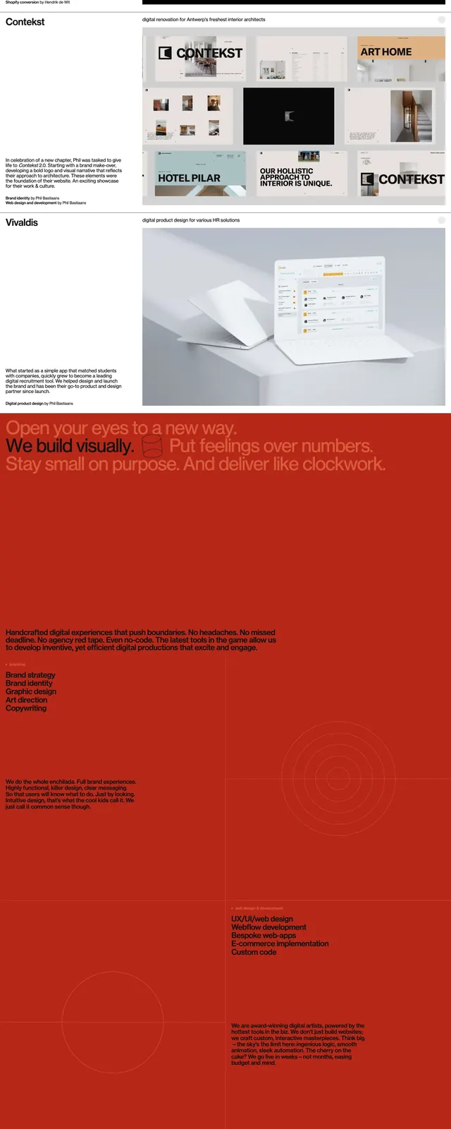
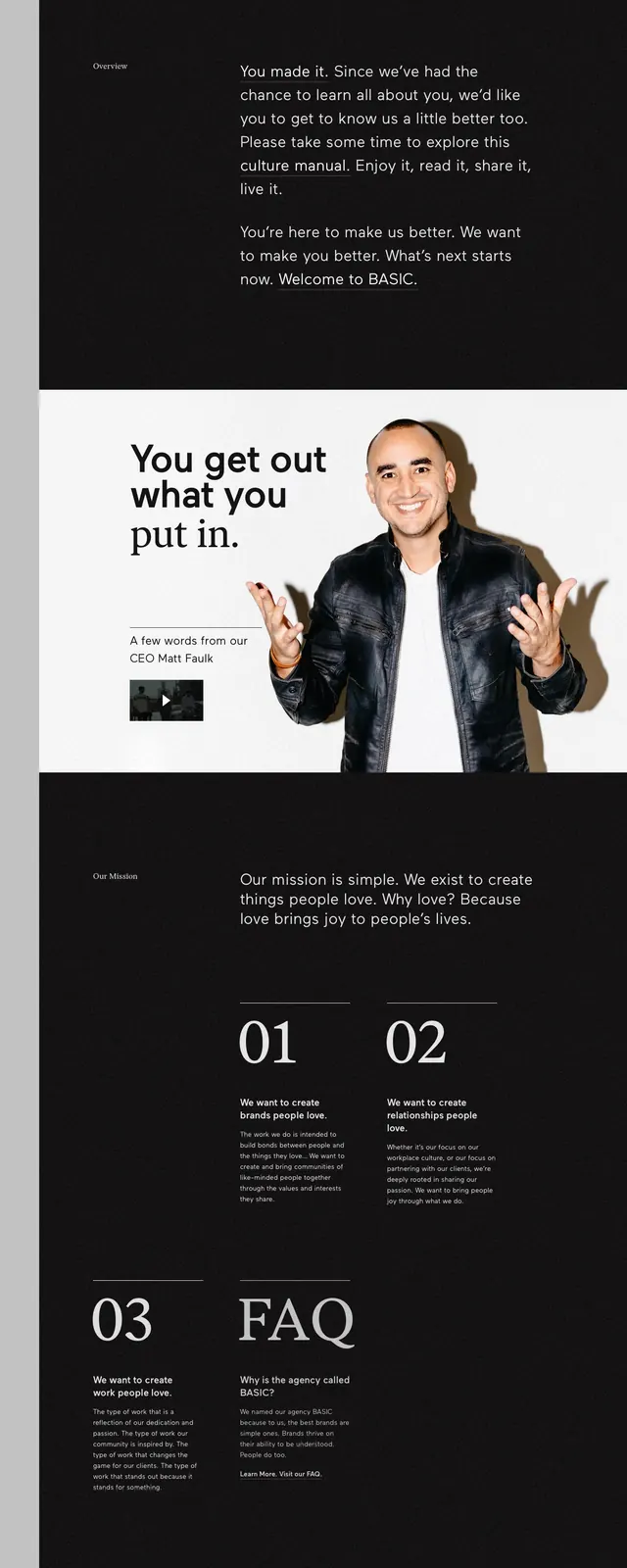
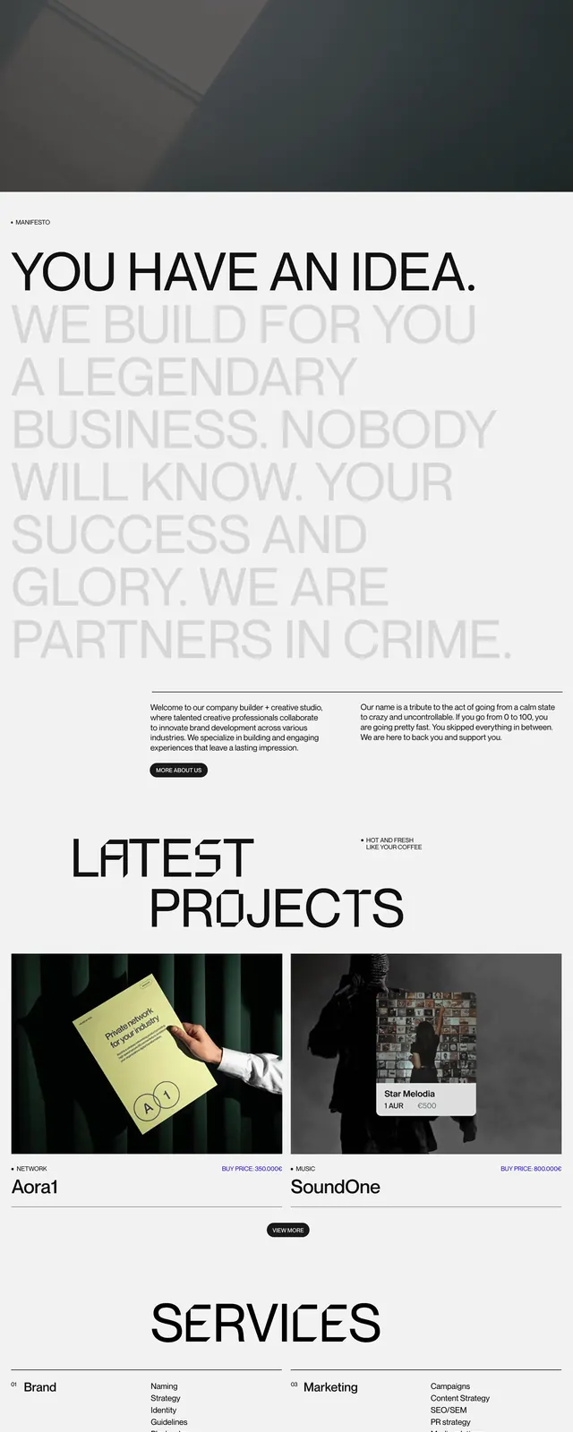
The design utilizes a strict black and white color scheme with massive, heavy-weight display fonts. A distinctive visual element is the transition from white to black vertical bars representing a scale from 'small idea' to 'bold business'. The layout alternates between full-width text blocks and structured grid sections for services.
Key takeaway
The use of extreme scale in typography creates a powerful visual hierarchy that conveys confidence and authority.
Reuse notes
Ideal for creative agencies or consultants who want to project a bold, uncompromising brand identity. The monochrome palette ensures a timeless, high-end feel.