Preview image. Unlock full-res
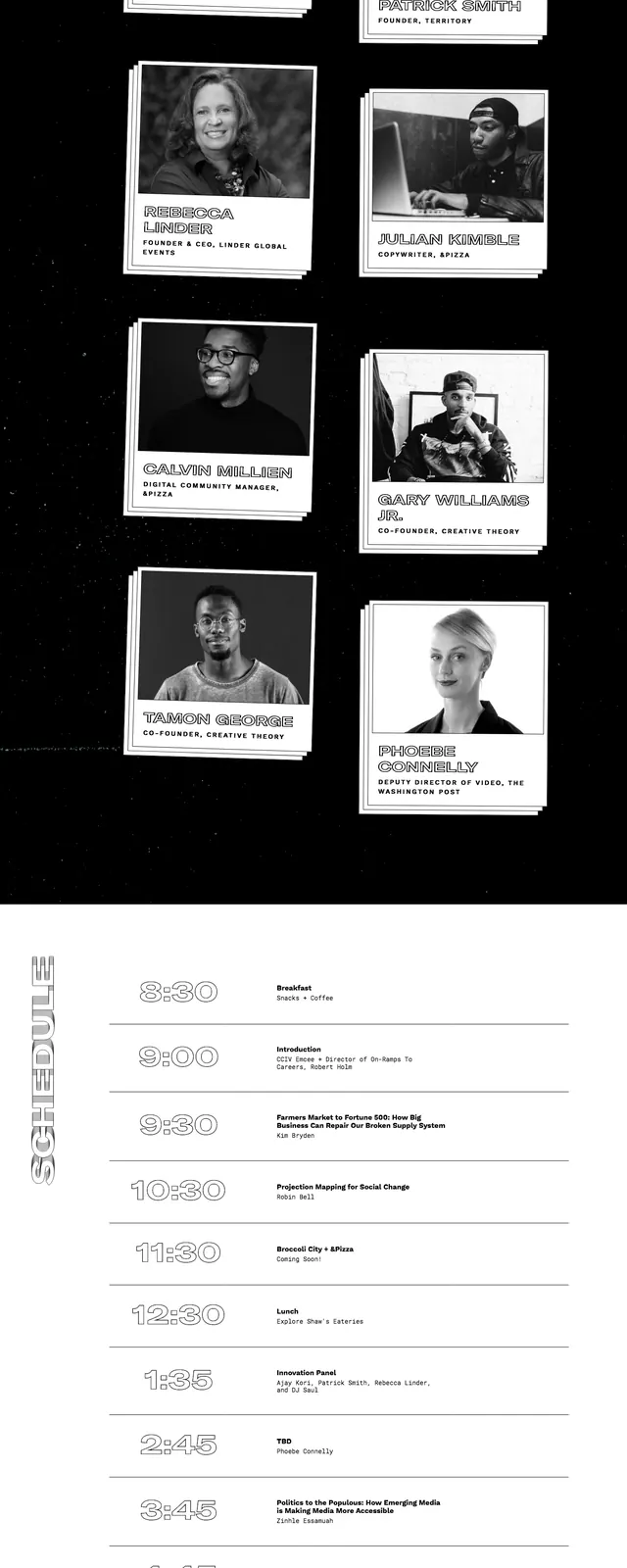
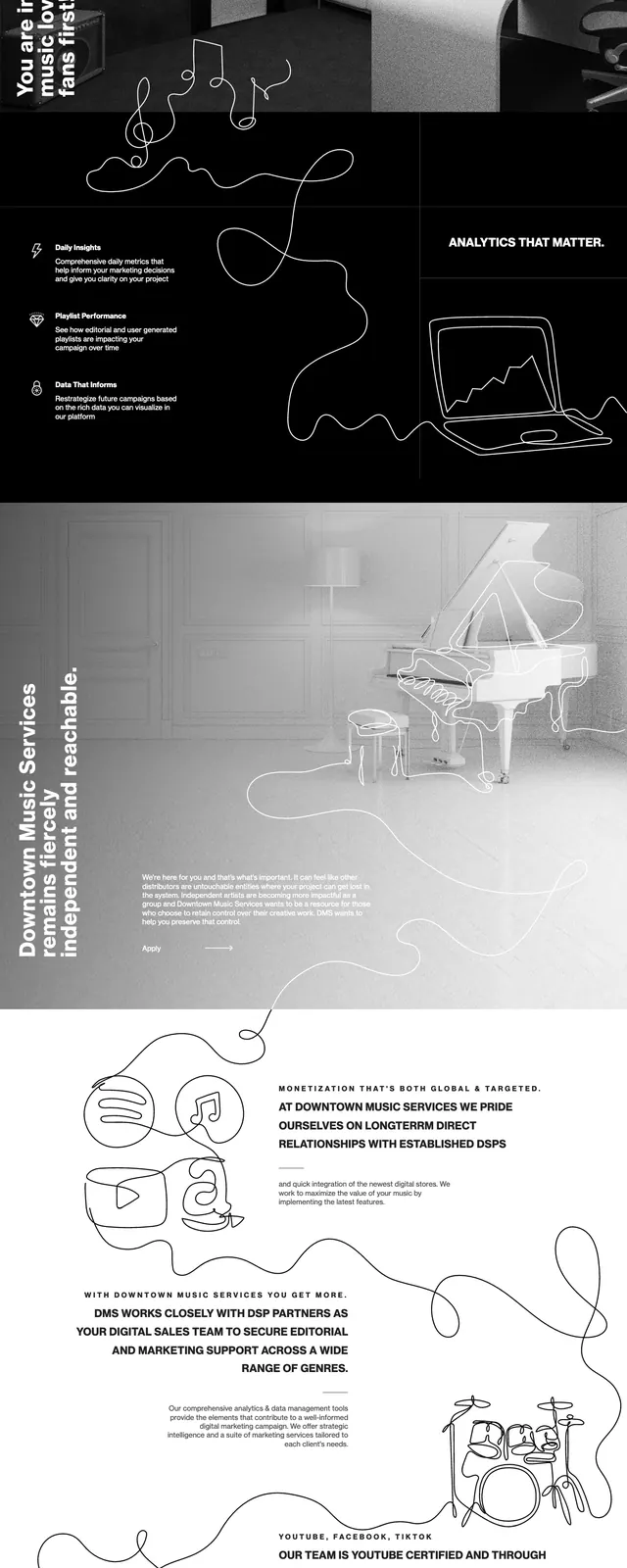
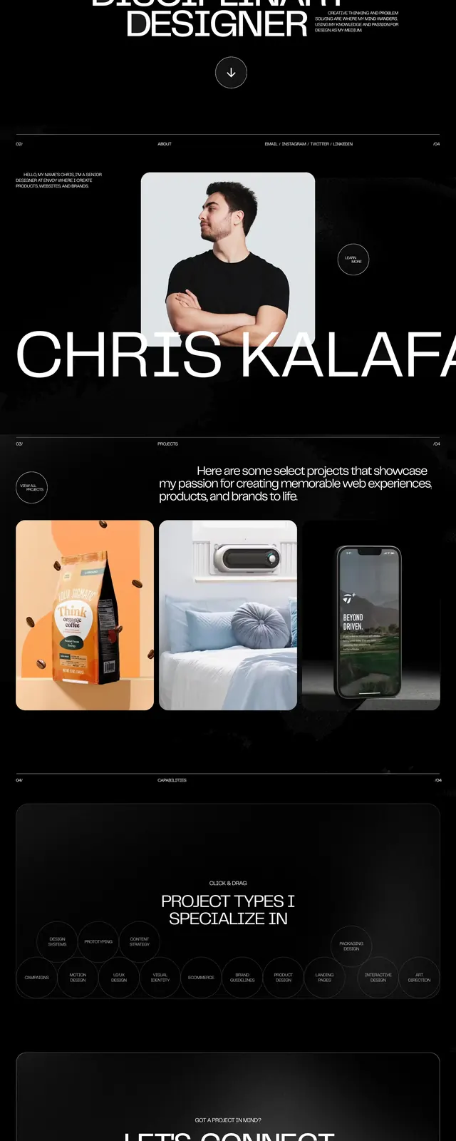
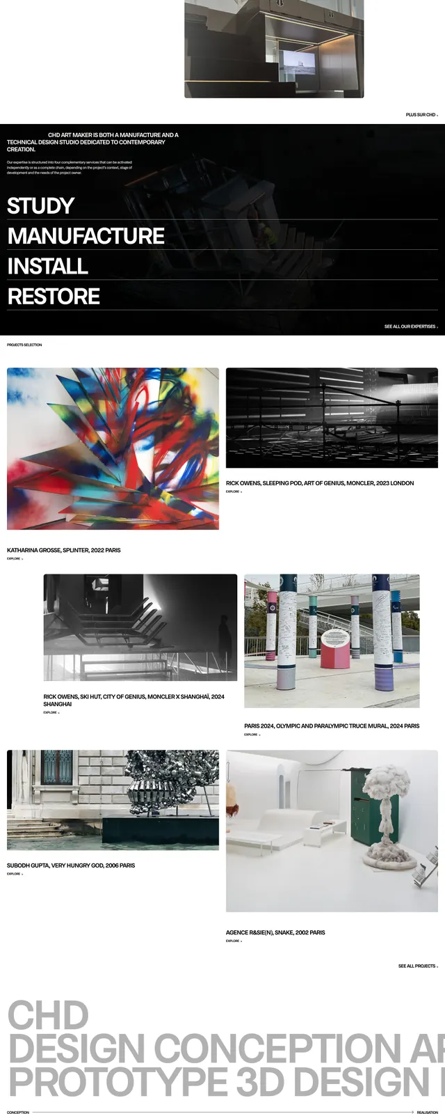
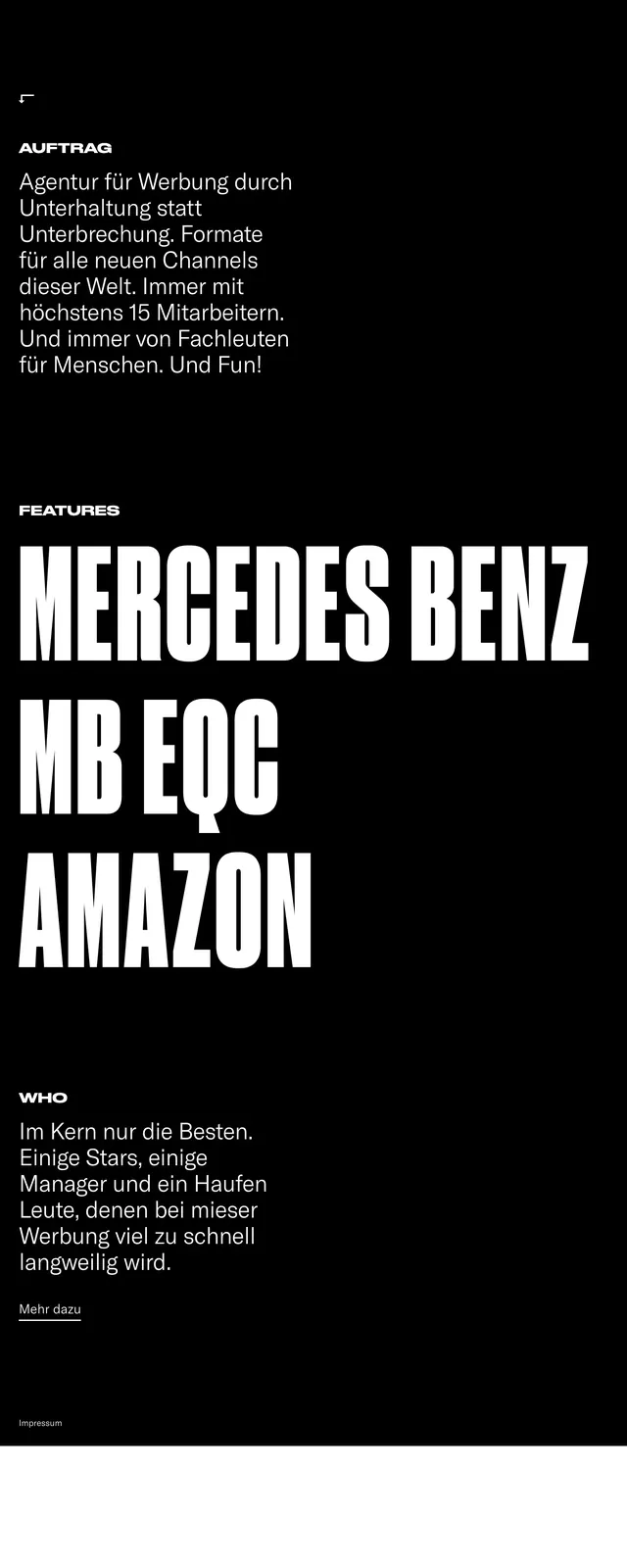
A stark black-and-white agency landing page built around oversized condensed headlines, minimal navigation, and sparse content blocks.
Summary
A stark black-and-white agency landing page built around oversized condensed headlines, minimal navigation, and sparse content blocks.
Visual description
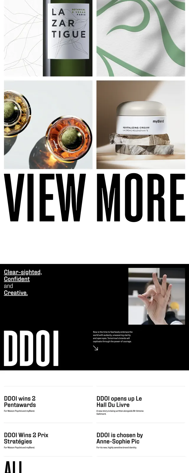
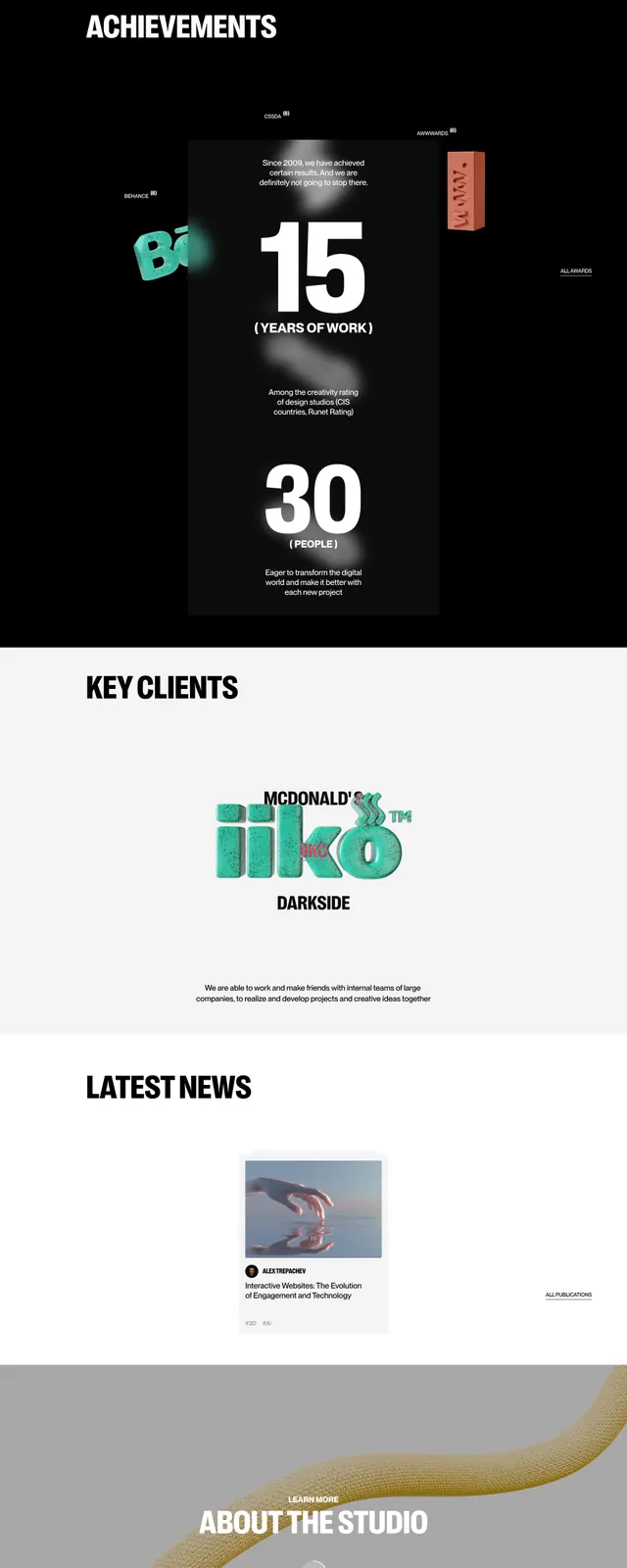
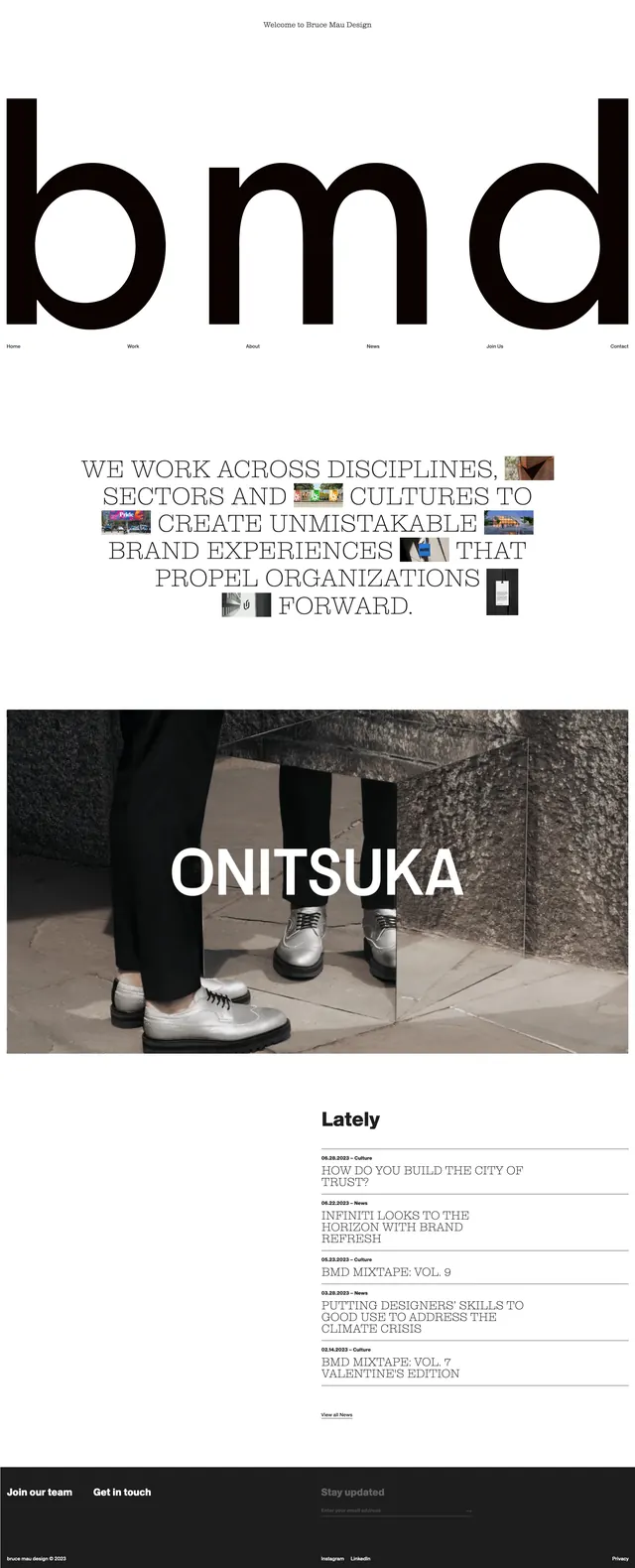
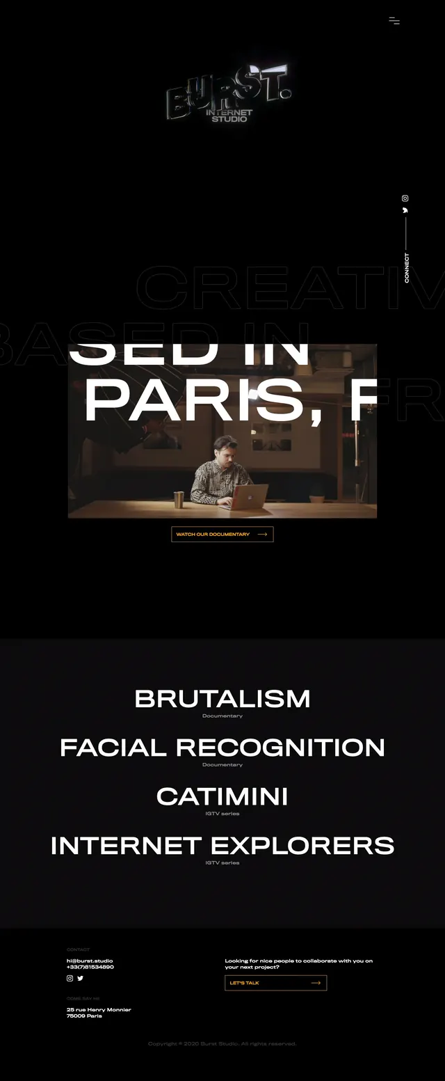
The page uses a black background with white text for the main hero and feature sections, then switches to a white background for the closing call to action. Navigation is tiny and minimal at the top, while the central content is dominated by huge condensed all-caps headings like "CREATIVE COSMOS 15" and client names such as "MERCEDES BENZ" and "AMAZON". Supporting copy is sparse and left-aligned, with thin divider lines and a small text link near the bottom.
Key takeaway
The design relies on extreme typographic scale and strict monochrome contrast to create a bold agency identity. It feels editorial and premium while staying visually simple.
Reuse notes
Reuse this pattern when the goal is to make typography the hero and keep all other UI elements understated. It works well for agency, portfolio, or branding sites that want a strong, fashion-editorial edge.