Preview image. Unlock full-res
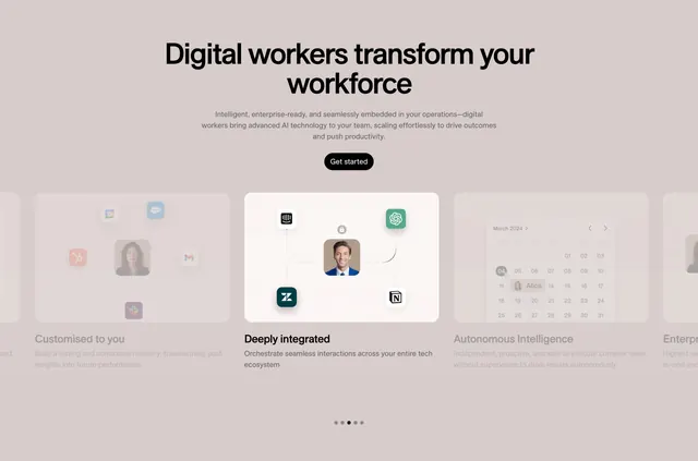
Centered feature carousel where a focused middle card sits between dimmed neighbors, each card showing a person photo wired to app integration icons.
Summary
A centered features section built as a horizontal carousel: one fully visible card in the middle is flanked by dimmed partial cards on either side, with dot pagination below. The defining move is the spotlight-on-one-card treatment that pulls the eye to a single feature at a time.
Visual description
A warm grey-beige background holds an oversized black two-line headline and three lines of muted sub-copy, with a single black pill "Get started" button beneath. Below sits a row of rounded feature cards; the active center card has a lighter cream fill and shows a smiling headshot connected by thin lines to a ring of app logos (OpenAI, Notion, Zendesk, and more), under the bold label "Deeply integrated". The cards to the left and right are faded back, with the left one previewing an integration graphic and the right one a March 2024 calendar UI. Five pagination dots at the bottom confirm a slider, with the second dot active.
Key takeaway
The carousel that dims every card except the focused one, so attention never splits. Wiring a central headshot to a halo of recognizable integration logos makes "works with your stack" instantly legible without a single word.
Reuse notes
Good for an AI or automation product that needs to show many integrations and multiple feature angles in one compact band. Relies on a slider, so it pairs with sites that already use motion; the dimmed neighbors imply swipe affordance. Works best on a light, low-saturation palette where the active card can quietly brighten.