Preview image. Unlock full-res
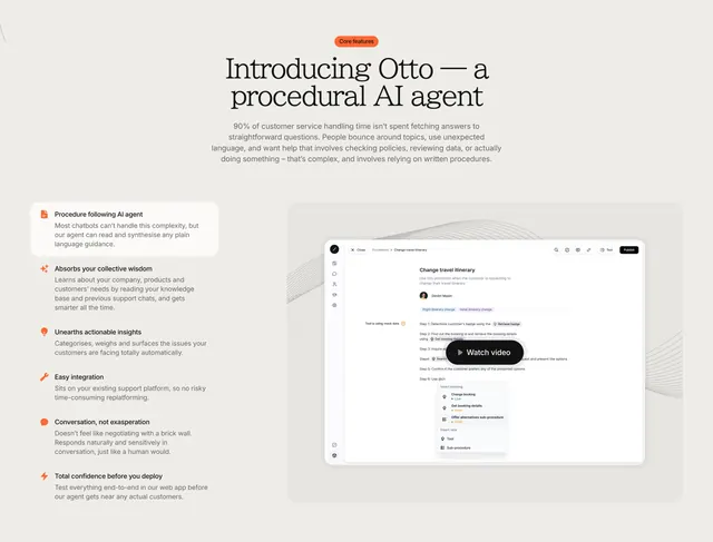
Cream feature-detail section with an oversized serif heading, a six-item icon list on the left, and a tabbed product screenshot with a watch-video button on the right.
Summary
A cream feature-detail section that stacks a centered serif intro over a two-column body: a six-item icon-led benefit list on the left and a framed product screenshot on the right. The defining move is the editorial serif heading sitting above a conventional features-plus-screenshot split.
Visual description
A centered orange "Core features" pill tops a two-line oversized serif heading and a multi-line muted paragraph. Below left, six benefits each pair a small orange icon with a bold label and two lines of grey copy (procedure following, absorbing knowledge, surfacing insights, easy integration, natural conversation, confidence before deploy); the first item sits on a raised white card. On the right, a large rounded product screenshot shows a "Change travel itinerary" procedure builder with in-tab filters ("Flight itinerary change", "Hotel itinerary change"), a step list, and an insert menu, overlaid by a black "Watch video" button. Faint line textures trail behind the frame.
Key takeaway
Leading a standard feature list with a centered serif headline to lift it above a plain sans block. Raising only the first list item onto a white card to anchor the eye, and dropping a "Watch video" button onto the product shot to add a demo path inside a static section.
Reuse notes
Well suited to an AI or support product that needs to explain several capabilities while showing the real interface. The serif-plus-sans mix reads premium; keep icons in one accent color to hold the list together. The screenshot must be detailed enough to reward the watch-video overlay.
More feature detail sections
See all

More like this
Keep what you find
A free account saves references to boards and can send you a weekly email of picks based on what you save.
To see every result, go Pro.