Preview image. Unlock full-res
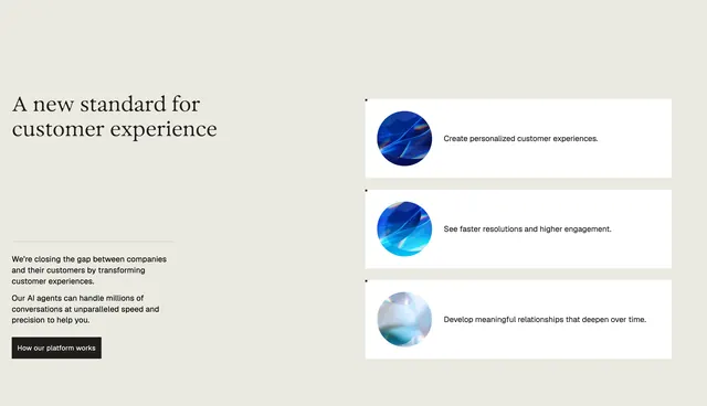
Two-column feature block with serif headline and black CTA on the left, three stacked white benefit rows with iridescent orb graphics on the right.
Summary
"A new standard for customer experience" splits the section: narrative copy and a solid black button on the left, three horizontal benefit rows with circular abstract visuals on the right.
Visual description
Warm off-white background in a roughly 50/50 split. Left column: large dark serif headline "A new standard for customer experience", thin gray divider, two short sans paragraphs about closing the company-customer gap and AI agents handling millions of conversations, then a solid black rectangular button labeled "How our platform works" in white sans text. Right column: three stacked white horizontal cards with equal vertical spacing. Each row places a circular abstract graphic on the left (dark blue-violet with light refraction, bright cyan-blue with glowing streaks, soft pearlescent gray-white) beside a single sans benefit line: "Create personalized customer experiences.", "See faster resolutions and higher engagement.", and "Develop meaningful relationships that deepen over time."
Key takeaway
Abstract orb thumbnails give three text-only benefits a premium, product-adjacent visual anchor without screenshots. The black CTA contrasts cleanly against the soft beige field.
Reuse notes
Strong pattern for platform or product value sections where you want proof points without UI chrome. Orbs can be swapped for icons or mini-screenshots. Left column copy block needs brevity to balance the three rows on the right.