Preview image. Unlock full-res
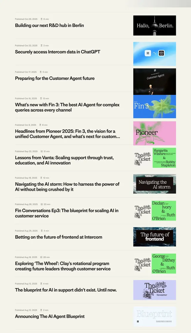
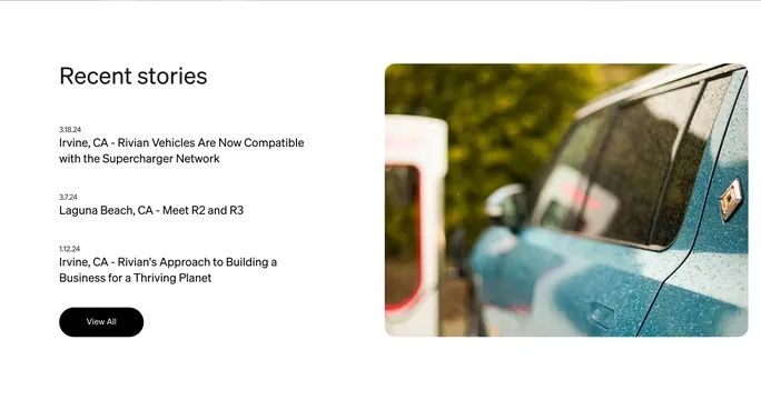
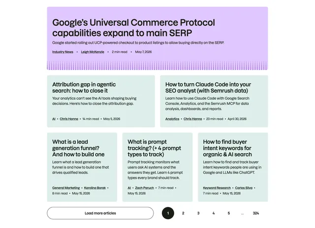
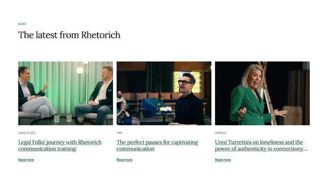
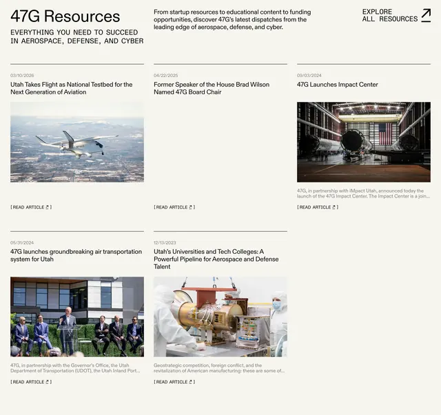
Warm off-white resources header over a three-column article grid with dated cards, photos, excerpts, and bracketed read links.
Summary
A 47G Resources block leads with oversized type and intro copy, then presents five dispatches in a ruled three-column grid where each card stacks date, headline, optional image, excerpt, and a read link.
Visual description
The background is a warm light beige. The top row splits into three zones: a large black "47G Resources" title with an all-caps subhead about aerospace, defense, and cyber; a center paragraph describing startup resources and funding; and a right-aligned "EXPLORE ALL RESOURCES" link with an up-right arrow. A horizontal rule separates the header from the article grid. Five cards sit in three columns with thin top borders. Each card shows a grey date (03/10/2026), a bold black headline, and most include a rectangular photo (aircraft, hangar interior, panel event, cleanroom work). Several cards add a grey excerpt paragraph. Every card ends with a bracketed "[ READ ARTICLE ]" link and arrow. One top-center card is text-only with no image.
Key takeaway
Let the header breathe across three unequal columns so title, context, and global CTA coexist without crowding. Use only top rules between cards instead of full boxes to keep a dense grid feeling editorial rather than card-heavy.
Reuse notes
Works for news hubs, resource libraries, or investor update pages that publish frequently. The asymmetric mix of image and text-only entries keeps rhythm when not every post has art. Pair with a strong typographic headline style; the layout depends on consistent date and link treatment more than heavy chrome.