Preview image. Unlock full-res
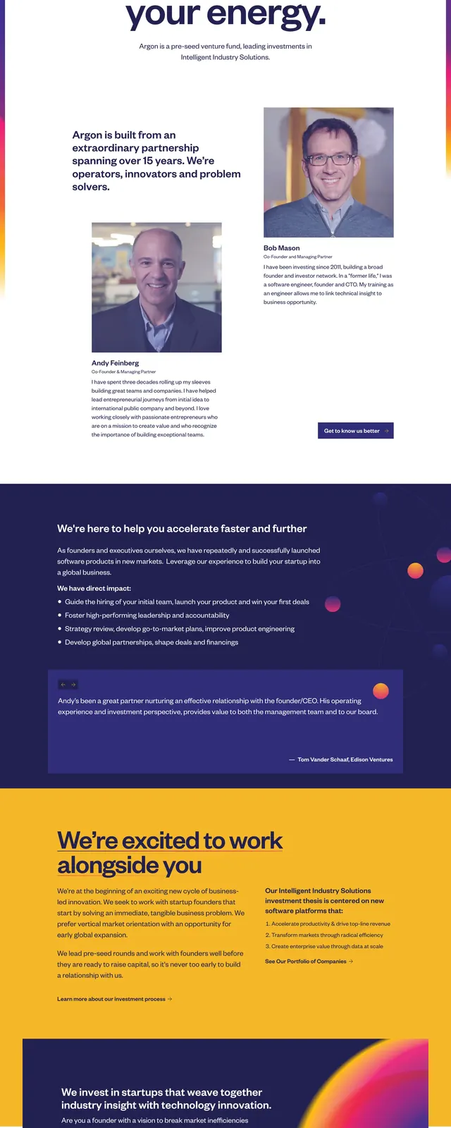
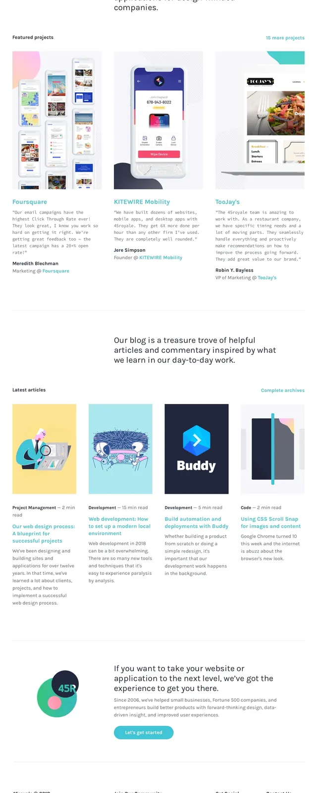
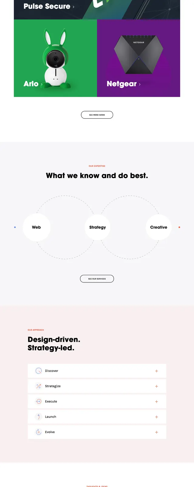
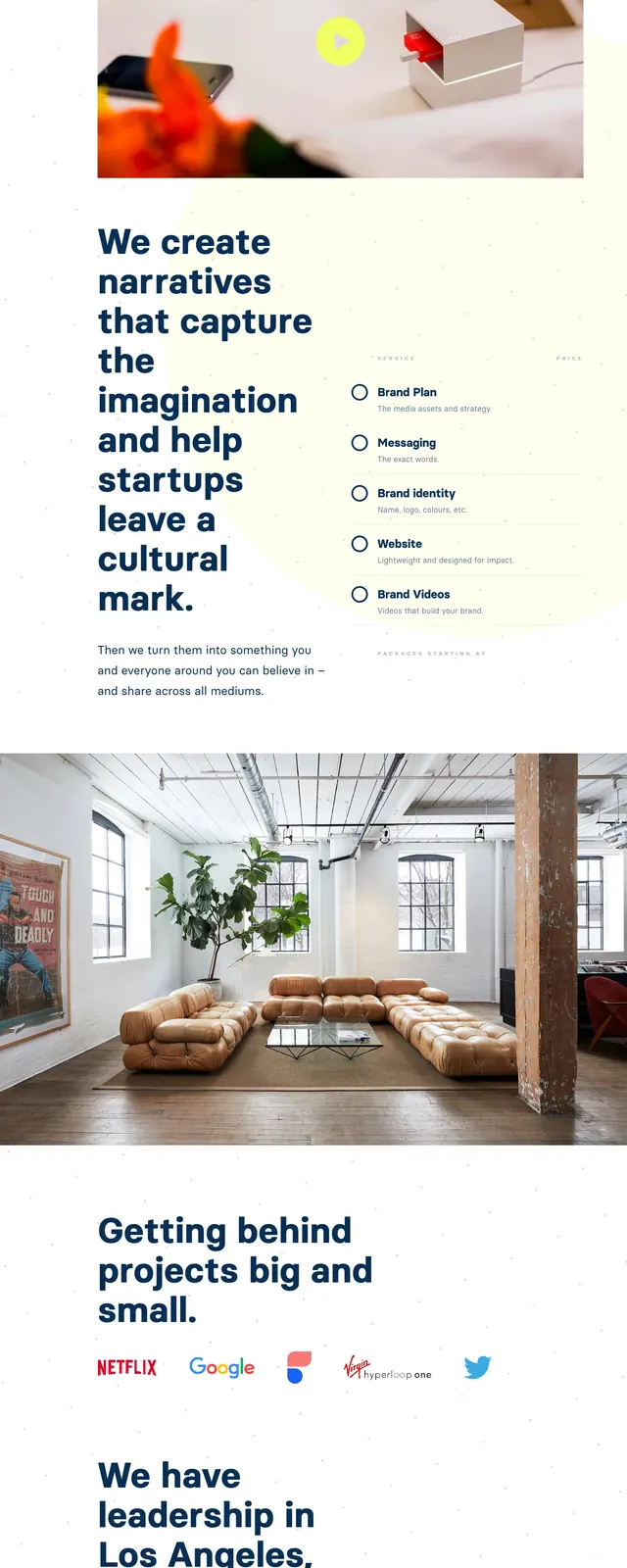
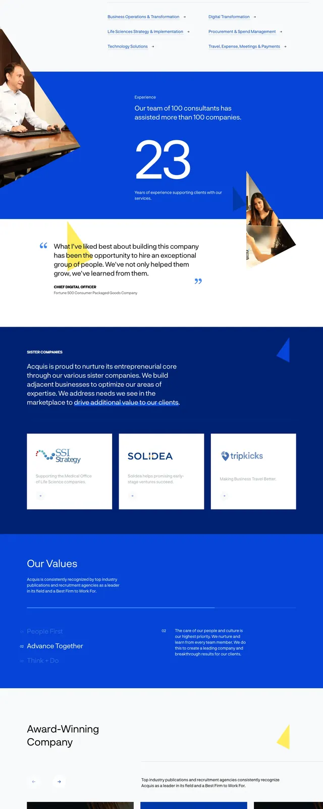
A bold, high-contrast corporate site featuring a vibrant blue primary color and a mix of geometric shapes.
Summary
A bold, high-contrast corporate site featuring a vibrant blue primary color and a mix of geometric shapes.
Visual description
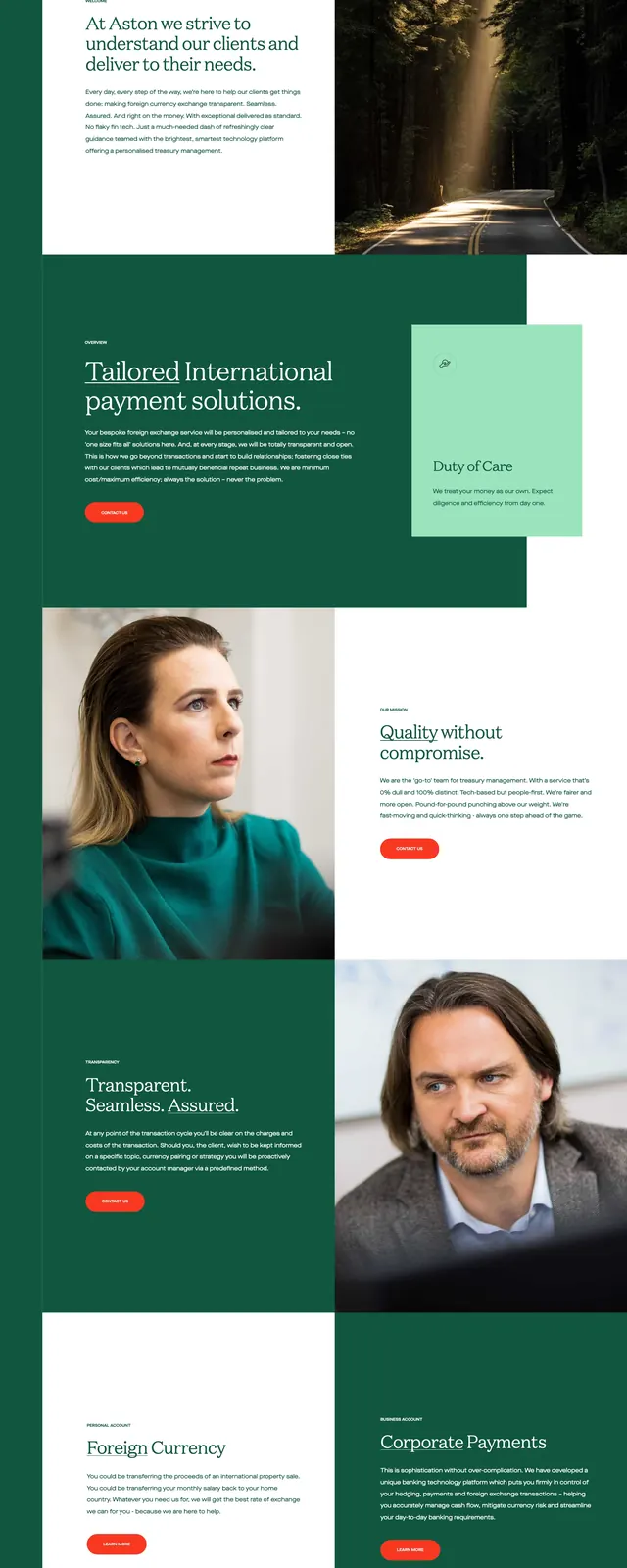
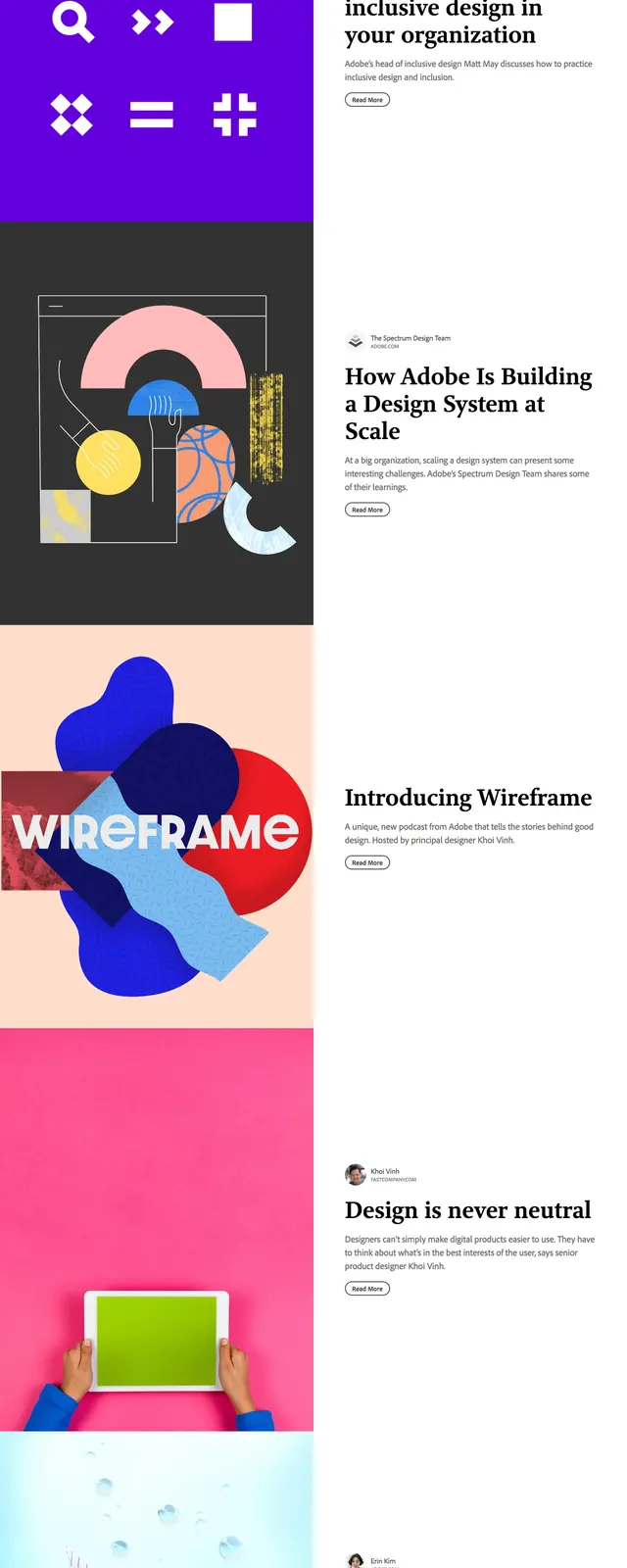
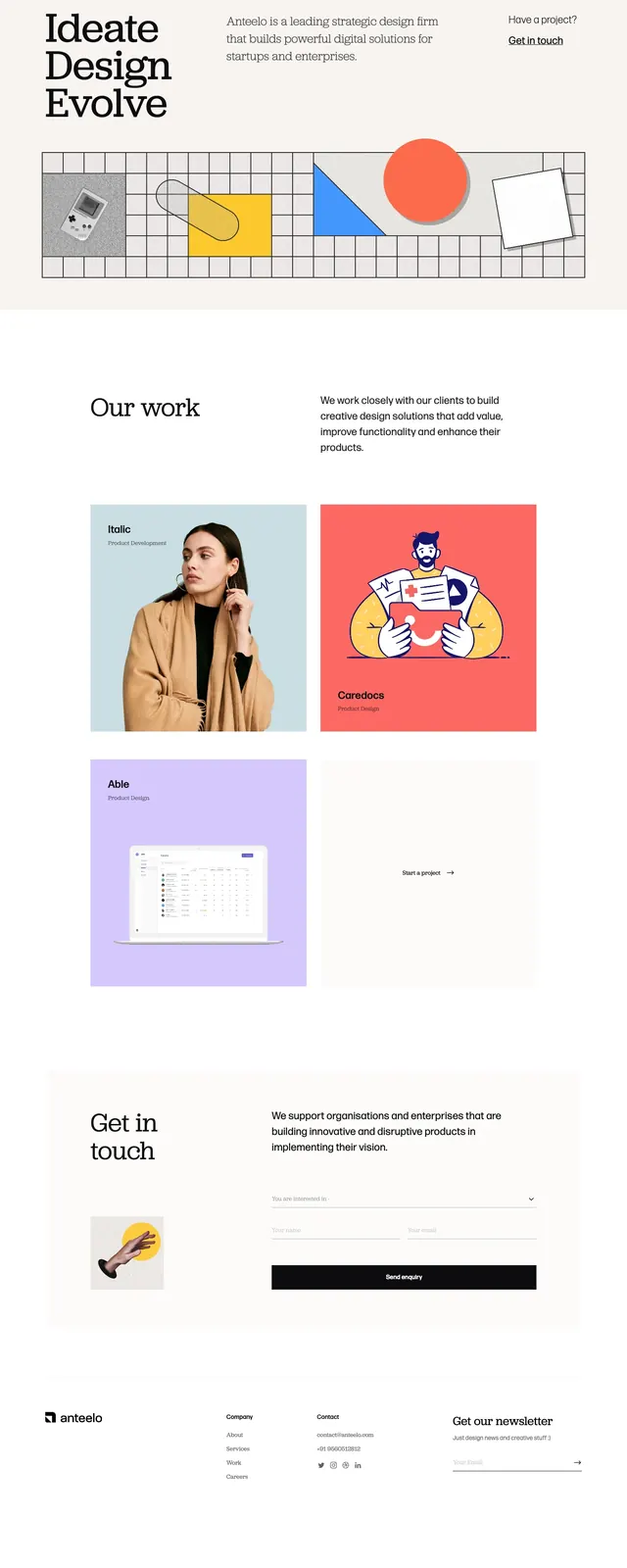
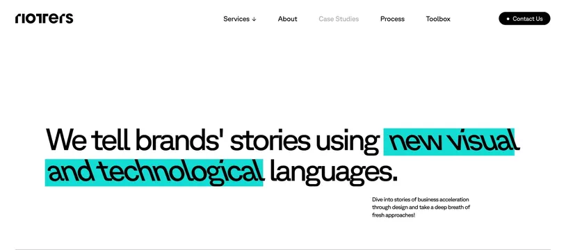
The page opens with a striking royal blue hero section featuring oversized white typography and a professional portrait. Below, a clean white section uses a large quote with a yellow accent. The 'Sister Companies' section returns to the blue background, showcasing three white cards in a grid layout.
Key takeaway
The use of a single dominant brand color across alternating sections creates a strong visual rhythm and brand identity.
Reuse notes
Effective for B2B services wanting to appear bold yet professional. The card-based layout for partner companies is highly reusable for portfolios or integrations.