Preview image. Unlock full-res
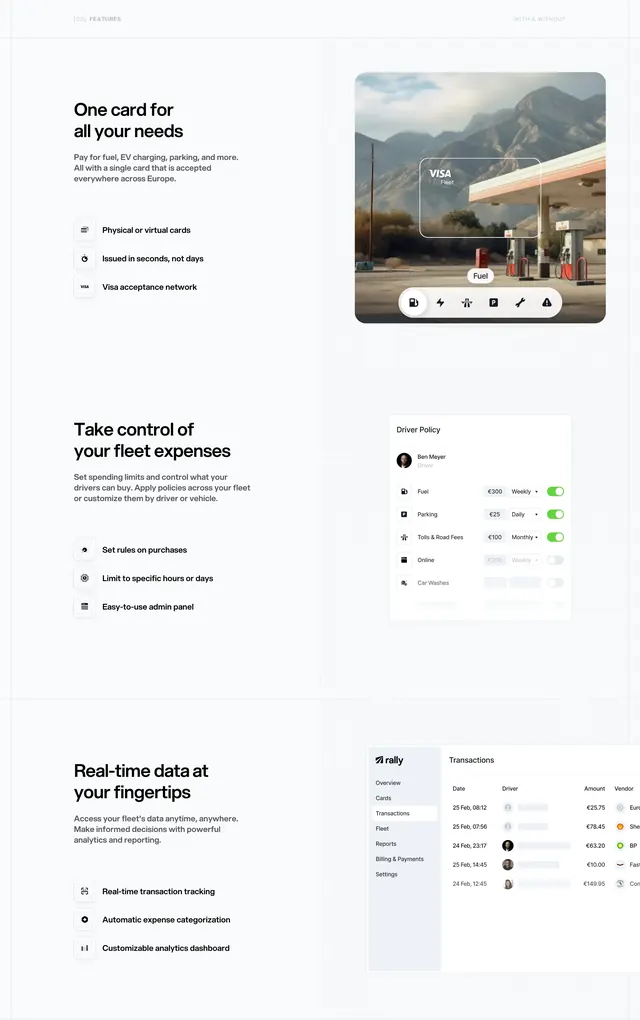
Three alternating text-left / mockup-right feature blocks covering unified cards, spend controls, and real-time transaction dashboard.
Summary
A vertical stack of three feature-detail sections, each with a bold headline, supporting copy, three icon bullets, and a large product visual on the right.
Visual description
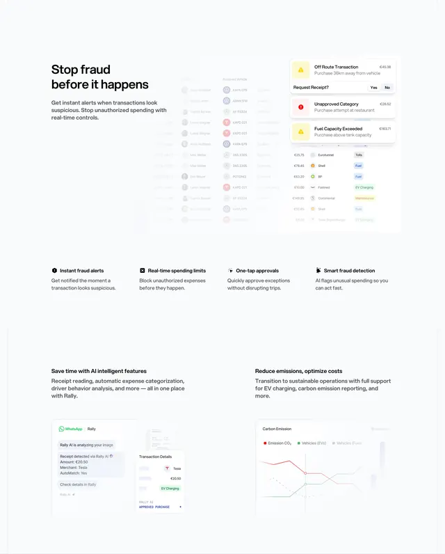
White background throughout. Section 1 "One card for all your needs": left text plus three gray-square icon bullets (physical/virtual cards, instant issuance, Visa network); right shows a gas-station photo with transparent card overlay and floating category pill bar (Fuel highlighted). Section 2 "Take control of your fleet expenses": bullets on rules, time limits, admin panel; right shows a "Driver Policy" card for Ben Meyer with category toggles and euro limits (Fuel, Parking, Tolls, Online, Car Washes). Section 3 "Real-time data at your fingertips": bullets on tracking, categorization, analytics; right shows full Rally dashboard with sidebar nav and Transactions table (dates, drivers, amounts, Shell/BP vendors).
Key takeaway
Repeating one proven split pattern three times but changing the mockup type (lifestyle photo + overlay, settings card, full dashboard) so each block feels fresh while staying structurally familiar.
Reuse notes
Standard B2B feature stack for complex products. Requires high-fidelity UI mockups that match real product screens. Long page; best when each section maps to a distinct buyer concern (coverage, control, visibility).