Preview image. Unlock full-res
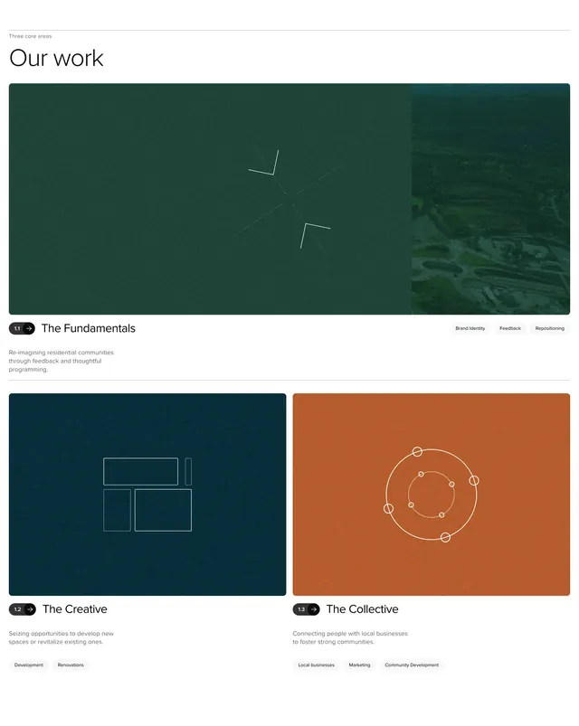
Our work" features section with one full-width green card above two smaller teal and terracotta cards, each with grainy color blocks, line-art icons, numbered pills, and category tags.
Summary
A three-pillar "Our work" section combining one wide feature card and two half-width cards, each with a textured color panel, thin vector graphic, numbered pill label, title, description, and grey tag row.
Visual description
White page with left-aligned header: small "Three core areas" label and large thin "Our work" heading. Row one is a full-width rounded rectangle in deep forest green with heavy grain; centered white line-art shows two arrows pointing inward; the right edge fades into a vertical aerial landscape strip. Below, two equal cards sit side by side: left panel in dark teal with a wireframe box graphic, right panel in terracotta with concentric circles and dots. Under each panel, a black numbered pill ("1.1", "1.2", "1.3" with arrow icons) precedes a bold title ("The Fundamentals", "The Creative", "The Collective") and grey body copy. Bottom of each block shows small grey pill tags such as "Brand Identity", "Development", and "Community Development".
Key takeaway
Numbered pill labels (1.1, 1.2, 1.3) give sequential structure to parallel service lines without a timeline component. Grainy color blocks plus minimal line icons create distinct pillars while staying on-brand. Tag rows at the foot of each card add scannable keywords without bulleted lists.
Reuse notes
Strong template for agencies, holdings, or multi-division companies presenting three offerings. The 1+2 bento scales visually at desktop; mobile should stack cards vertically. Each panel needs a distinct hue and simple icon motif; busy photography inside every tile would fight the system.