Preview image. Unlock full-res
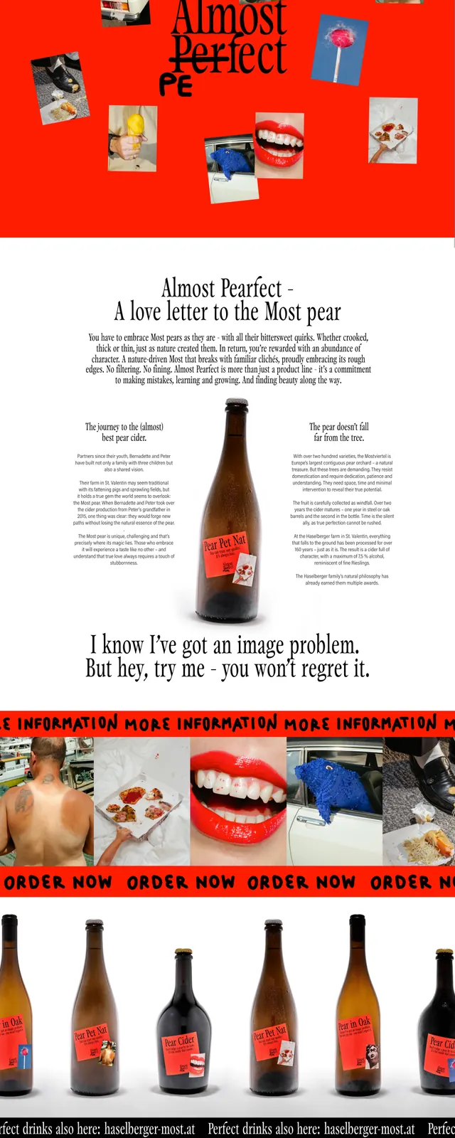
A bold, high-energy landing page for a cider brand featuring a chaotic collage aesthetic and vibrant red backgrounds.
Summary
A bold, high-energy landing page for a cider brand featuring a chaotic collage aesthetic and vibrant red backgrounds.
Visual description
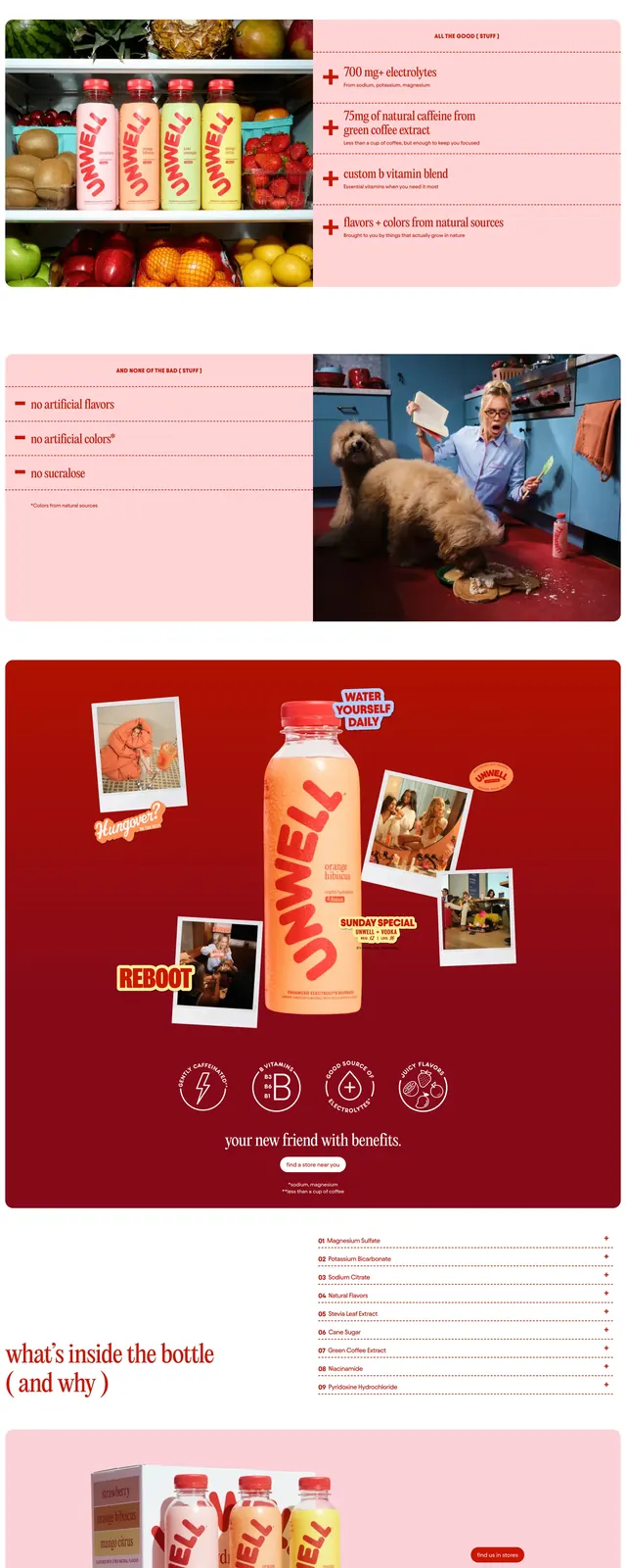
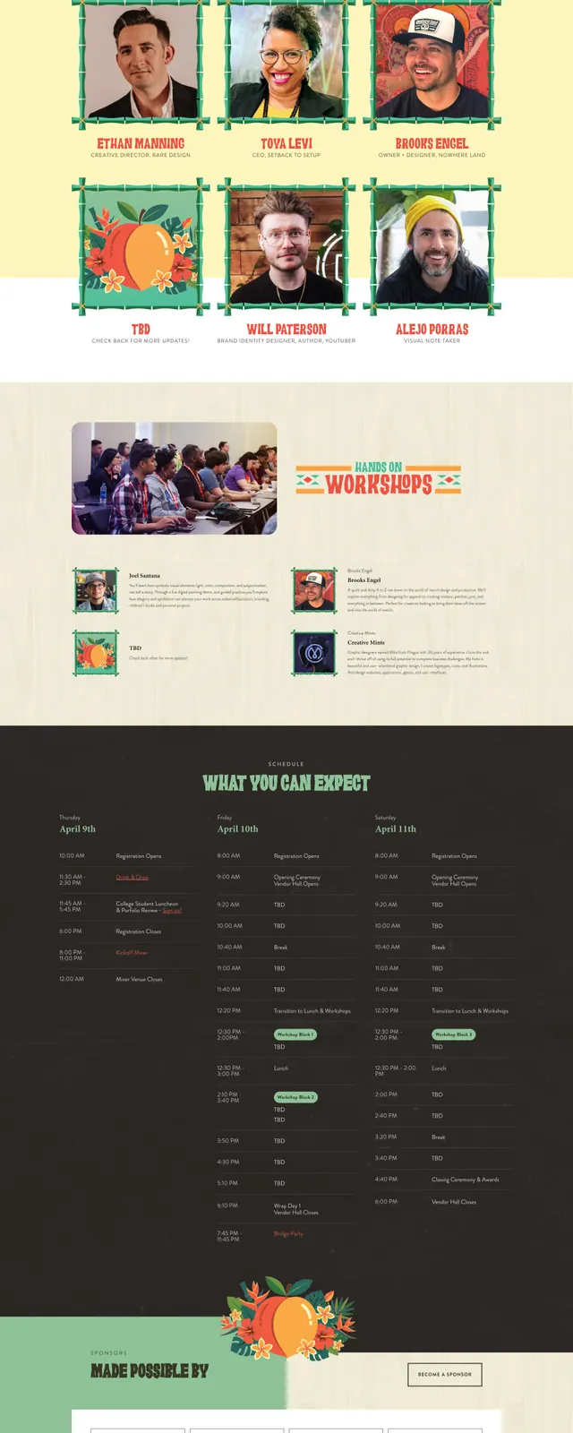
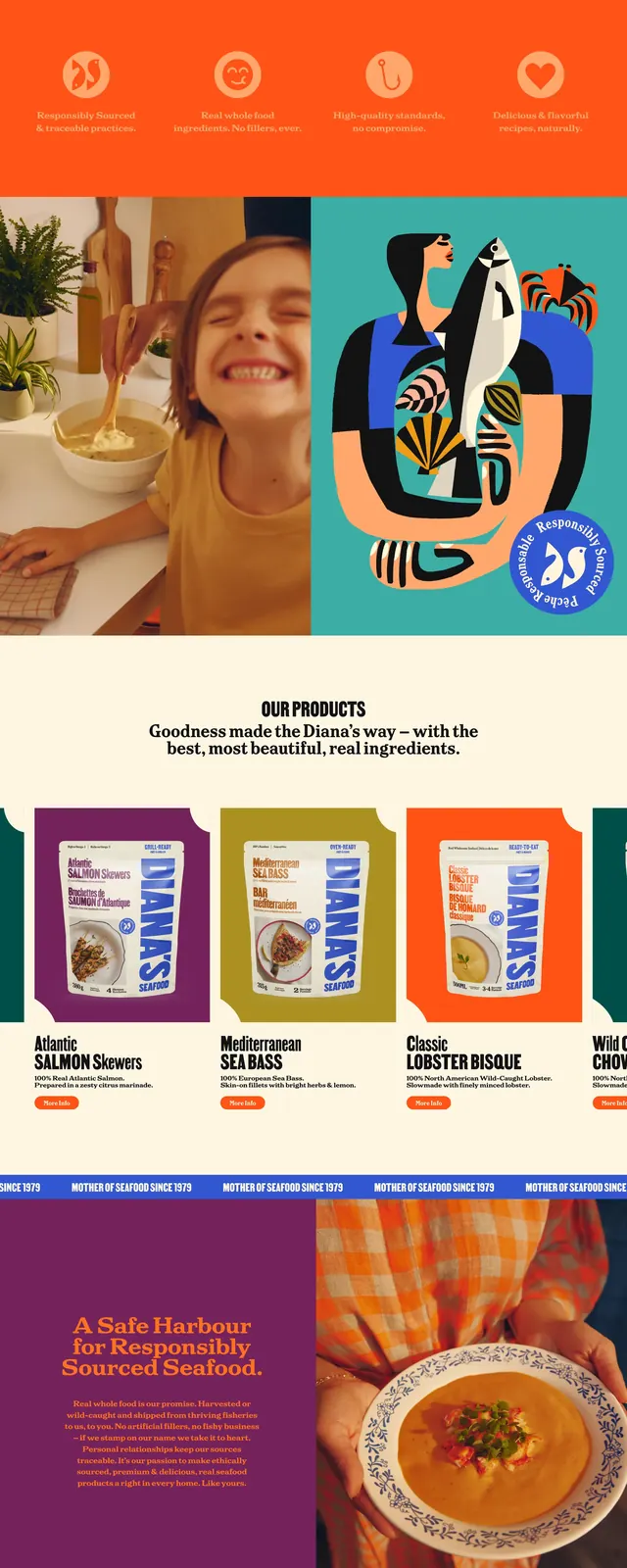
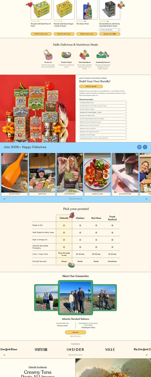
The page features a dominant bright red background with a chaotic collage of mismatched photographs overlapping the main title. It transitions into a clean white section with centered serif typography and product imagery. The bottom sections return to the red theme with repeating oversized text banners and a product gallery.
Key takeaway
The use of 'anti-design' and collage elements creates a rebellious, authentic brand personality that stands out from corporate standards.
Reuse notes
Effective for brands wanting to convey a 'handmade' or 'imperfect' vibe. Use high-contrast background colors to anchor the scattered visual elements.