Preview image. Unlock full-res
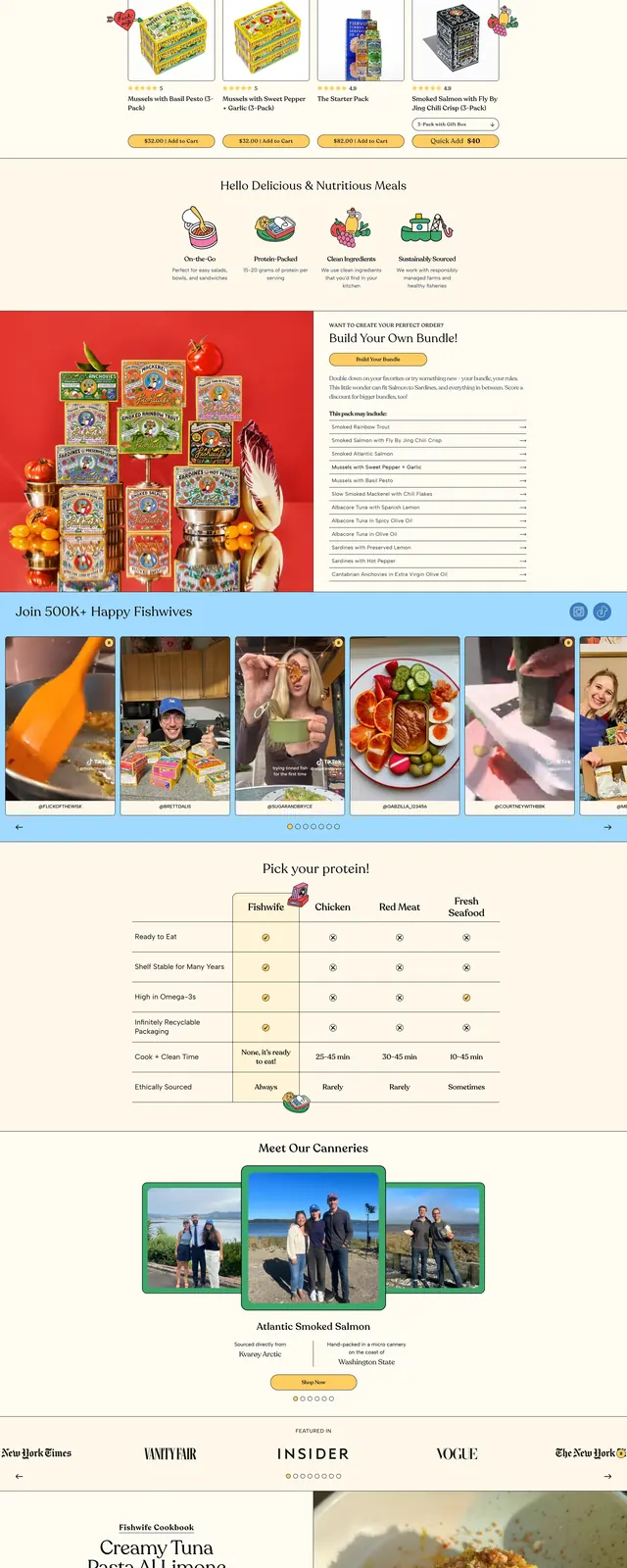
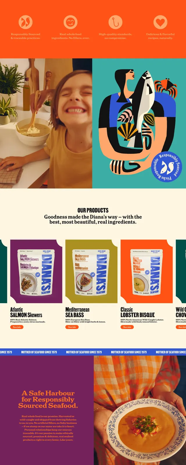
A bold seafood brand landing page with oversized blue headlines, warm cream backgrounds, playful fish illustrations, and product-focused merchandising throughout.
Summary
A bold seafood brand landing page with oversized blue headlines, warm cream backgrounds, playful fish illustrations, and product-focused merchandising throughout.
Visual description
The page opens with a compact top navigation, a centered wordmark, and a small orange contact button on a pale cream background. A very large blue all-caps headline dominates the first screen, followed by an orange serif subheading and a single rounded orange CTA. Below, a large lifestyle photo is layered with cutout fish illustrations and graphic stickers, and the lower sections continue with product cards, a "Where to find us" information block, and a saturated blue footer-like band with oversized branding and a newsletter form.
Key takeaway
The strongest move is the contrast between giant branded typography and whimsical seafood illustration, which makes the brand feel memorable and playful. The layout also shows how to mix hero messaging, product merchandising, and utility sections without losing visual energy.
Reuse notes
Use this pattern for consumer food brands that want to feel premium but approachable, especially when packaging and mascot-style graphics are part of the identity. It works best when you have strong brand colors, bold display type, and product imagery that can carry the page visually.