Preview image. Unlock full-res
A bold beverage brand homepage built around oversized product visuals, playful retro graphics, and a bright red identity.
Summary
A bold beverage brand homepage built around oversized product visuals, playful retro graphics, and a bright red identity.
Visual description
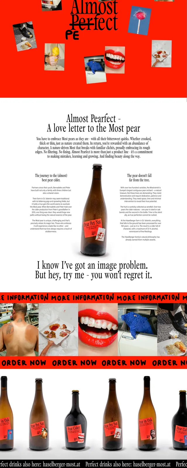
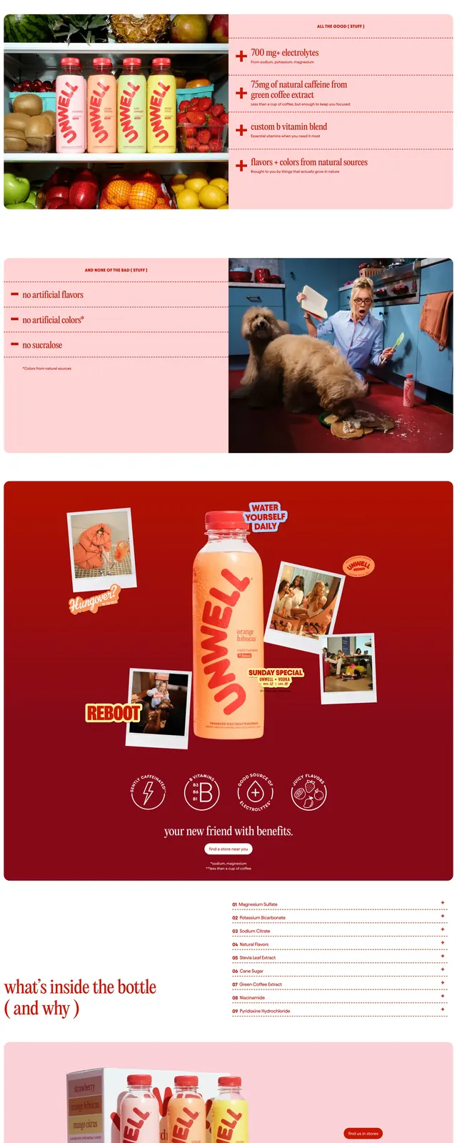
The page opens with a full-bleed lifestyle hero featuring a woman holding a drink bottle, overlaid with a large curved UNWELL logo and a small primary call-to-action. Below, a section presents multiple product cards in soft pastel blocks, followed by a wide split section with a product and lifestyle imagery. Further down, a large red editorial collage showcases the bottle surrounded by polaroid-style photos and sticker-like labels, ending with a newsletter form and a huge branded footer lockup.
Key takeaway
The design leans on strong brand repetition, oversized logo treatment, and saturated red panels to make a simple beverage product feel memorable and culturally driven. It combines ecommerce clarity with an energetic social-first visual language.
Reuse notes
Reuse this pattern for consumer brands that need a loud personality and a simple product story: hero video or image, product lineup cards, then a bold branded storytelling section. The strongest transferable elements are the oversized wordmark, sticker badges, and high-contrast product photography against flat color fields.