Preview image. Unlock full-res
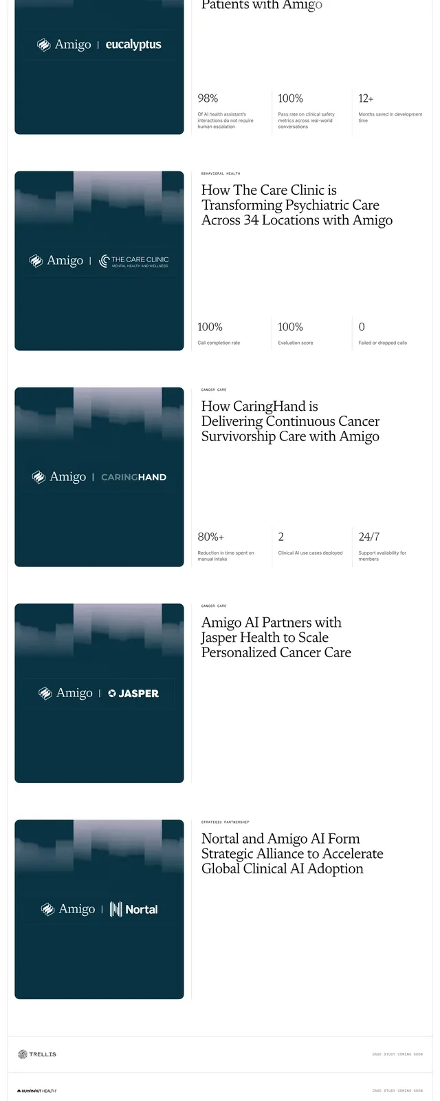
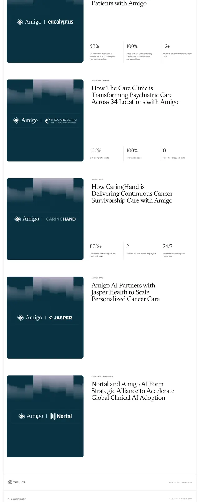
Stacked customer partnership cards pairing dark teal logo tiles with oversized serif headlines and three-column outcome metrics, ending in coming-soon logo rows.
Summary
A vertical list of Amigo customer success cards, each splitting a dark teal partner-logo tile from a white content panel with category label, large serif headline, and three proof-point metrics.
Visual description
Long white scroll of bordered horizontal cards. Each row places a rounded dark-teal square on the left with a lavender gradient bar-chart skyline graphic at the top and a white "Amigo | [partner]" logo lockup centered (Eucalyptus, The Care Clinic, CaringHand, Jasper, Nortal). The right panel carries a small grey all-caps category ("DIGITAL HEALTH", "BEHAVIORAL HEALTH", "CANCER CARE", "STRATEGIC PARTNERSHIP"), an oversized mixed-weight serif headline about the partnership, and on several rows a three-column metrics band with large serif numbers (98%, 100%, 12+, 80%+, 24/7) and short grey captions separated by vertical rules. Below the full cards, three slim rows show partner logos (Trellis, Humanaut Health, IVIM) left-aligned with "CASE STUDY COMING SOON" in small grey caps on the right, divided by hairlines.
Key takeaway
Lead each customer story with a branded tile plus hard metrics in the same row so outcomes feel evidenced, not anecdotal. Grey-accent words inside serif headlines add hierarchy without color. Coming-soon rows let you ship a credible logo wall before every case study is written.
Reuse notes
Strong for healthcare AI or enterprise SaaS customer pages that need clinical proof points. Requires partner logos and real metrics; the dark-teal tile system needs at least three completed stories to avoid looking sparse.