Preview image. Unlock full-res
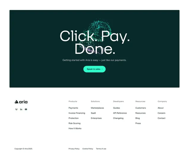
A boxed dark-green particle CTA stacked above a light six-column footer with wordmark, social icons and grouped navigation links.
Summary
A footer that stacks a contained dark-green "Click. Pay. Done." CTA panel on top of a clean white multi-column link footer. The contrast between the saturated particle CTA box and the airy black-on-white link grid below defines it.
Visual description
At the top, a rounded deep-green panel repeats the "Click. Pay. Done." headline over a teal particle burst, with a grey supporting line and a single mint pill button "Speak to sales." Below, on white, the Aria wordmark and flower mark sit upper left above three small circular social icons (a webflow-like mark, LinkedIn, YouTube). To the right, navigation is grouped under grey column headings (Products, Solutions, Developers, Resources, Company) with black link items beneath each, totaling six aligned columns including the logo column. A hairline separates a bottom row holding the copyright and Privacy Policy, Cookie Policy, and Terms of use links.
Key takeaway
Folding the final CTA into the top of the footer as a self-contained colored panel keeps the conversion ask present right up to the page end. The grey-heading, black-link column system makes a dense six-column footer easy to scan. Pairing one bold colored block with an otherwise minimal white footer balances energy and calm.
Reuse notes
Good when navigation is broad enough to need many columns yet the brand wants a quiet footer. The dark CTA panel needs its particle effect on a saturated fill to land. Works on light pages; the six-column grid should collapse responsively on smaller screens.
More footer sections
See all
More like this
Keep what you find
A free account saves references to boards and can send you a weekly email of picks based on what you save.
To see every result, go Pro.