Preview image. Unlock full-res
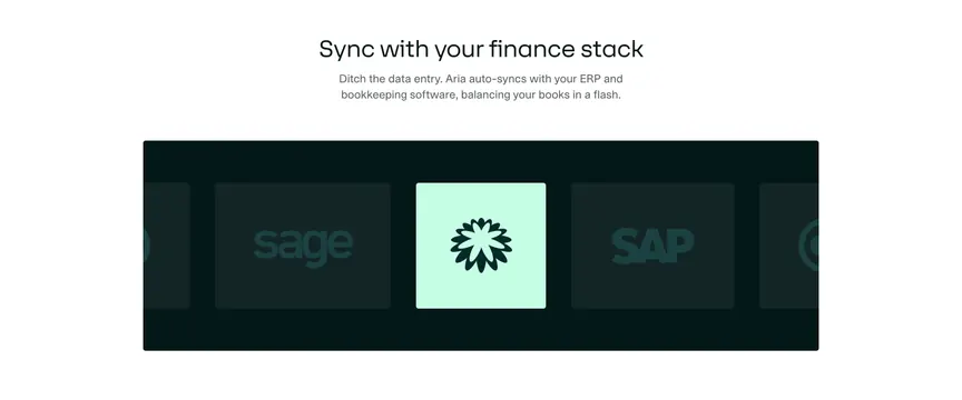
Light integrations section with a centered headline above a dark contained band of integration logo tiles, the middle one highlighted in mint.
Summary
An integrations section with a centered headline and subhead above a dark contained band of square logo tiles, where the centered tile is lifted out in bright mint. The single highlighted tile in a row of dimmed ones is the move.
Visual description
White page. Centered black headline "Sync with your finance stack" with a two-line grey subhead about auto-syncing with ERP and bookkeeping software. Below sits a wide, rounded, very dark green band acting as a track. Across it run square integration tiles: outer tiles are dim, low-contrast logos (Sage on the left, SAP on the right, partial tiles peeking at both edges), while the center tile is filled bright mint with a dark flower mark, clearly the active item. The partial tiles at each edge imply a horizontally scrolling carousel.
Key takeaway
Highlighting one centered tile in a saturated accent against dimmed neighbors directs attention and signals the brand sits at the hub of the stack. The dark contained band frames third-party logos cleanly and lets a single color pop carry the focus. Edge-peeking tiles hint at more integrations without listing them all.
Reuse notes
Use to show a product plugging into a known tool ecosystem (ERP, accounting, finance). The peeking tiles suggest a slider, so it suits a section meant to auto-scroll or be dragged. Real partner logos are required; keep the dimmed treatment subtle so the logos remain recognizable.
More integrations sections
See all











More like this



Keep what you find
A free account saves references to boards and can send you a weekly email of picks based on what you save.
To see every result, go Pro.