Preview image. Unlock full-res
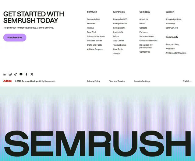
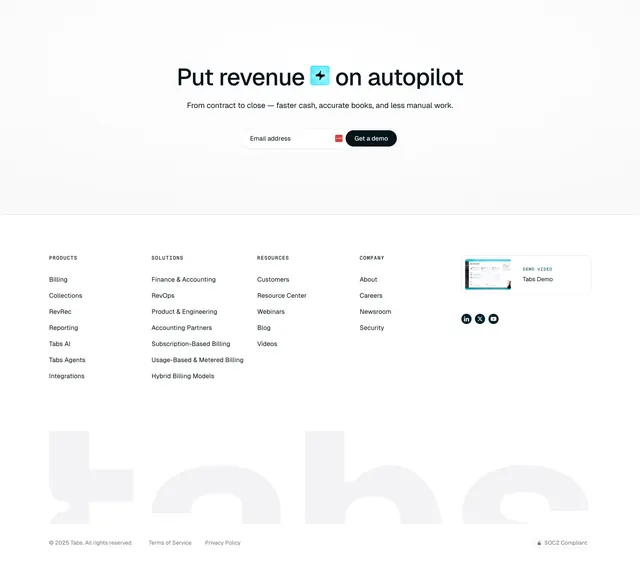
Light footer combining a final email-CTA hero, a five-column link grid, and an oversized ghosted wordmark behind it.
Summary
A light footer that opens with a centered final email-CTA hero, then drops into a five-column link grid with a giant ghosted brand wordmark filling the lower band. The defining move is the oversized faint "tabs" letterform spanning the full width behind the legal row.
Visual description
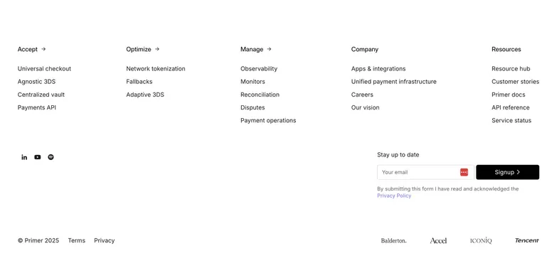
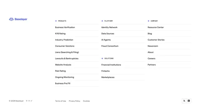
At the top, on a faintly dotted white field, a centered oversized headline "Put revenue [icon] on autopilot" sits over one line of grey subcopy and an inline pill-shaped email form (Email address field plus a dark "Get a demo" button). A thin rule separates this from the footer proper. Four labeled link columns (PRODUCTS, SOLUTIONS, RESOURCES, COMPANY) run left to right; to their right is a small "DEMO VIDEO / Tabs Demo" card with a UI thumbnail, plus three round social icons (LinkedIn, X, YouTube). Behind the lower half, an extremely large light-grey "tabs" wordmark is ghosted across the full width. The baseline row carries the copyright, Terms and Privacy links, and a small lock "SOC2 Compliant" badge.
Key takeaway
Stacking a last-chance email CTA on top of the navigation footer so the page ends on a conversion prompt, not just links. The oversized ghosted wordmark turns dead footer space into brand presence without adding visual weight, and the small SOC2 badge plants trust at the very bottom.
Reuse notes
Good closing footer for a B2B SaaS that wants one more demo capture before the link grid. The ghost wordmark needs enough vertical room and a short brand name to read cleanly. Five columns including the demo card is dense, so keep link labels short. Works on light backgrounds; the dotted texture is subtle and easy to drop if it clashes.