Preview image. Unlock full-res
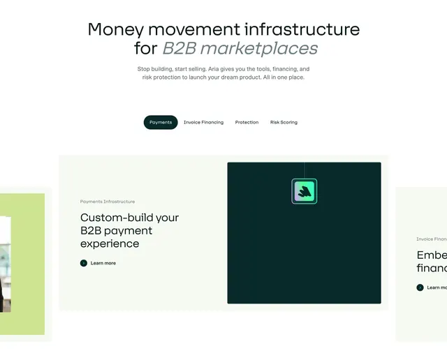
Tabbed features section with a centered headline, a pill tab bar, and a carousel of split feature cards pairing copy with dark visual panels.
Summary
A tabbed features block where a pill-shaped tab bar switches between feature cards, each splitting descriptive copy from a dark green visual panel. Adjacent cards peek in from the sides to signal the carousel.
Visual description
Centered at top is a two-line headline mixing upright and italic weights ("Money movement infrastructure for B2B marketplaces"), with two lines of grey sub-copy beneath. A rounded pill tab bar holds four tabs (Payments selected in dark green, then Invoice Financing, Protection, Risk Scoring). Below sits the active feature card on a pale panel: left side has an eyebrow ("Payments Infrastructure"), a bold heading ("Custom-build your B2B payment experience"), and a circular "Learn more" arrow link; right side is a dark teal square holding a small gradient app icon. Partial neighbouring cards (a green photo card on the left, an "Invoice Financing" card on the right) bleed in past the edges.
Key takeaway
Using a pill tab bar plus visible peeking neighbour cards to make a single section browse like a deck without scrolling away. The mixed upright-and-italic headline adds editorial personality to an otherwise clean fintech layout.
Reuse notes
Good for products with several parallel capabilities you want to present as siblings. The dark visual panel is a flexible slot for an icon, screenshot, or animation per tab. Best when each tab's visual is genuinely distinct so switching feels worthwhile.