Preview image. Unlock full-res
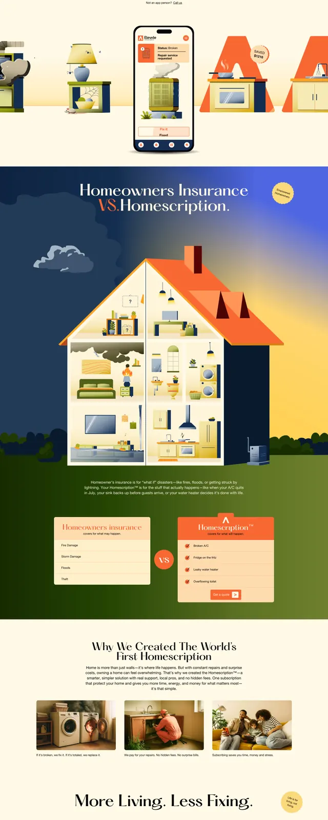
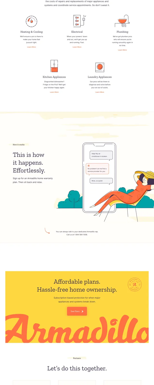
A friendly and approachable home warranty landing page featuring custom illustrations and a clean, airy layout.
Summary
A friendly and approachable home warranty landing page featuring custom illustrations and a clean, airy layout.
Visual description
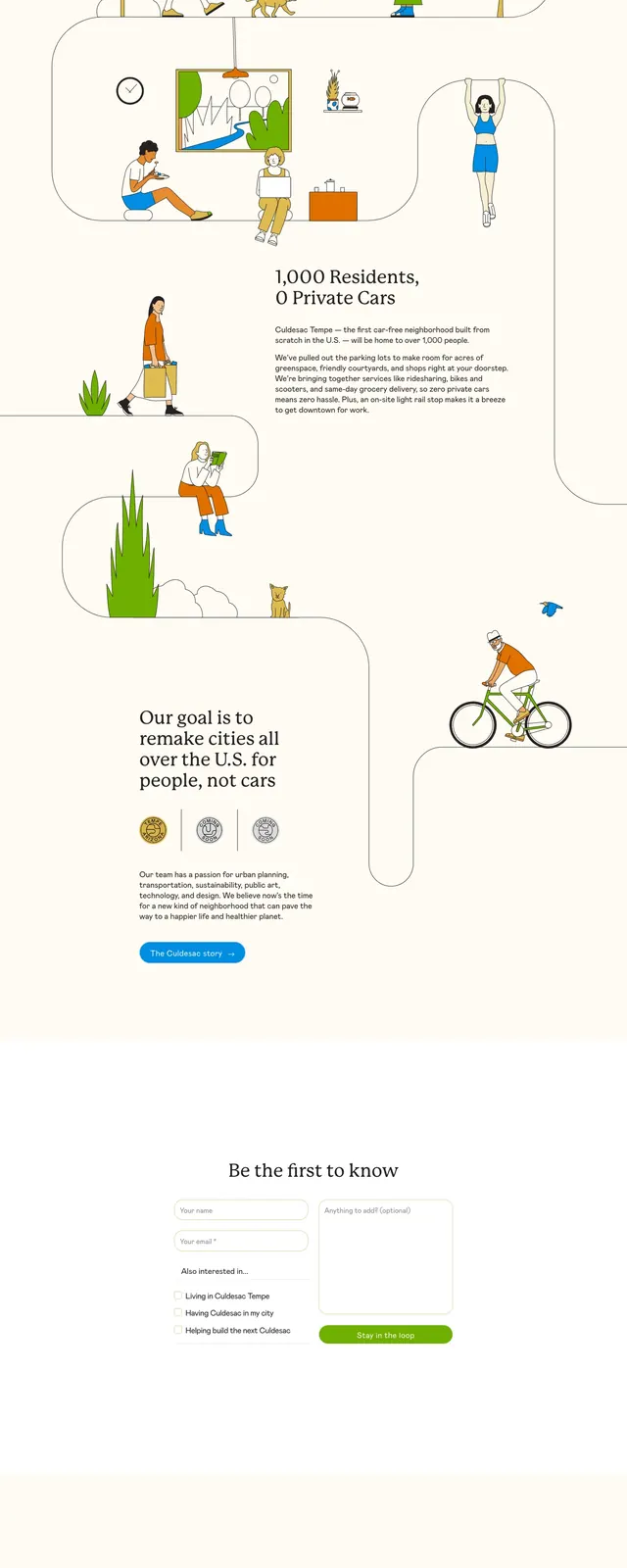
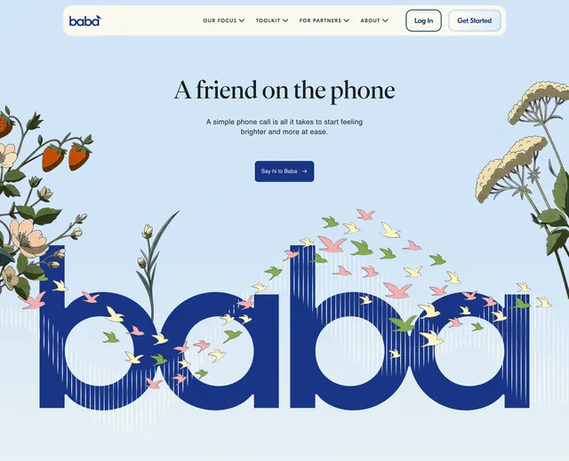
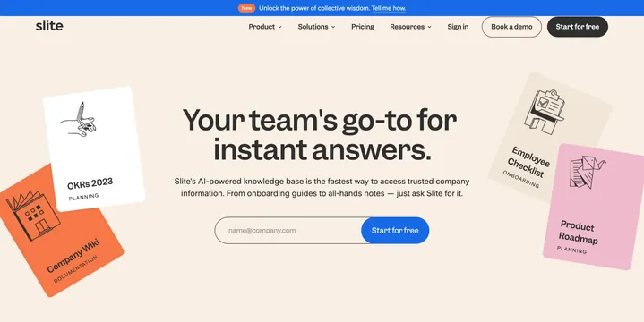
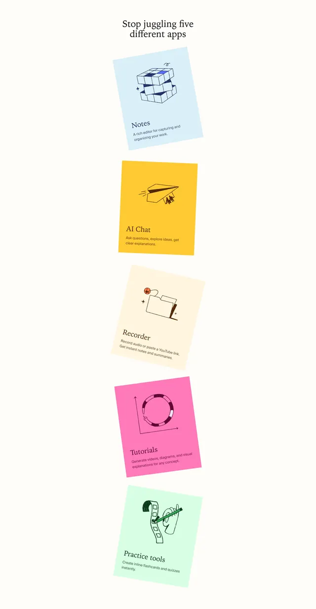
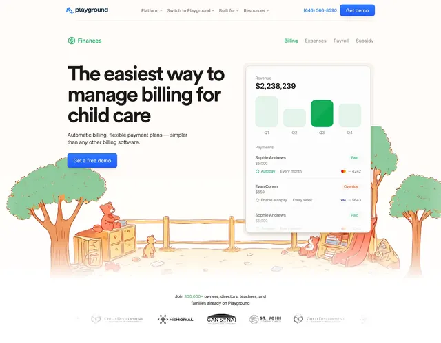
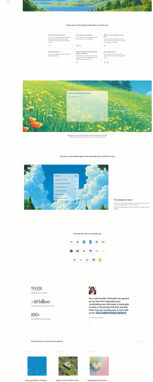
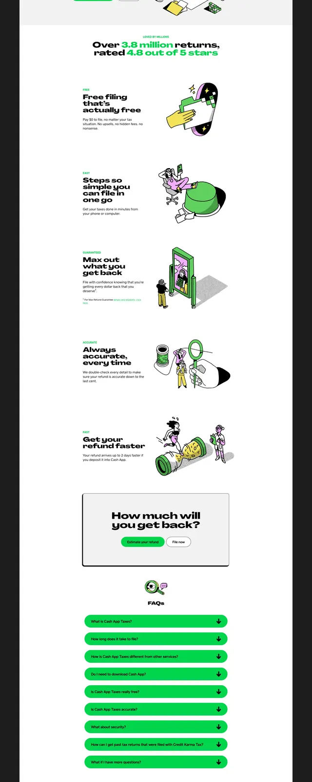
The page uses a soft cream background with a mix of elegant serif headings and clean sans-serif body text. Custom, colorful flat illustrations of homes and mobile app interactions are used to visualize the service. The layout transitions from a centered hero to a split-screen feature section and a three-column card grid.
Key takeaway
The combination of serif typography and whimsical illustrations transforms a typically dry industry (insurance/warranty) into an inviting, modern experience.
Reuse notes
Use this approach for service-based businesses that want to appear accessible and less corporate. The split-screen layout with an illustration on one side is effective for explaining complex processes simply.