Preview image. Unlock full-res
A light, illustrated landing page for Culdesac uses playful drawings and generous whitespace to present a car-free neighborhood concept.
Summary
A light, illustrated landing page for Culdesac uses playful drawings and generous whitespace to present a car-free neighborhood concept.
Visual description
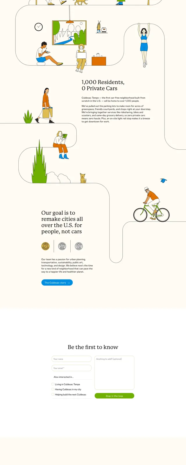
The page uses a cream background with a centered serif headline, short supporting copy, and a blue primary CTA. Large hand-drawn illustrations of people, trees, bikes, and neighborhood scenes are arranged along a winding path that flows through stacked page slices. Lower sections continue the same visual language with a mission statement, small badge-like icons, and a sparse footer-style closing message.
Key takeaway
The design feels concept-driven and story-led, with illustration doing most of the communication work. Strong whitespace and simple CTA hierarchy keep the page airy despite the detailed drawings.
Reuse notes
Reuse this structure for a brand or real-estate concept page that needs to feel thoughtful and human. The illustrated path motif can also work as a narrative device for explaining a process or community vision.