Preview image. Unlock full-res
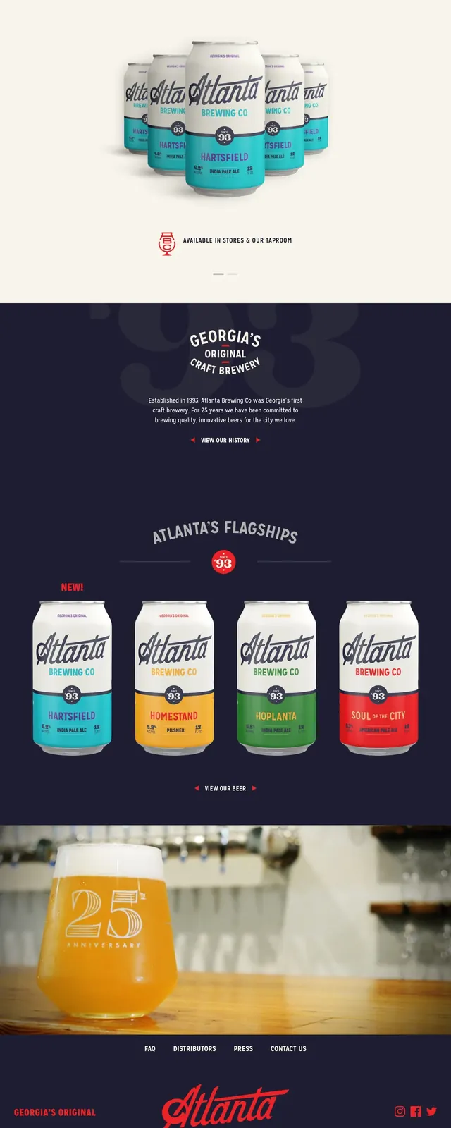
A clean, product-focused brewery website featuring high-quality beverage renders and a strong brand identity.
Styleminimal, editorial, photographic
Colorlight, high-contrast, vibrant
Typesans-serif, display, all-caps
Moodprofessional, bold, premium
Industryfood
Elementsbutton-primary, image, nav-menu, form, logo, text-input
Summary
A clean, product-focused brewery website featuring high-quality beverage renders and a strong brand identity.
Visual description
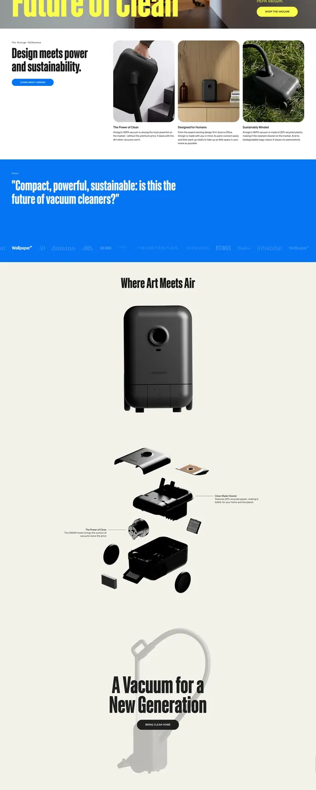
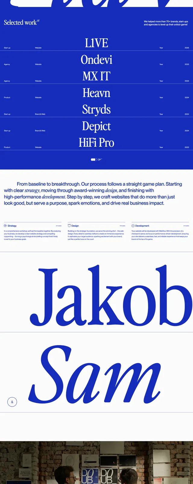
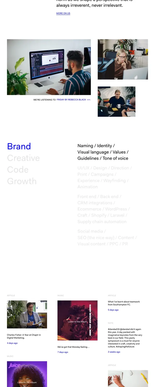
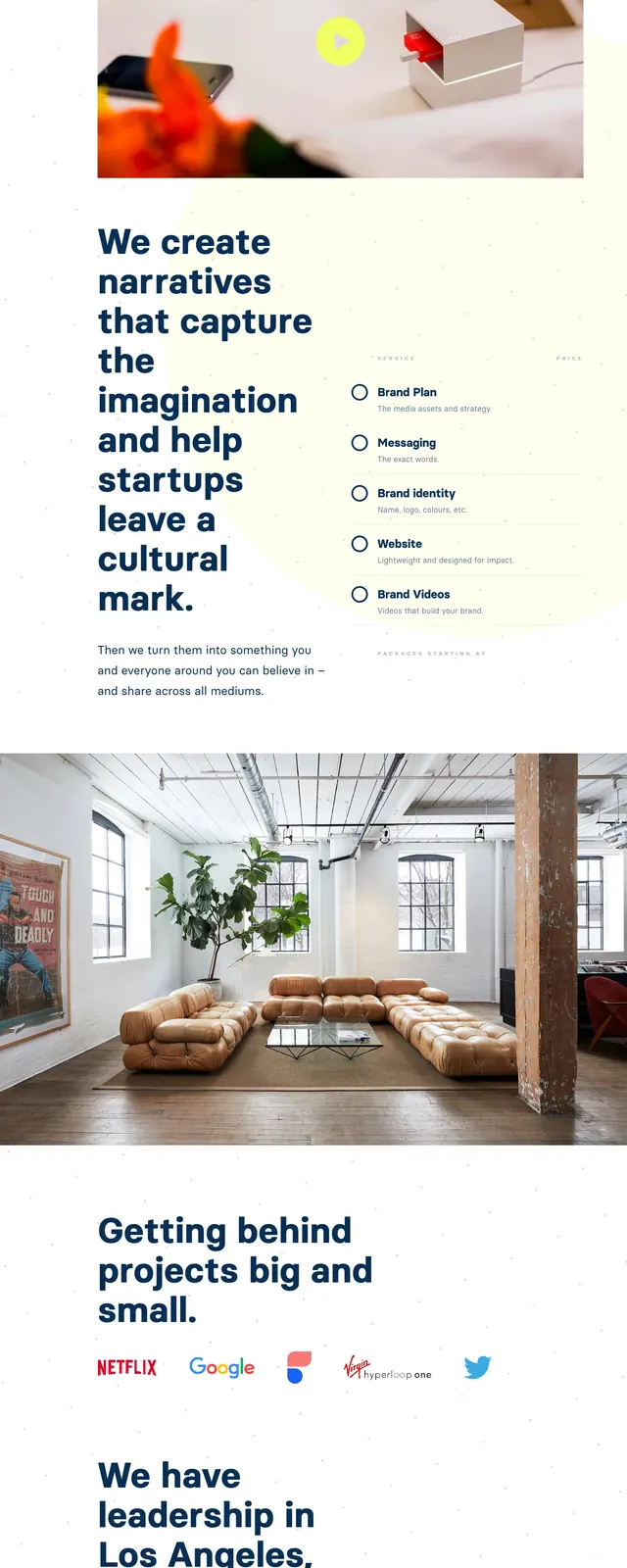
The page uses a high-contrast white and dark navy color scheme with red accents. It features large, centered product photography of aluminum cans and a glass of beer. The footer contains a structured information grid with contact details and operating hours.
Key takeaway
Effective use of negative space and centered alignment to make product imagery the primary focus.
Reuse notes
The 'Flagships' grid is a great pattern for showcasing a product line with consistent packaging.