Preview image. Unlock full-res
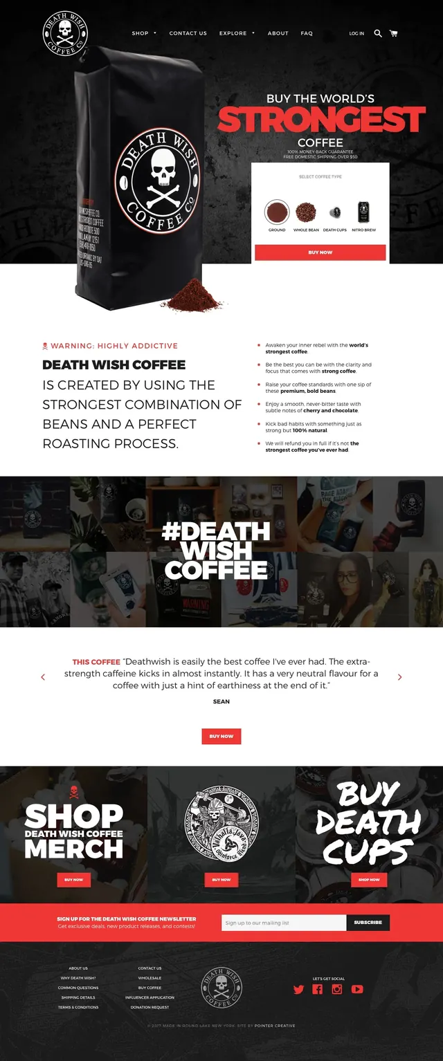
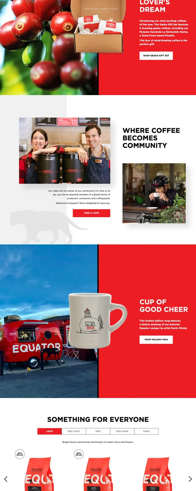
A bold coffee brand homepage built around oversized product imagery, strong red branding, and clean commerce-focused sections.
Summary
A bold coffee brand homepage built around oversized product imagery, strong red branding, and clean commerce-focused sections.
Visual description
The page opens with a full-bleed hero filled with repeating red coffee bag imagery, a centered white headline, and a small primary call-to-action button. Below, the layout stacks into clean white sections with large headings, editorial-style photography, and a mix of product, cafe, and community content. A later split section uses a strong red block alongside a lifestyle image and a mug product shot, followed by social tiles, a newsletter bar, and a dense footer with links and partner logos.
Key takeaway
The design relies on a single strong brand color, oversized type, and high-contrast photography to make the storefront feel energetic and memorable. It is a good reference for coffee or lifestyle ecommerce sites that want both brand warmth and clear shopping paths.
Reuse notes
Reuse the red hero treatment, centered headline hierarchy, and simple CTA placement for a fast, branded first impression. The stacked content sections and compact footer work well for brands that need to mix story, product, and community without losing clarity.