Preview image. Unlock full-res
A dark, gradient-heavy landing page for Beeper that positions a unified chat inbox as the main product promise.
Summary
A dark, gradient-heavy landing page for Beeper that positions a unified chat inbox as the main product promise.
Visual description
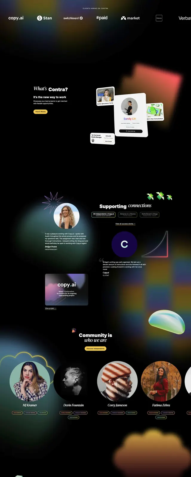
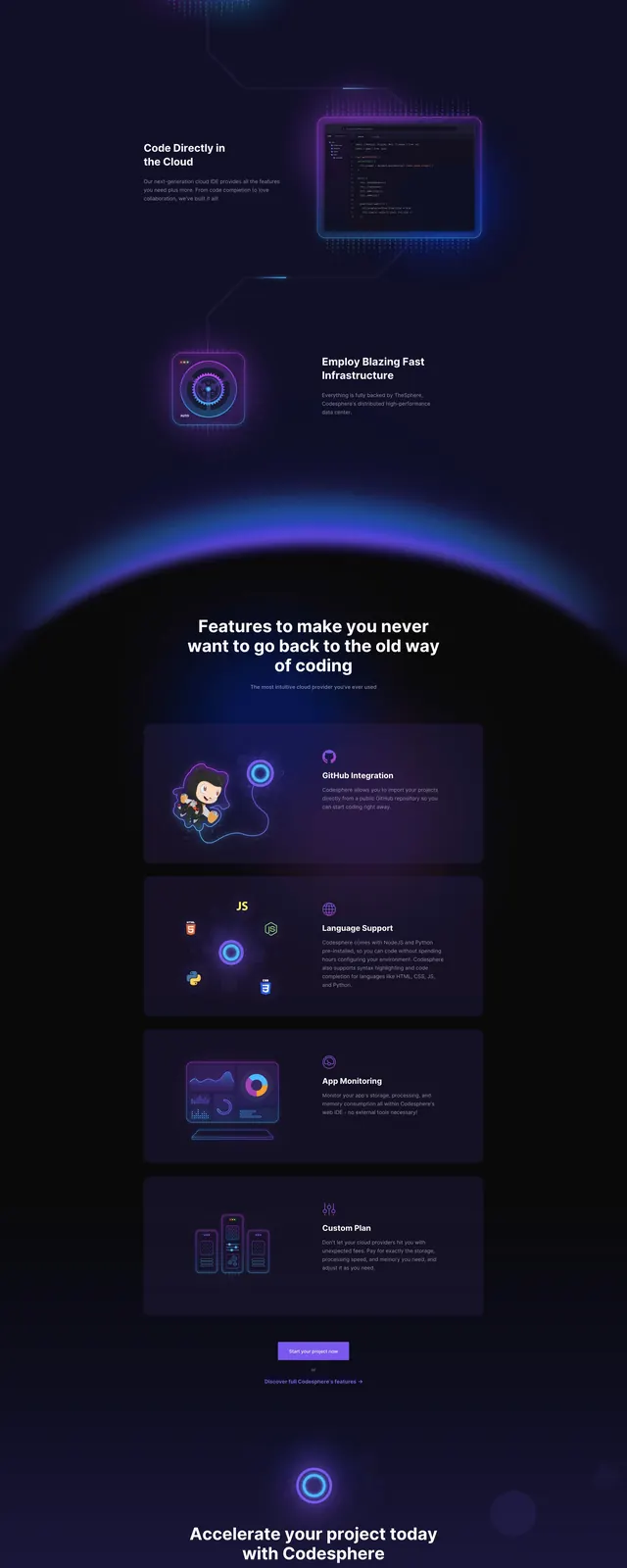
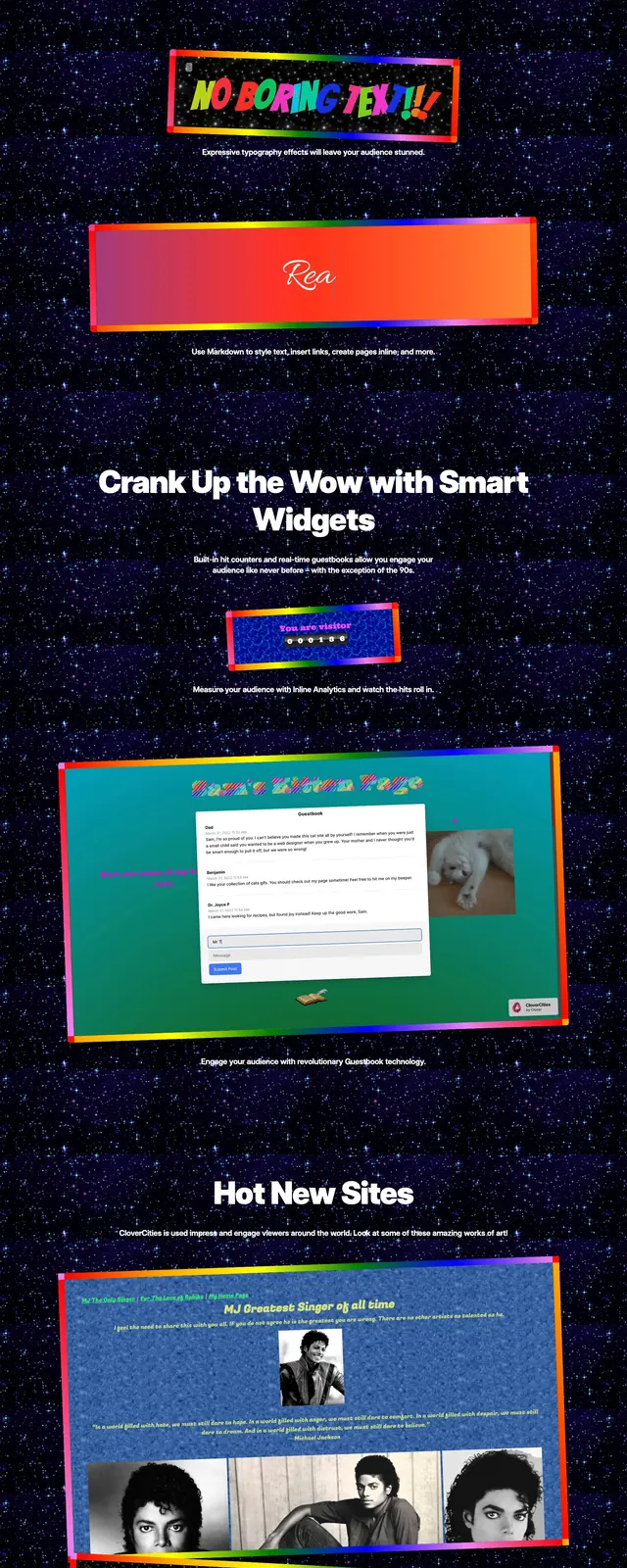
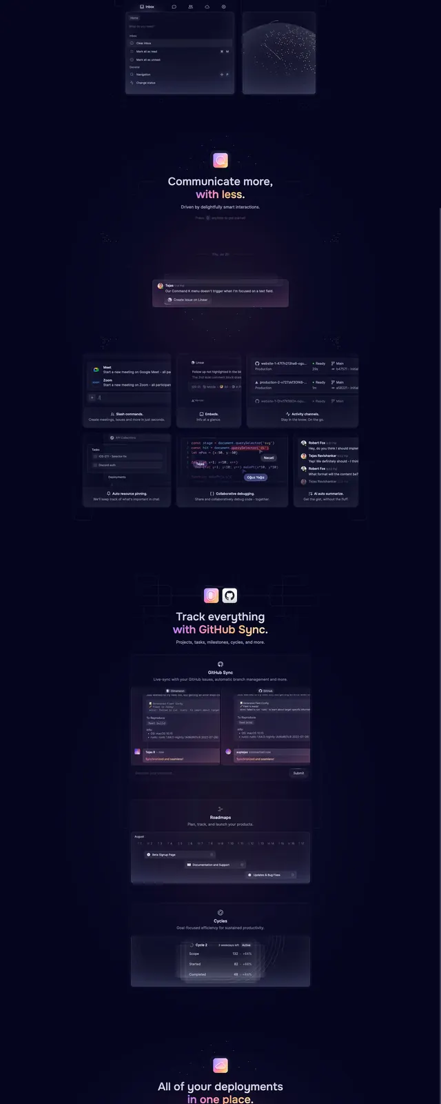
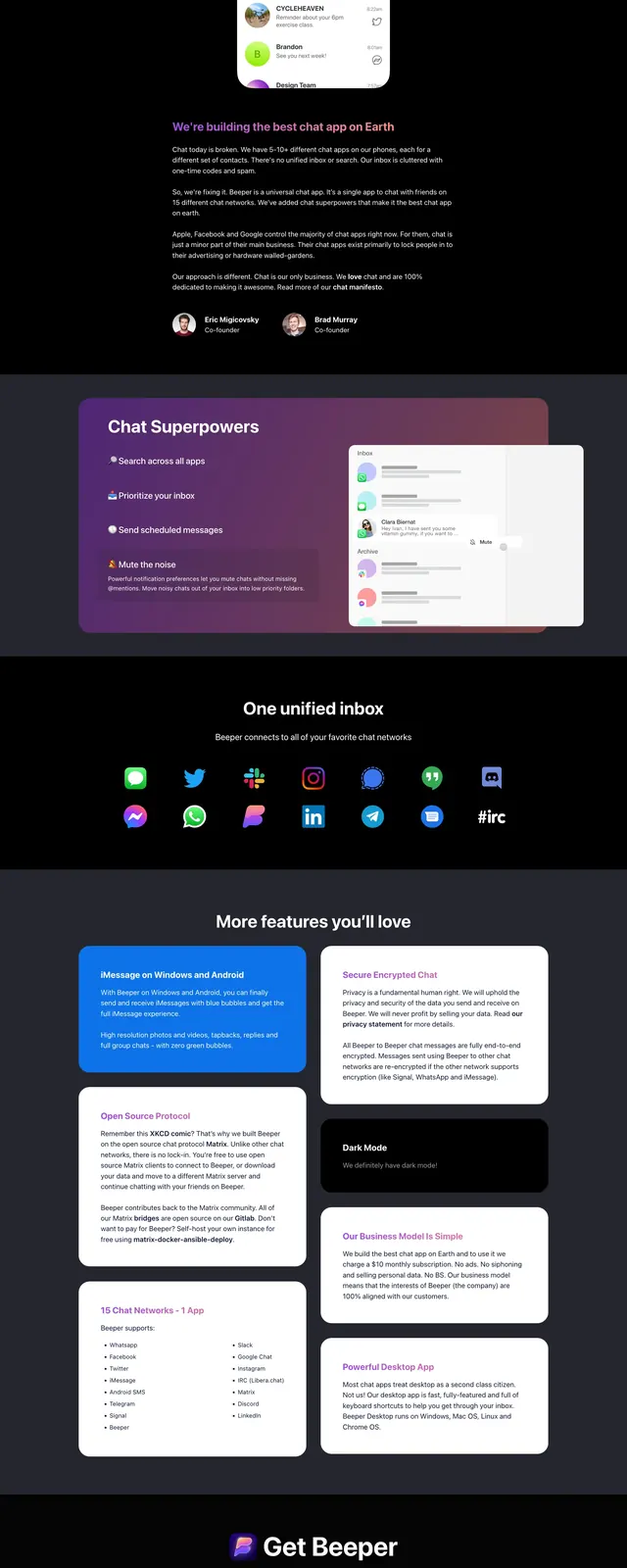
The page opens with a centered hero on a dark purple-to-black gradient background, with floating messaging app icons arranged around a large headline. A prominent mobile app mockup sits below the CTA, framed as the main product visual. Lower slices show feature callouts, a unified inbox logos strip, and additional product showcase sections with large UI screenshots.
Key takeaway
The design sells consolidation and convenience through a strong hero message paired with clear product imagery. High contrast, neon-accented gradients, and floating app icons make the unified messaging concept immediately legible.
Reuse notes
This layout works well for consumer SaaS launches where one core promise needs to land fast. Reuse the centered hero, floating icon cluster, and device mockup treatment for products that aggregate multiple services into one interface.