Preview image. Unlock full-res
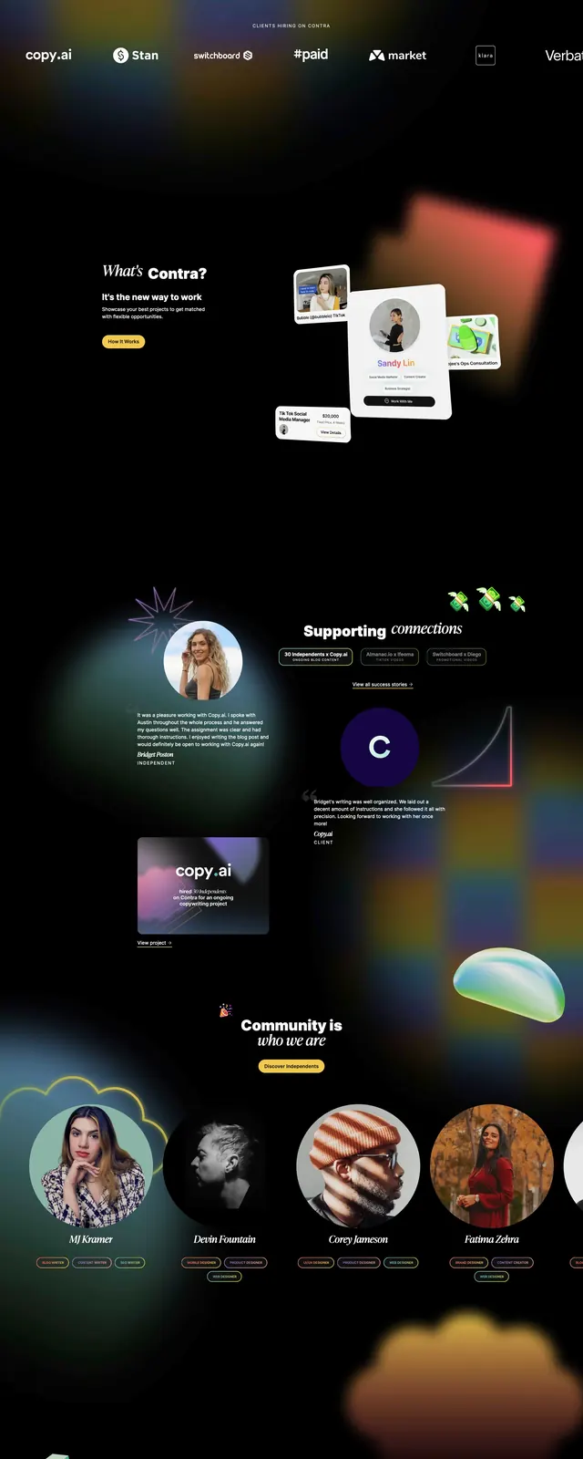
A dark, high-contrast landing page for Contra that uses overlapping portraits, bold typography, and bright yellow CTAs to frame an independent-work community.
Summary
A dark, high-contrast landing page for Contra that uses overlapping portraits, bold typography, and bright yellow CTAs to frame an independent-work community.
Visual description
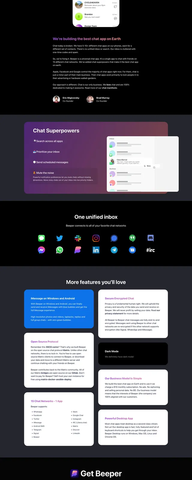
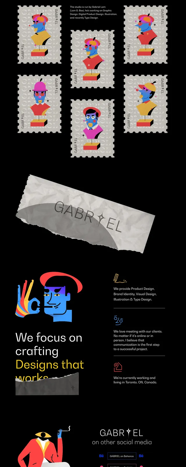
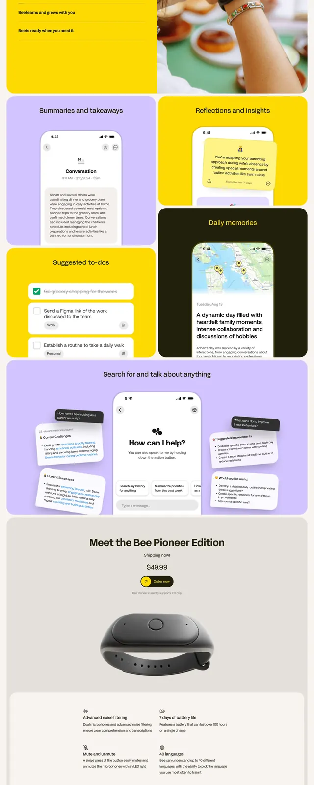
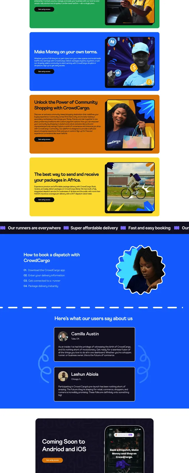
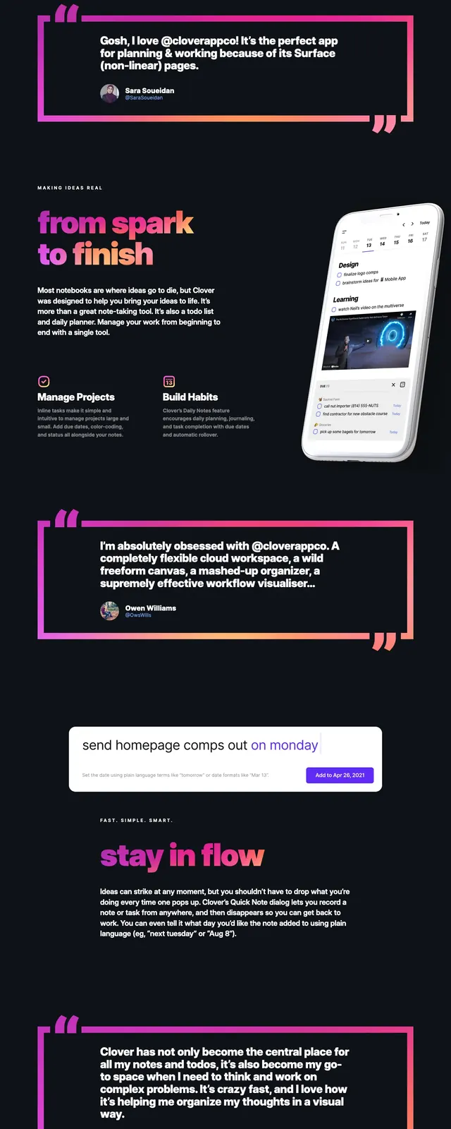
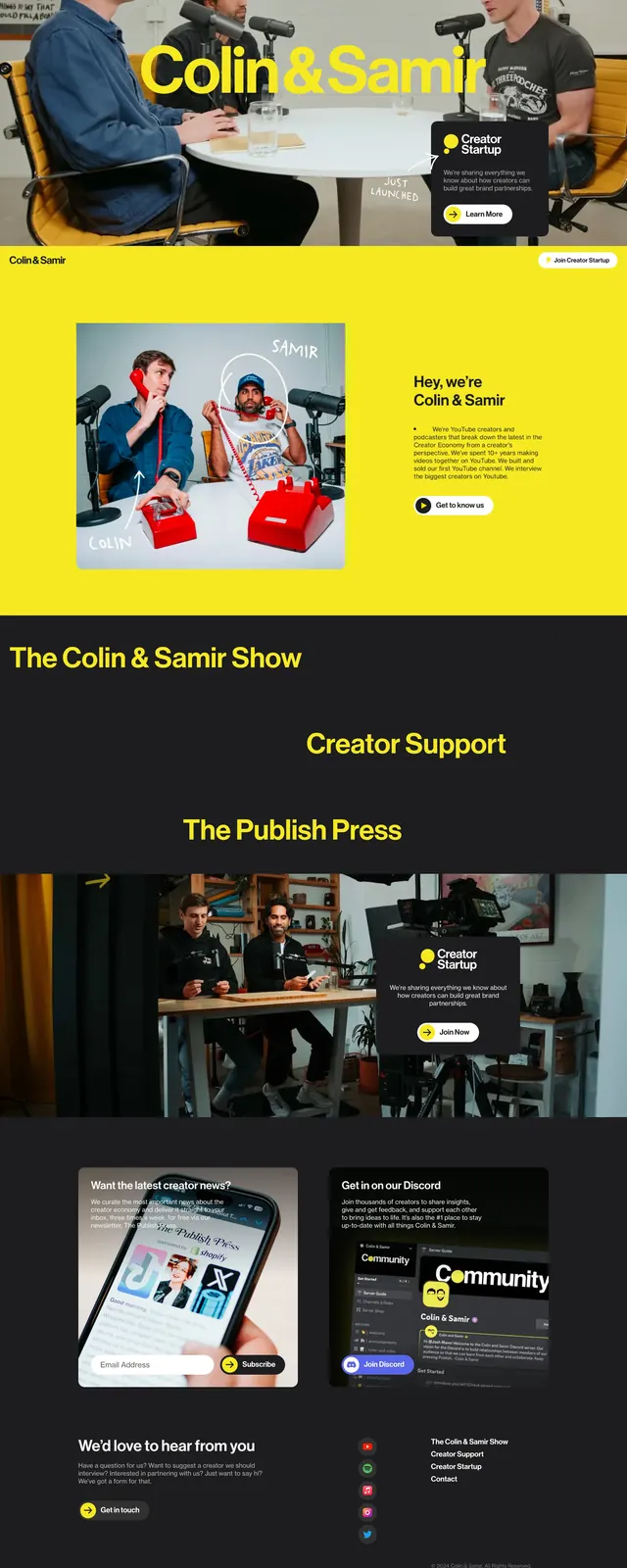
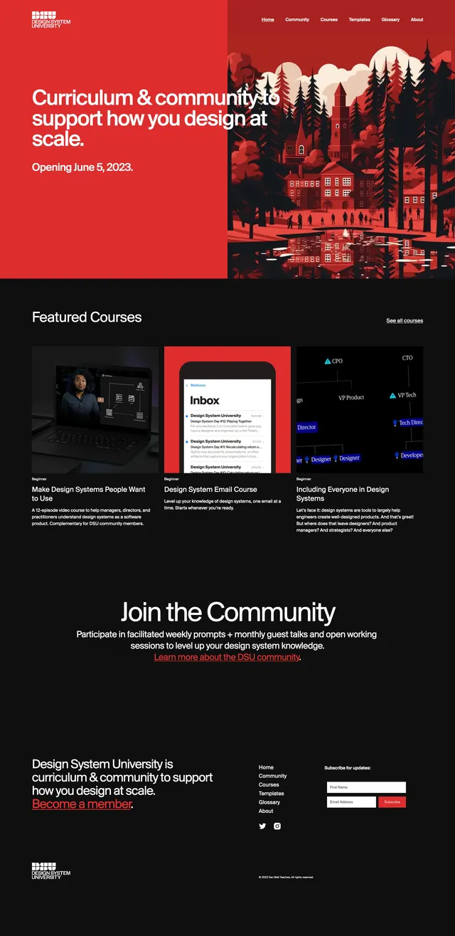
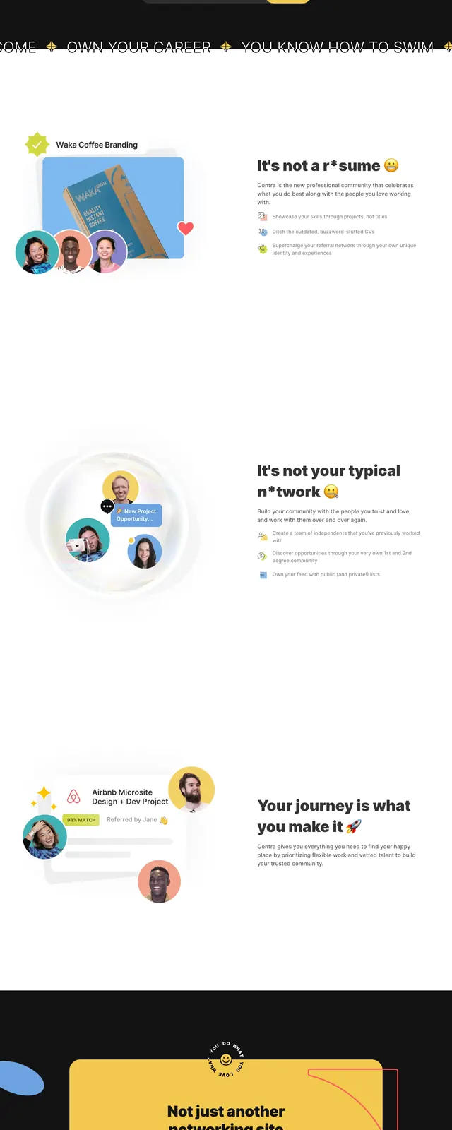
The page opens with a dark hero section featuring a top navigation bar, a small announcement badge, and a large centered headline with overlapping portrait cards. A rounded email input and bright yellow call-to-action button sit beneath the subheading, all against a near-black background. Lower sections switch to a mostly white split layout with a large circular image composition on the left and feature copy on the right, followed by a dark CTA band with a large yellow panel. Decorative abstract shapes, playful accents, and a compact footer complete the page.
Key takeaway
The design pairs startup polish with a creative, community-driven feel through contrast, overlap, and bold CTA hierarchy. It is especially reusable for hero-driven landing pages that need to communicate personality and trust quickly.
Reuse notes
Reuse the centered hero structure, overlapping avatar imagery, and strong button contrast for community or marketplace products. The split feature block and dark CTA panel are adaptable patterns for explaining value and driving signups.