Preview image. Unlock full-res
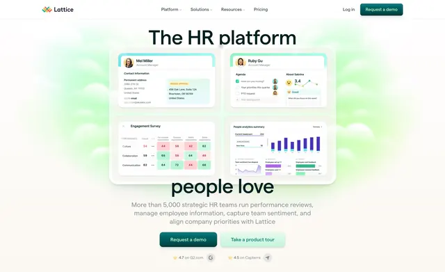
Centered call-to-action over a soft green sky-and-clouds gradient with a single demo button and review-score badges.
Summary
A centered closing CTA that floats a single dark-green demo button over a pale green cloud gradient, with two third-party review scores sitting beneath as social proof.
Visual description
Full-bleed soft gradient background blending cream at the edges into light green with blurred white cloud shapes. Centered, a large dark headline reads "Your people are your business" with a one-line subhead "Ensure both are successful with Lattice." below it. A single filled dark-green pill button labeled "Request a demo" sits centered under the copy. Beneath the button, two small inline trust marks: a star with "4.7 on G2.com" and its logo, and a star with "4.5 on Capterra" and its logo, separated by generous whitespace. Everything is stacked and centered with airy vertical spacing.
Key takeaway
The dreamy cloud gradient doing all the visual work behind plain centered type, so a single CTA reads as calm rather than aggressive. Pairing the lone button with two named review scores adds credibility without a testimonial block.
Reuse notes
Good closing section for an HR or people-ops SaaS where the brand wants a soft, optimistic finish. The single CTA plus review badges is a clean, low-friction pattern. Works best on a light page; the gradient needs room to breathe so keep surrounding sections uncluttered.