Preview image. Unlock full-res
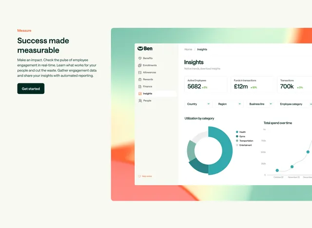
Split section with orange Measure label, Success made measurable copy, and a dashboard mockup showing KPI cards, filters, and charts on a gradient glow.
Summary
Left-aligned feature block labeled Measure with Get started CTA opposite a layered Insights dashboard showing employee KPIs, filters, and utilization charts.
Visual description
Warm cream background. Left: small orange all-caps Measure label, large dark green headline Success made measurable, gray paragraph on engagement data and reporting, dark green Get started button. Right: white product UI on orange-green gradient glow with sidebar (Insights active), three KPI cards (Active Employees 5682, Funds �12m, Transactions 700k with green deltas), four filter dropdowns, donut chart for utilization by category, and line chart for total spend over time.
Key takeaway
Orange section label creates rhythm across a multi-feature homepage. Real dashboard chrome with KPIs and charts proves analytics depth better than abstract icons. Gradient glow behind the UI adds depth without a full-bleed screenshot.
Reuse notes
Use for SaaS feature sections where reporting is the differentiator. Requires a polished product capture. Split layout balances copy against data-heavy UI.