Preview image. Unlock full-res
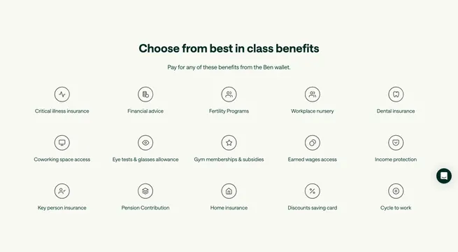
Centered headline above a five-by-three grid of circular line icons labeling benefit categories payable from the Ben wallet.
Summary
Fifteen benefit types in a uniform icon grid under Choose from best in class benefits, each with a circled line icon and short label.
Visual description
Light cream background. Centered dark green headline and subhead about paying from the Ben wallet. Below, a 5-column by 3-row grid: each cell has a thin black circle enclosing a minimal line icon (heartbeat, coins, tooth, star, shield, etc.) with a short label underneath covering insurance, wellness, finance, and lifestyle categories. Small dark chat widget visible at right edge.
Key takeaway
Consistent circular icon containers make fifteen disparate categories feel like one system. Headline + wallet subhead frames the grid as purchasable catalog, not feature specs. Monochrome icons keep a dense grid readable.
Reuse notes
Use for marketplace or wallet products showing breadth of spend categories. Requires a cohesive icon set. Five columns may reduce on tablet; consider progressive disclosure for longer lists.