Preview image. Unlock full-res
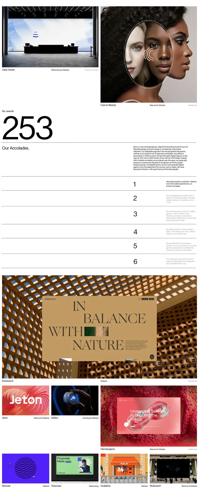
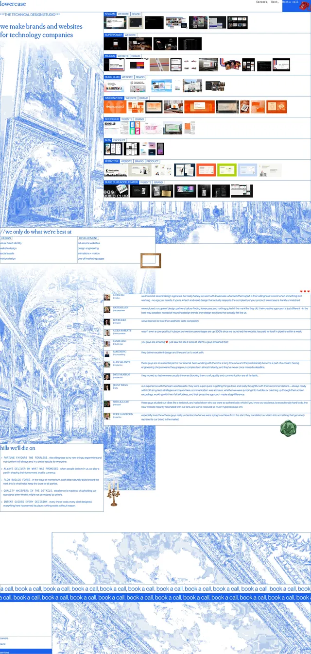
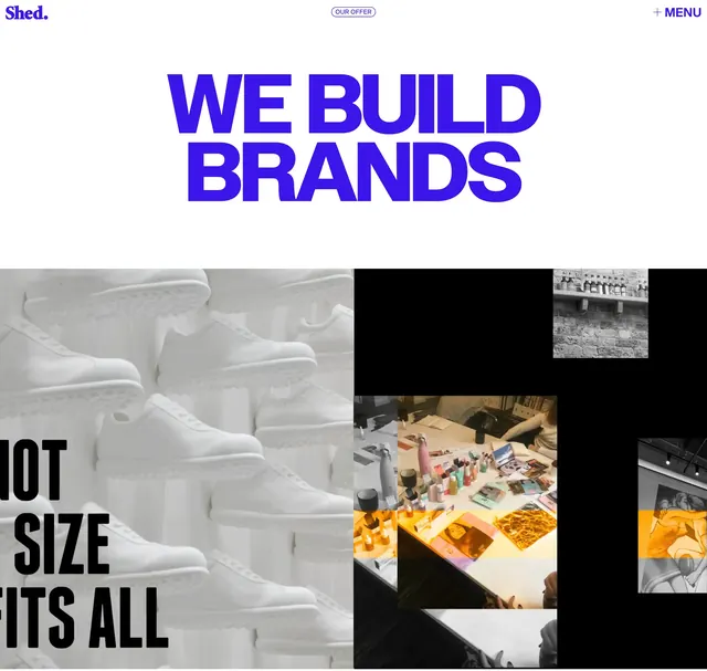
A full-bleed agency landing page with oversized serif headlines, saturated blue accents, and a strong editorial layout.
Summary
A full-bleed agency landing page with oversized serif headlines, saturated blue accents, and a strong editorial layout.
Visual description
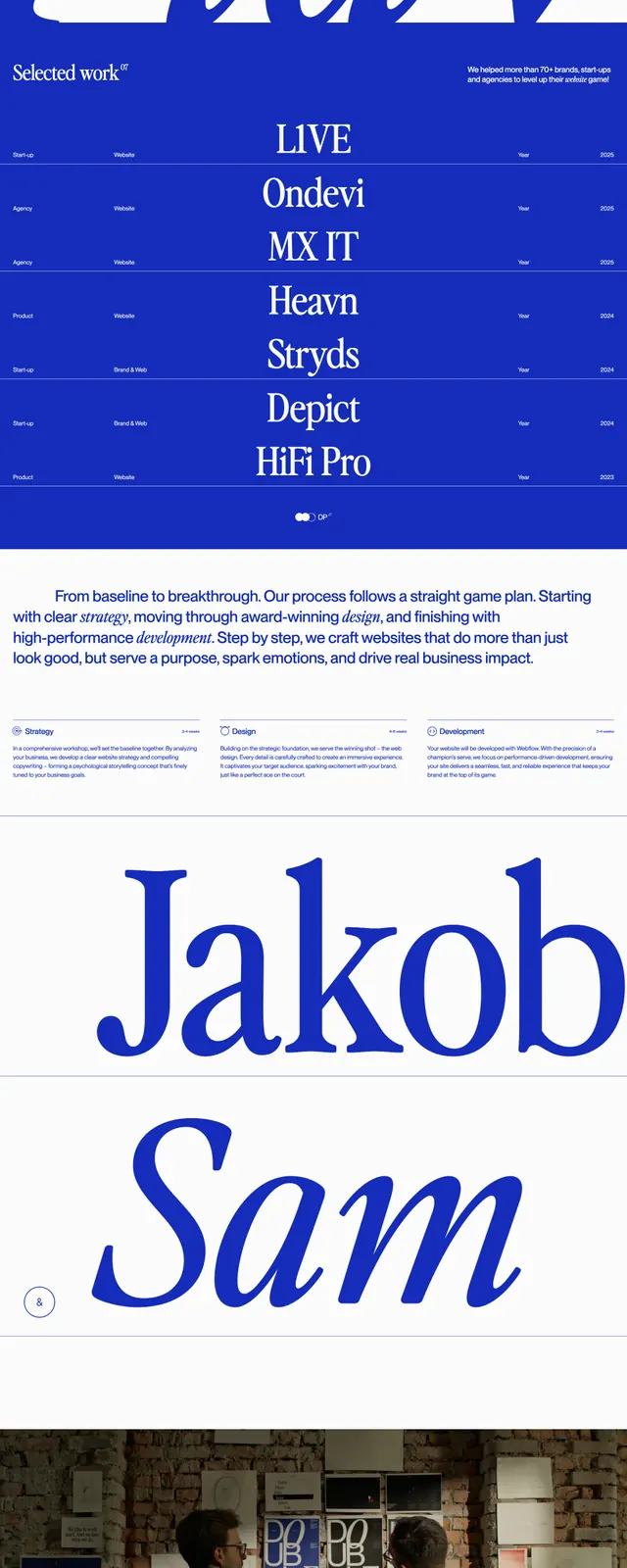
The page opens with a full-width photographic hero showing a person in front of a wall of tennis-inspired posters, with a small top navigation and a centered wordmark. Large serif headline text sits over the image, and the layout uses a strong blue-and-white palette with oversized typography throughout the page. Below the hero are stacked editorial sections: a mission block, a three-column process row, a giant typographic name treatment, and a centered call-to-action above a branded blue footer. Thin rules, small captions, and generous whitespace keep the composition airy despite the bold type scale.
Key takeaway
The main reusable move is the contrast between restrained editorial spacing and very large serif display type. The blue brand color is used sparingly but consistently to make the layout feel sharp and memorable.
Reuse notes
Use this pattern for creative agencies, studios, or premium service brands that want an editorial feel without heavy UI chrome. It works best when you have strong photography, a distinctive serif headline, and a limited accent color palette.