Preview image. Unlock full-res
A playful full-bleed hero for a supplement brand with oversized typography, pastel 3D product staging, and a prominent CTA.
Summary
A playful full-bleed hero for a supplement brand with oversized typography, pastel 3D product staging, and a prominent CTA.
Visual description
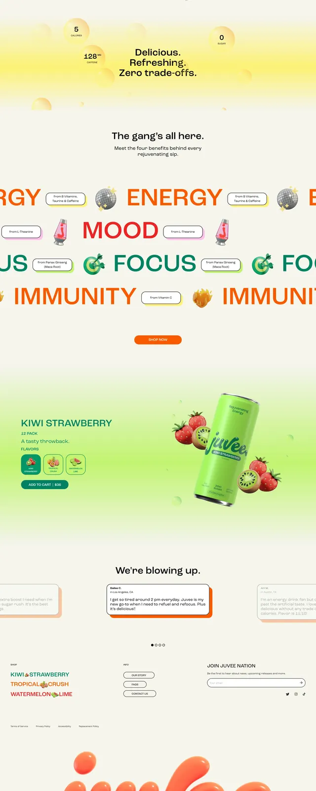
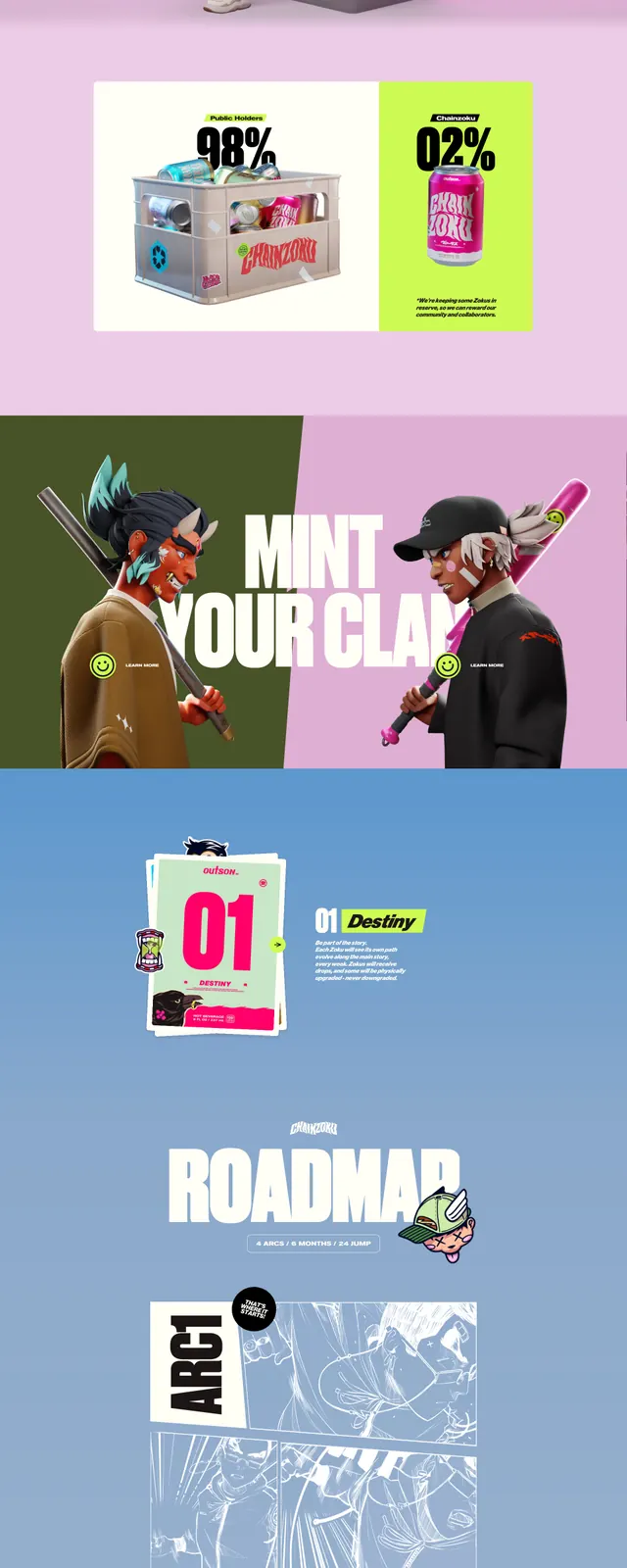
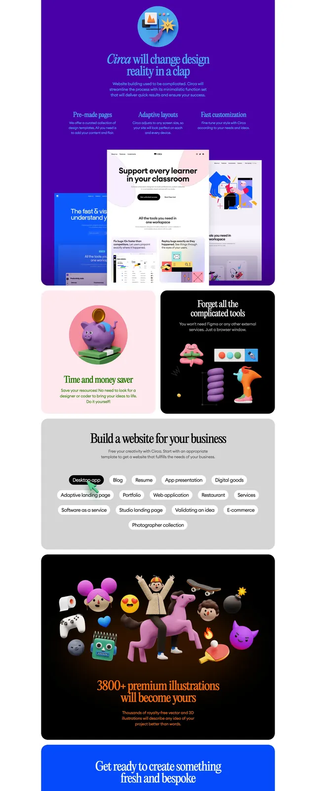
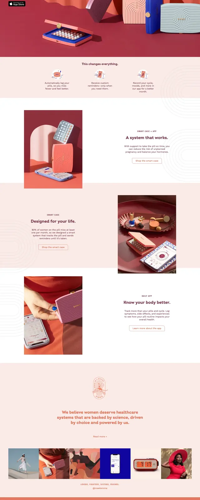
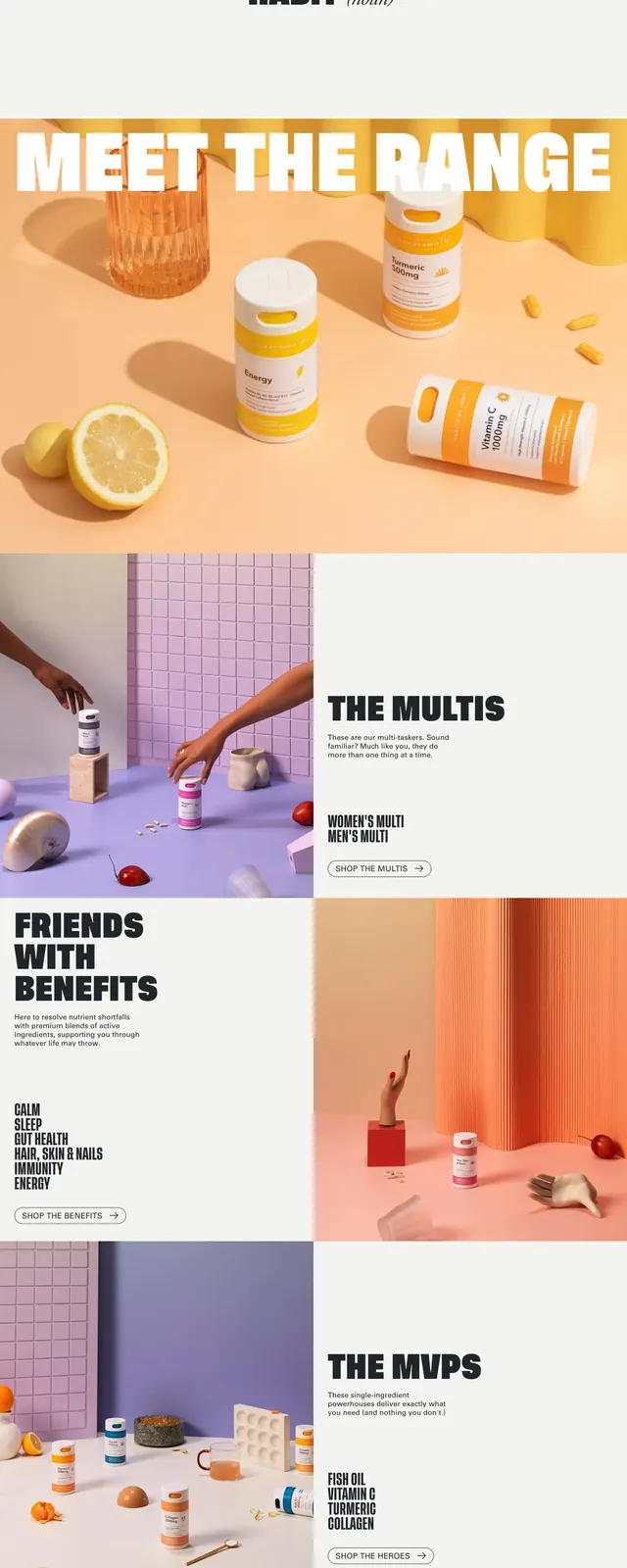
The top section shows a pastel 3D product scene with multiple supplement containers arranged on a lavender floor against a tiled pink wall. Huge white headline text reading #DOITDAILY spans across the lower half of the hero, with a smaller CTA and thin utility labels tucked along the edges. Lower slices continue the same visual system with split editorial sections, large black all-caps headings, photo blocks, an Instagram promo panel, and a two-column footer-like CTA area on a pink background. The palette stays soft and playful throughout, using lilac, pink, peach, white, and small accent colors on the packaging.
Key takeaway
The main reusable move is the contrast between oversized, heavy display type and delicate pastel product imagery. The page uses editorial spacing and repeated pink/lilac backgrounds to make a consumer brand feel energetic without becoming visually noisy.
Reuse notes
Use this structure for lifestyle, wellness, or DTC product sites that need a strong brand personality and a lot of visual merchandising. It works best when product renders or still-life photography can carry the page, with large type and simple CTAs layered on top.