Preview image. Unlock full-res
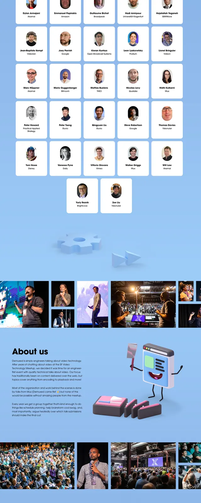
A playful conference landing page with a soft blue gradient background, bold hero messaging, and 3D illustrated event characters and scene elements.
Summary
A playful conference landing page with a soft blue gradient background, bold hero messaging, and 3D illustrated event characters and scene elements.
Visual description
The page opens with a large left-aligned headline, supporting event details, and a prominent black primary CTA on a light blue gradient background. On the right, a 3D illustrated TV mascot and small props create a whimsical conference theme. Lower sections show a 'Why attend?' block, speaker cards, a photo gallery strip, sponsor logos, and a footer-like illustrated scene with additional branding. The overall page uses soft shadows, rounded cards, and scattered 3D objects to keep the layout lively and layered.
Key takeaway
This is a strong example of an event landing page that mixes playful 3D illustration with a clear conversion-focused hero. The reusable pattern is a bold hero followed by stacked proof sections: speakers, photos, sponsors, and organizer branding.
Reuse notes
Reuse the formula of a simple high-contrast CTA hero paired with a whimsical branded illustration to make a conference page feel distinctive. The speaker cards, sponsor logo strip, and gallery band are easy section patterns to adapt for other event sites.