Preview image. Unlock full-res
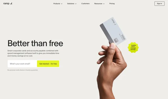
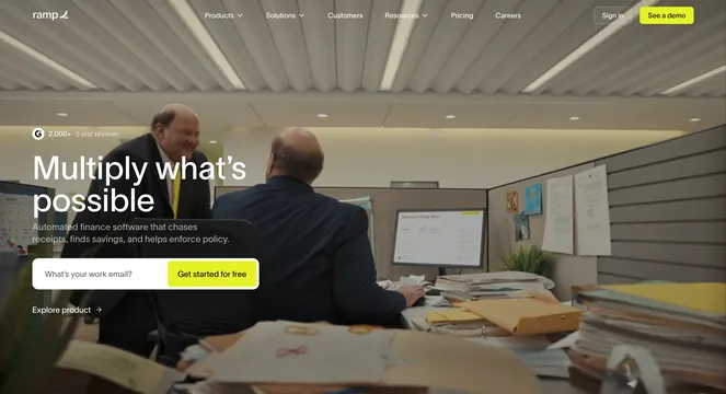
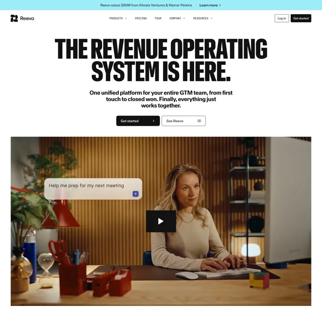
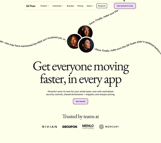
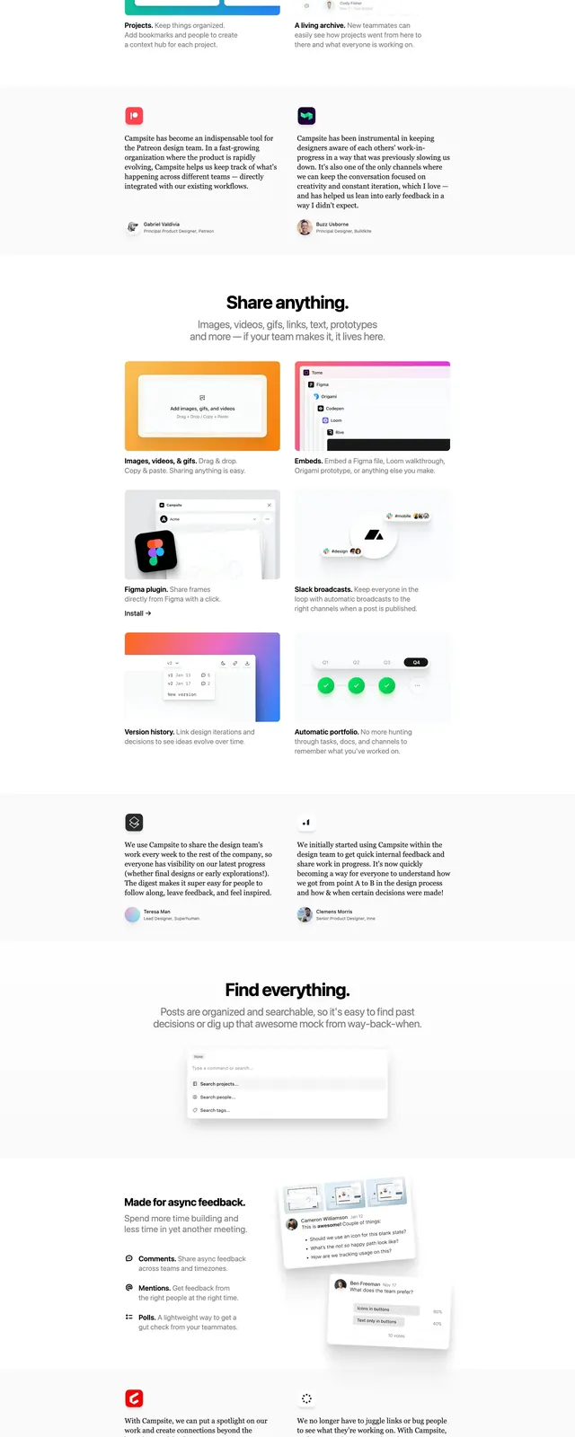
A centered SaaS landing page hero with oversized headline text, a bright primary CTA, and layered product and social-proof sections below.
Summary
A centered SaaS landing page hero with oversized headline text, a bright primary CTA, and layered product and social-proof sections below.
Visual description
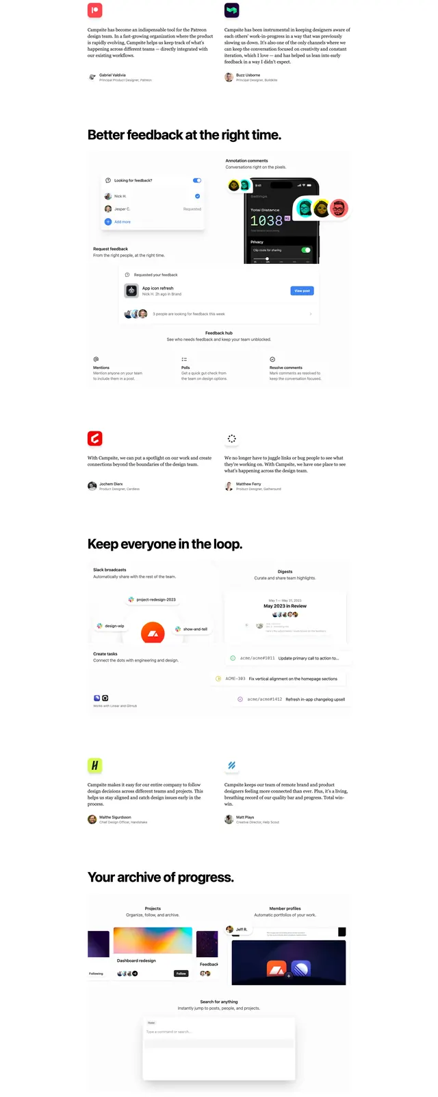
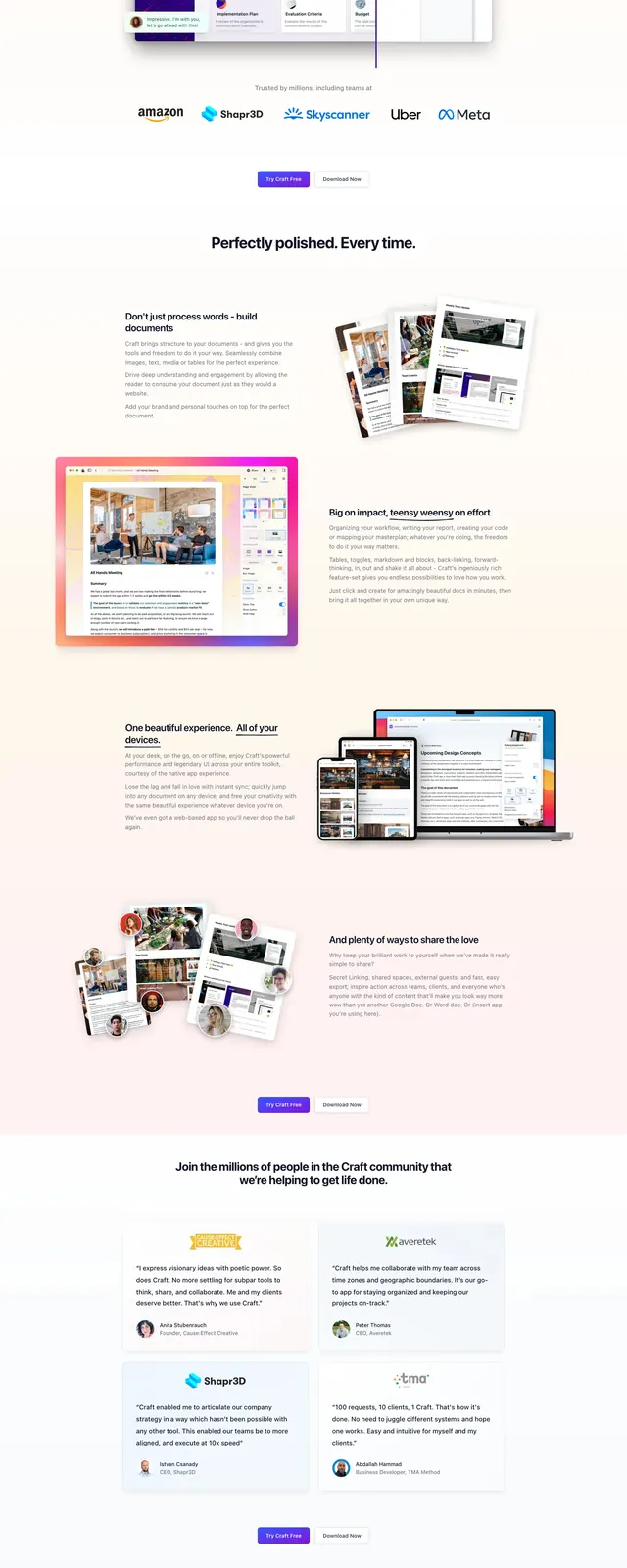
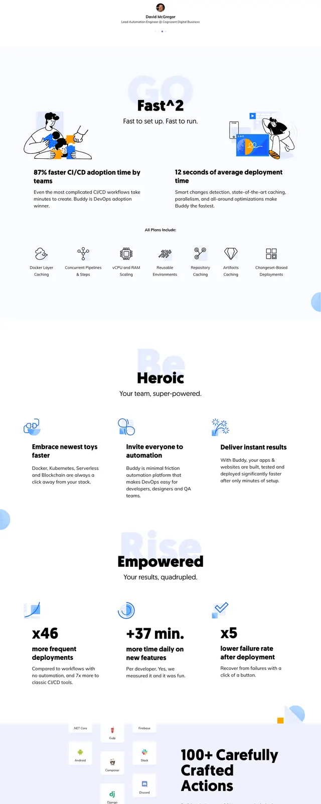
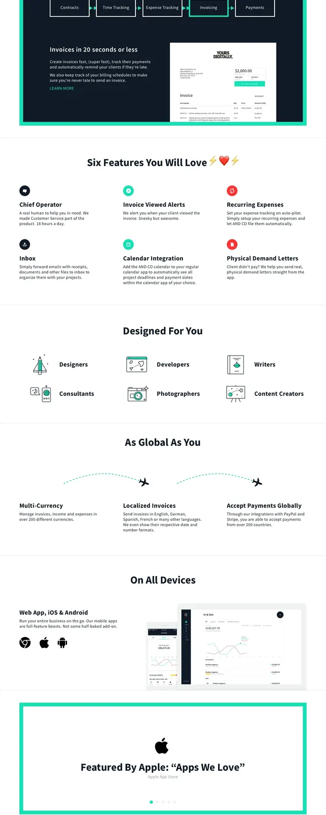
The page uses a very light background with a centered hero at the top, topped by a small badge and followed by a large bold headline and a single orange-to-pink primary button. Below the hero is a large framed product screenshot, then a row of customer logos, a four-card feature grid, two testimonial cards, a dark announcement banner, and a changelog-style list section. Near the bottom there is another centered CTA button and a simple footer on a black strip.
Key takeaway
The strongest pattern is the calm, highly spaced SaaS hero paired with immediate proof through product imagery and logos. The page keeps attention on one primary action while gradually adding credibility through features, testimonials, and updates.
Reuse notes
Reuse this structure for product-led SaaS pages that need to feel clean, trusted, and easy to scan. It works best when the hero message is short and the product screenshot can carry most of the visual explanation.