Preview image. Unlock full-res
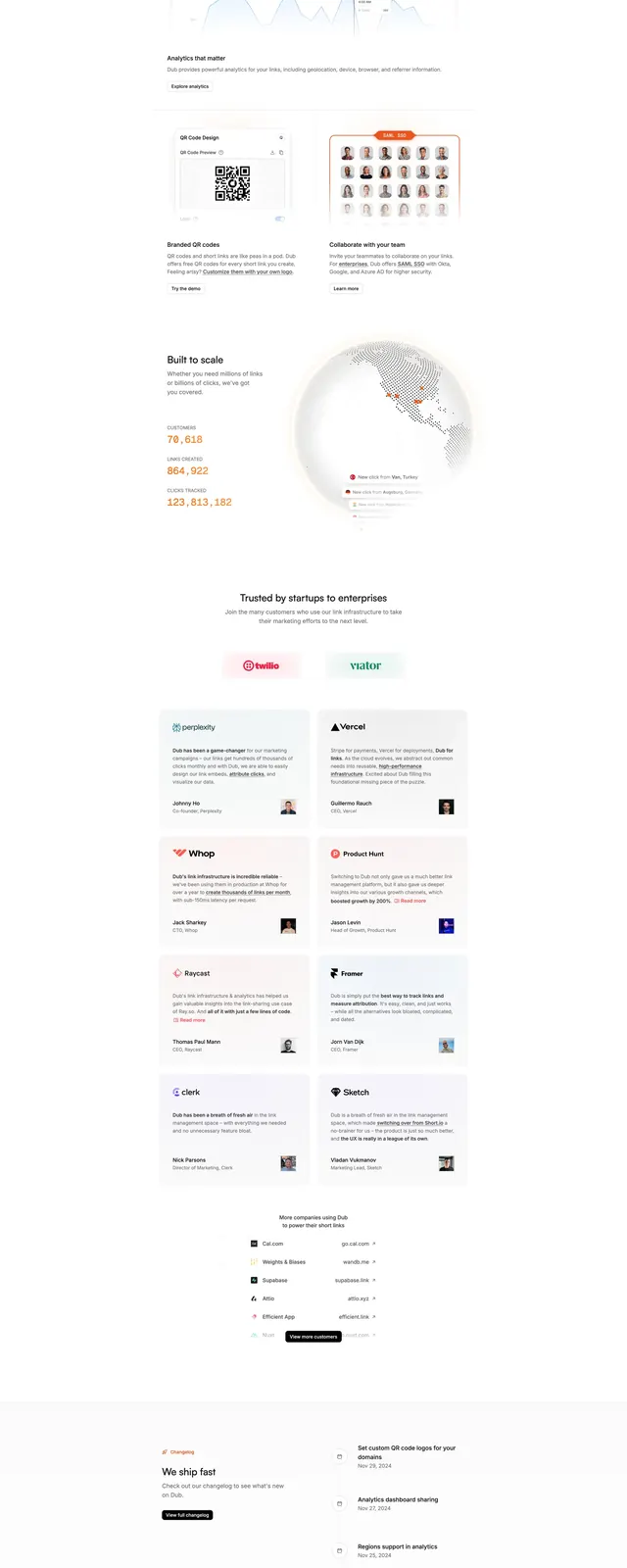
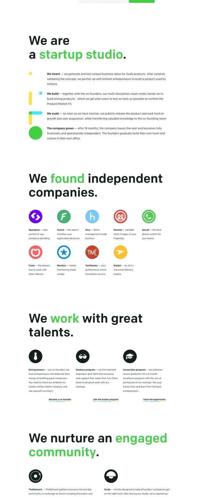
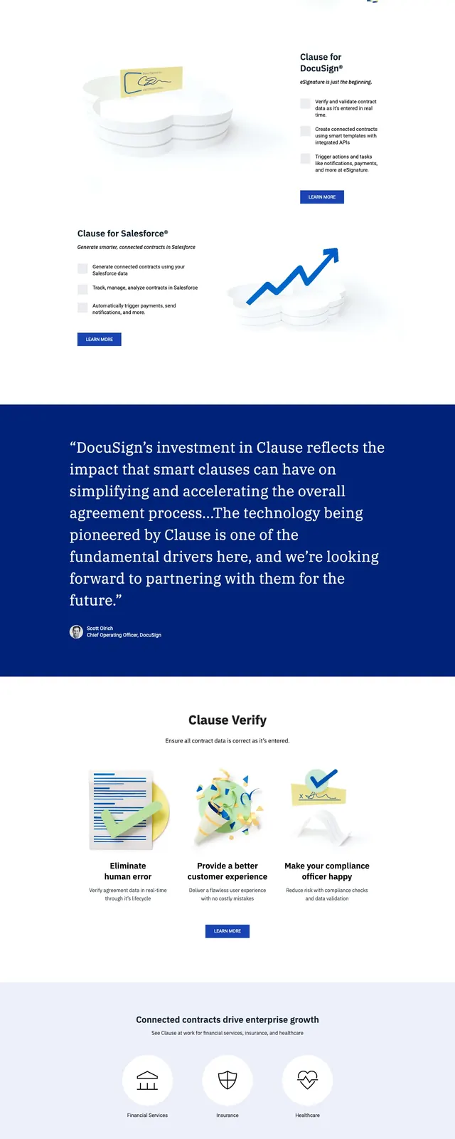
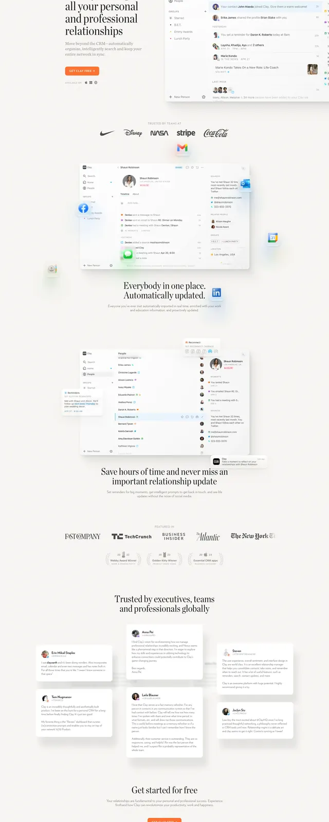
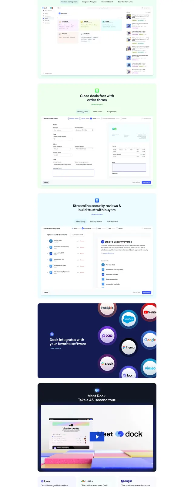
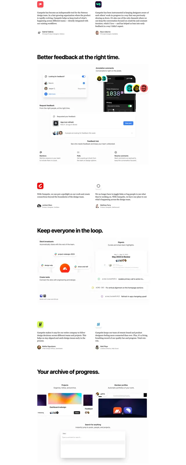
A clean SaaS homepage with a centered hero, large product screenshot, logo strip, feature cards, testimonials, and a final call to action.
Summary
A clean SaaS homepage with a centered hero, large product screenshot, logo strip, feature cards, testimonials, and a final call to action.
Visual description
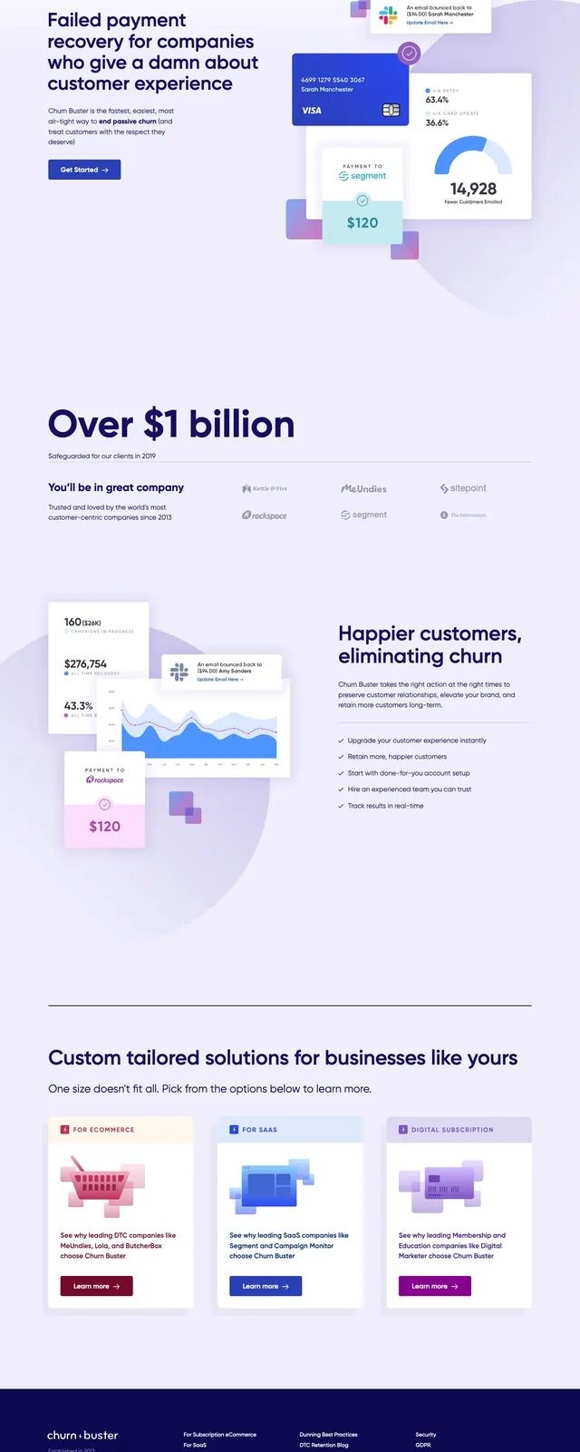
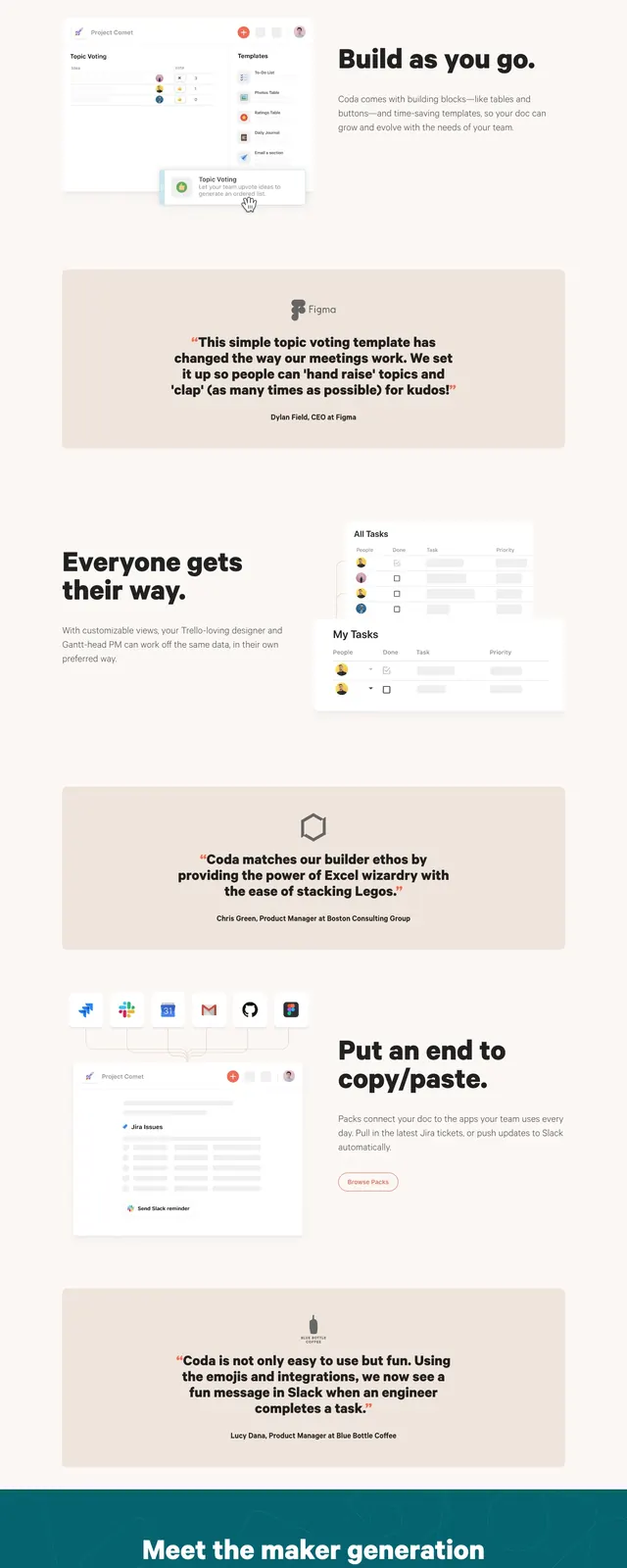
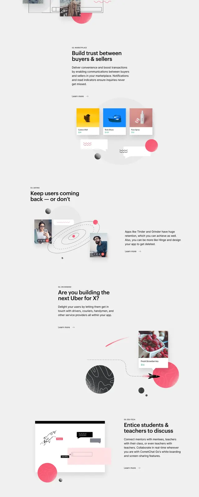
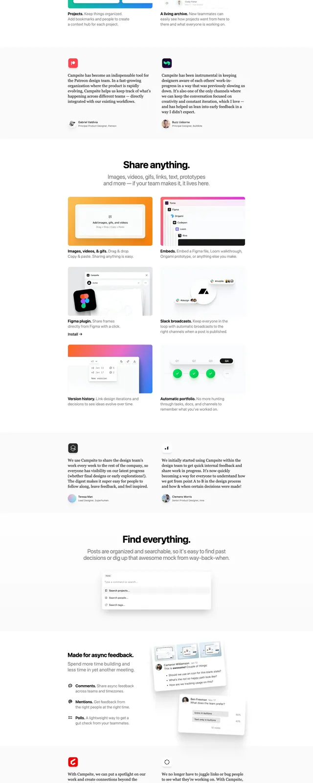
The page uses a bright white background with a centered top navigation, a small badge above the headline, and a large bold hero statement. A prominent orange primary button sits under the headline, followed by a large framed product screenshot with a soft shadow. Lower on the page are a row of customer logos, three light feature cards, two testimonial quotes, a feature section with a bento-like product illustration, a short changelog-style list, and a compact closing CTA above a simple multi-column footer.
Key takeaway
The design relies on strong hierarchy, generous whitespace, and one accent color to make the product story feel clear and confident. The repeated use of centered sections and soft cards creates a polished but approachable SaaS pattern.
Reuse notes
Useful for B2B or productivity products that need a calm, credible homepage with minimal visual noise. Reuse the structure when you want to combine product proof, social proof, and a final conversion push without using a heavy marketing layout.