Preview image. Unlock full-res
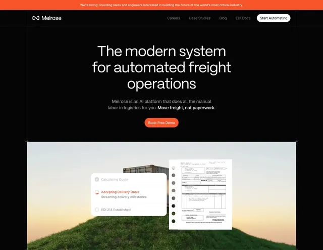
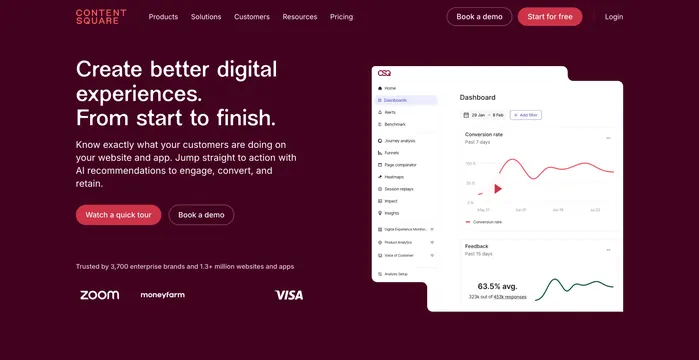
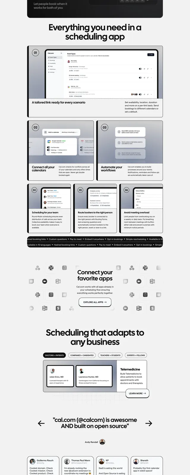
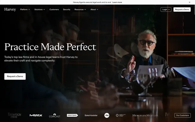
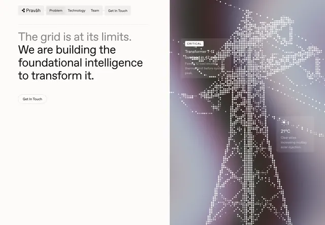
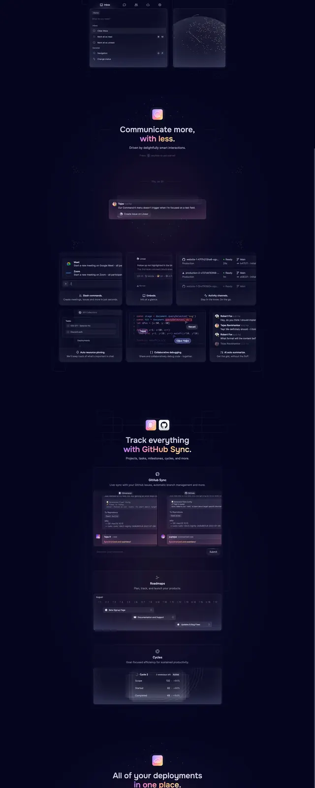
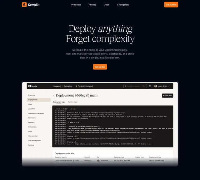
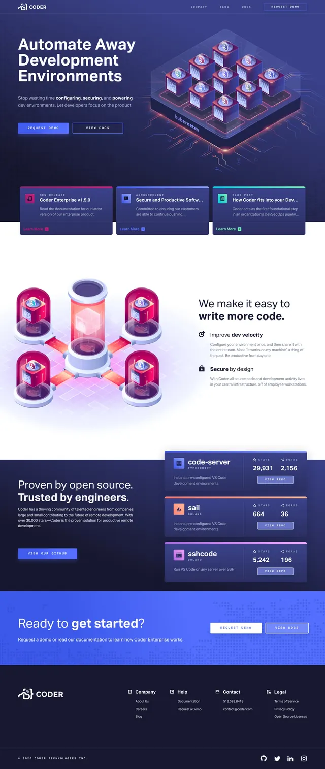
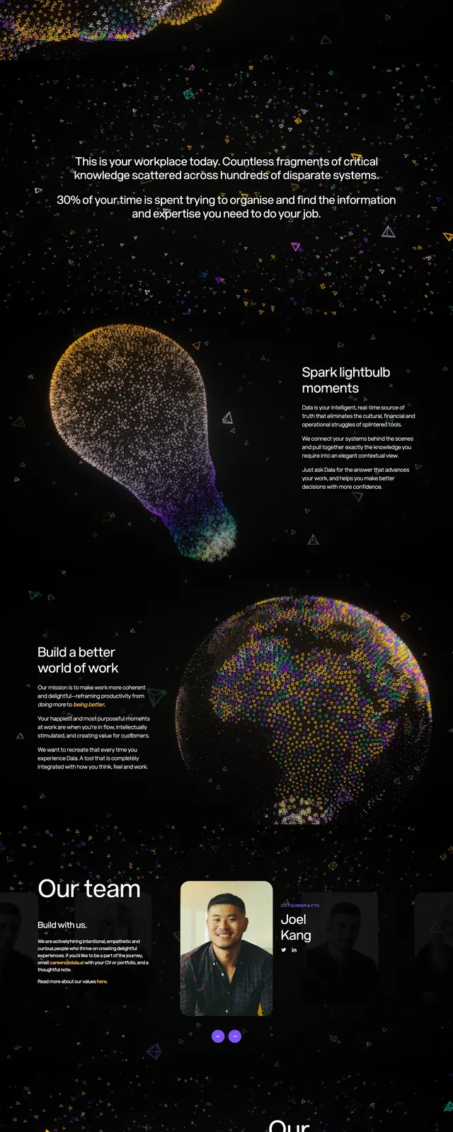
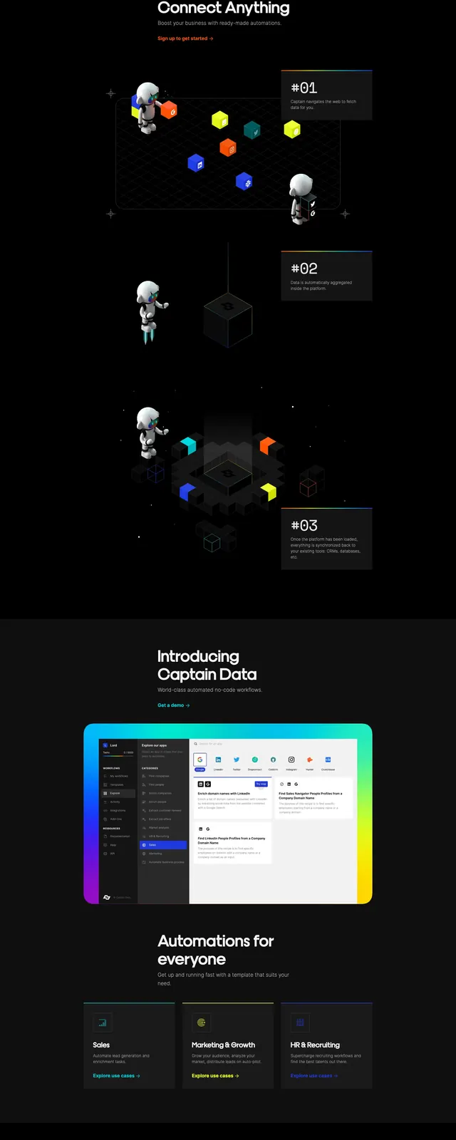
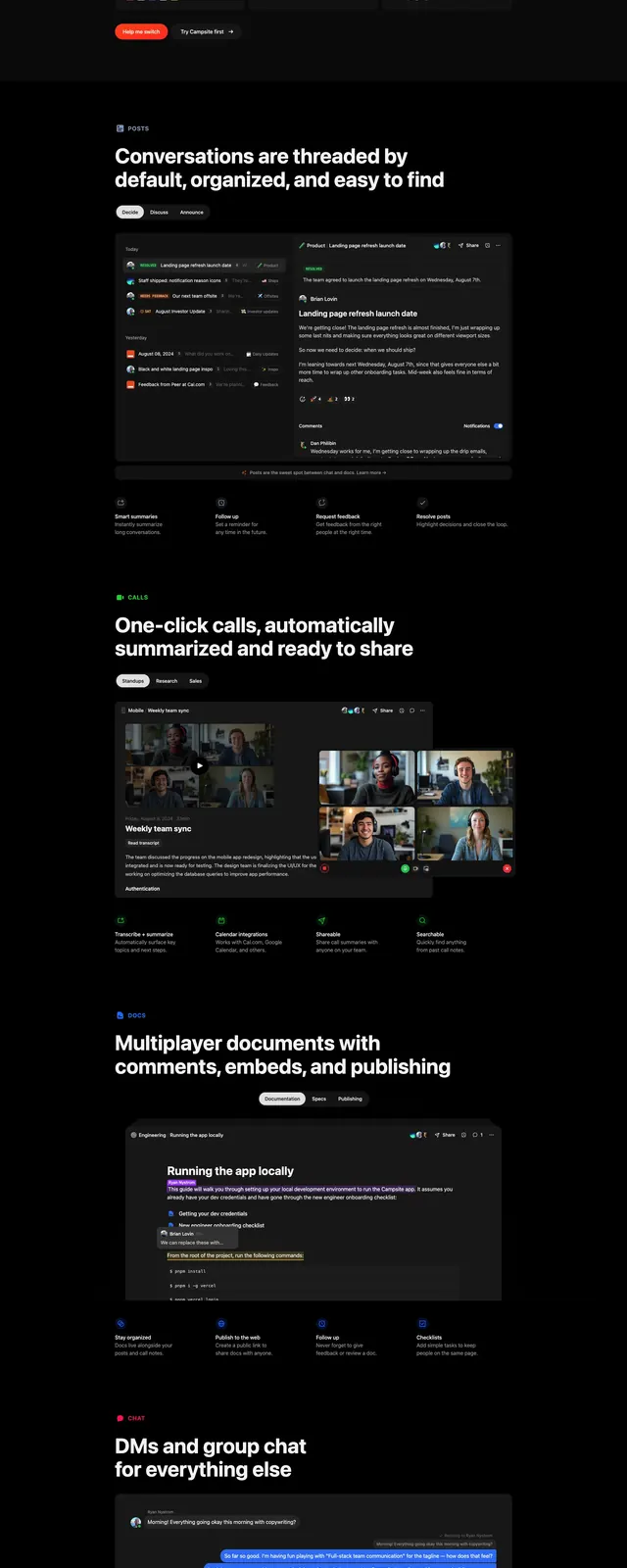
A dark, high-contrast SaaS landing page with oversized hero messaging, product screenshots, and stacked feature sections.
Summary
A dark, high-contrast SaaS landing page with oversized hero messaging, product screenshots, and stacked feature sections.
Visual description
The page uses a near-black background with centered white hero copy and a small top navigation bar. A large product mockup sits below the headline, followed by logo/social proof and multiple stacked feature sections with screenshots, tabs, and short benefit blurbs. Later slices repeat the same pattern with bold section headlines, supporting UI cards, and a final centered CTA above a dark dashboard screenshot with fiery accent graphics. The overall composition is spacious, editorial, and heavily focused on product proof.
Key takeaway
This design relies on strong contrast, oversized typography, and repeated product visuals to communicate clarity and momentum. It is especially effective for a B2B SaaS product that wants to feel premium and focused.
Reuse notes
Reuse the centered hero with a single primary CTA, then follow with screenshot-led feature blocks and concise benefit labels. The dark canvas and minimal chrome keep the attention on product UI and make the page feel polished without extra decoration.