Preview image. Unlock full-res
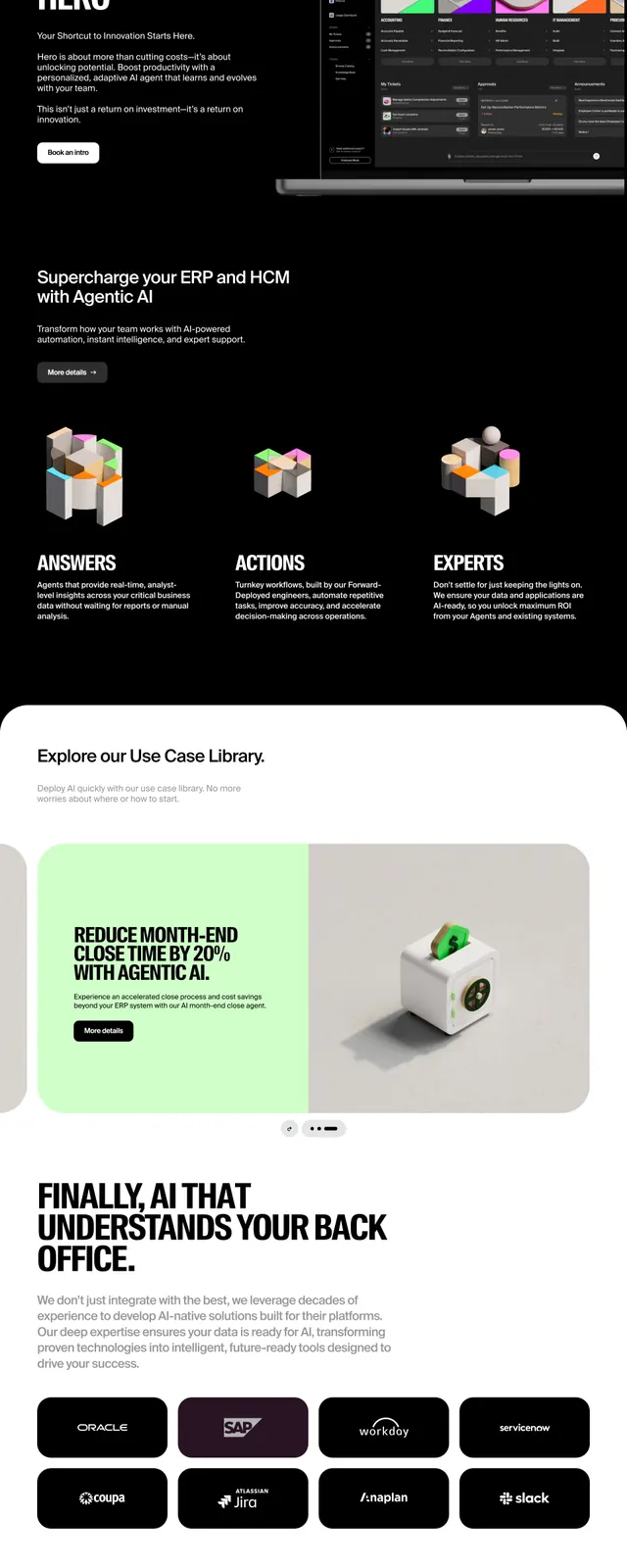
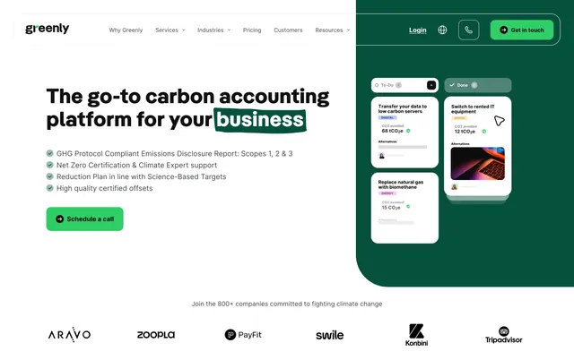
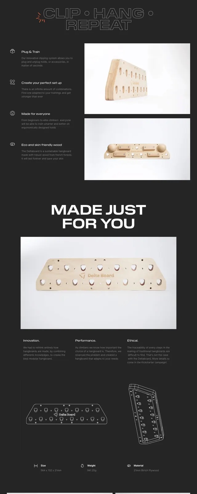
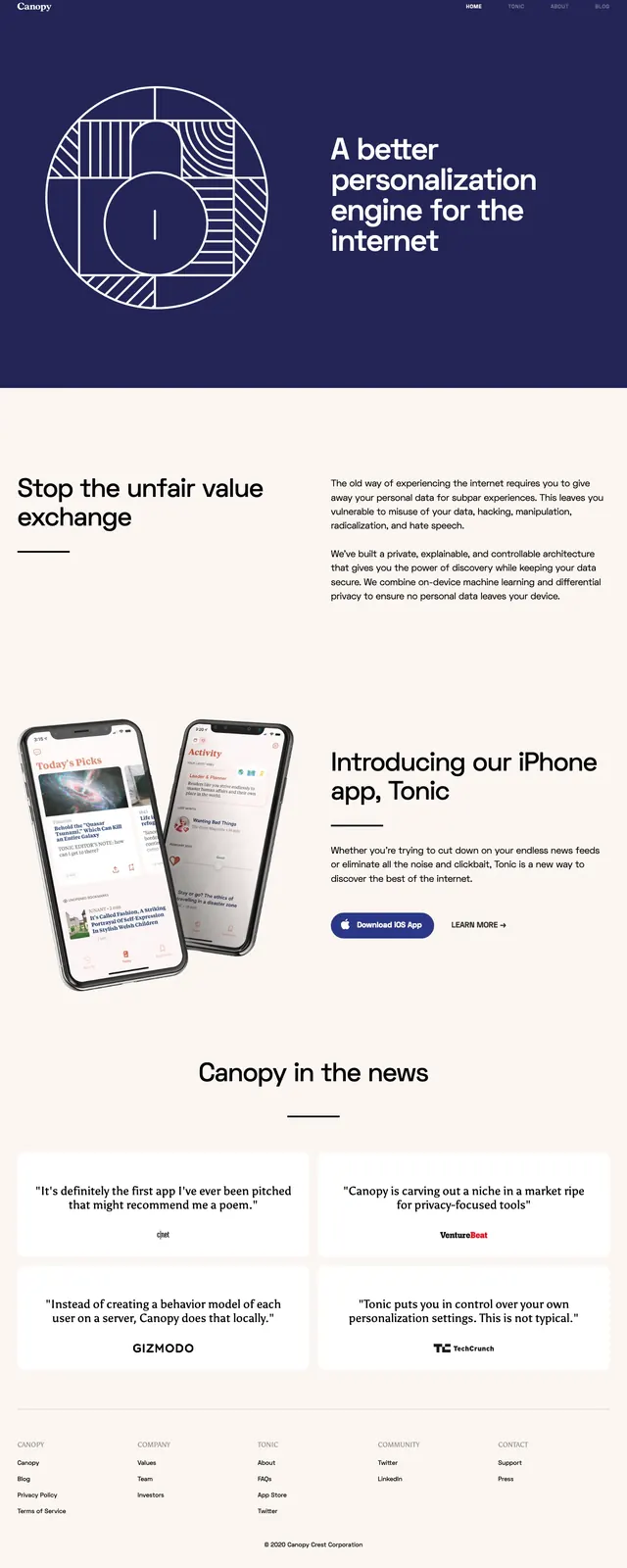
A minimal, high-contrast landing page for a scheduling product with oversized typography, rounded UI cards, and dark feature blocks.
Summary
A minimal, high-contrast landing page for a scheduling product with oversized typography, rounded UI cards, and dark feature blocks.
Visual description
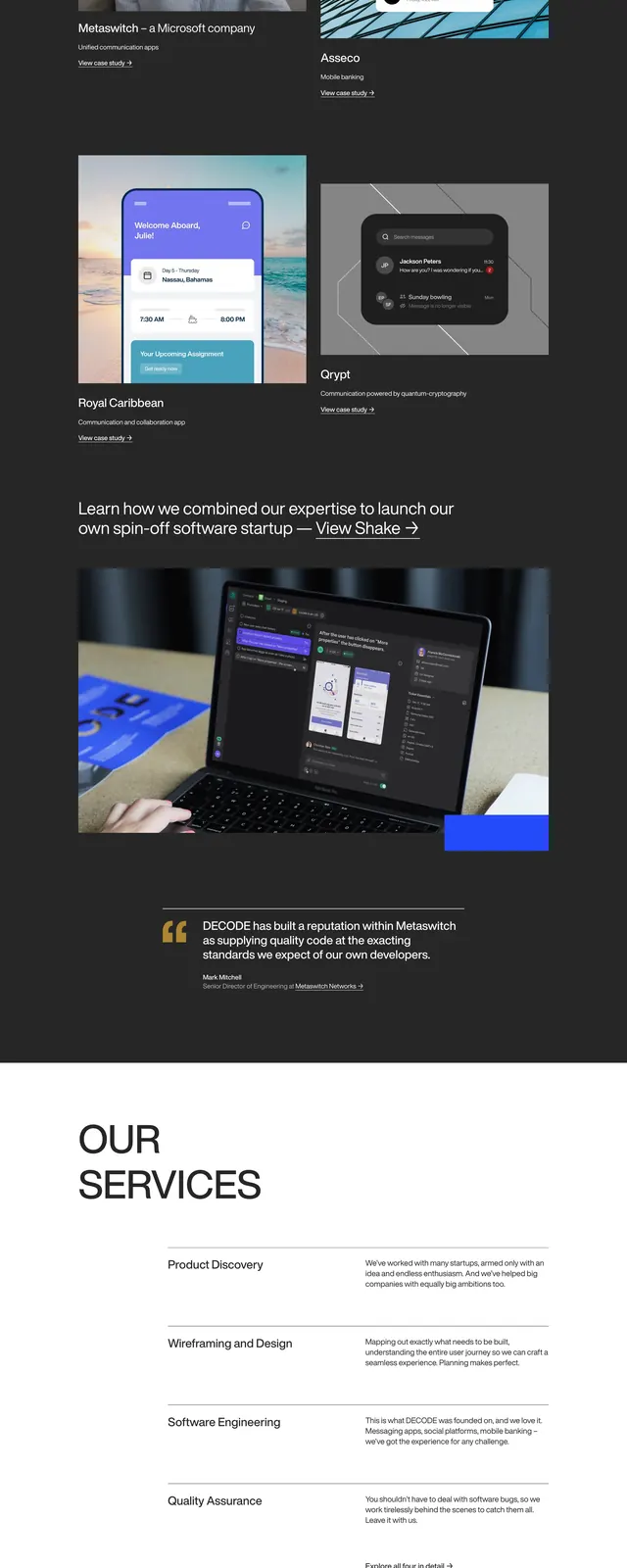
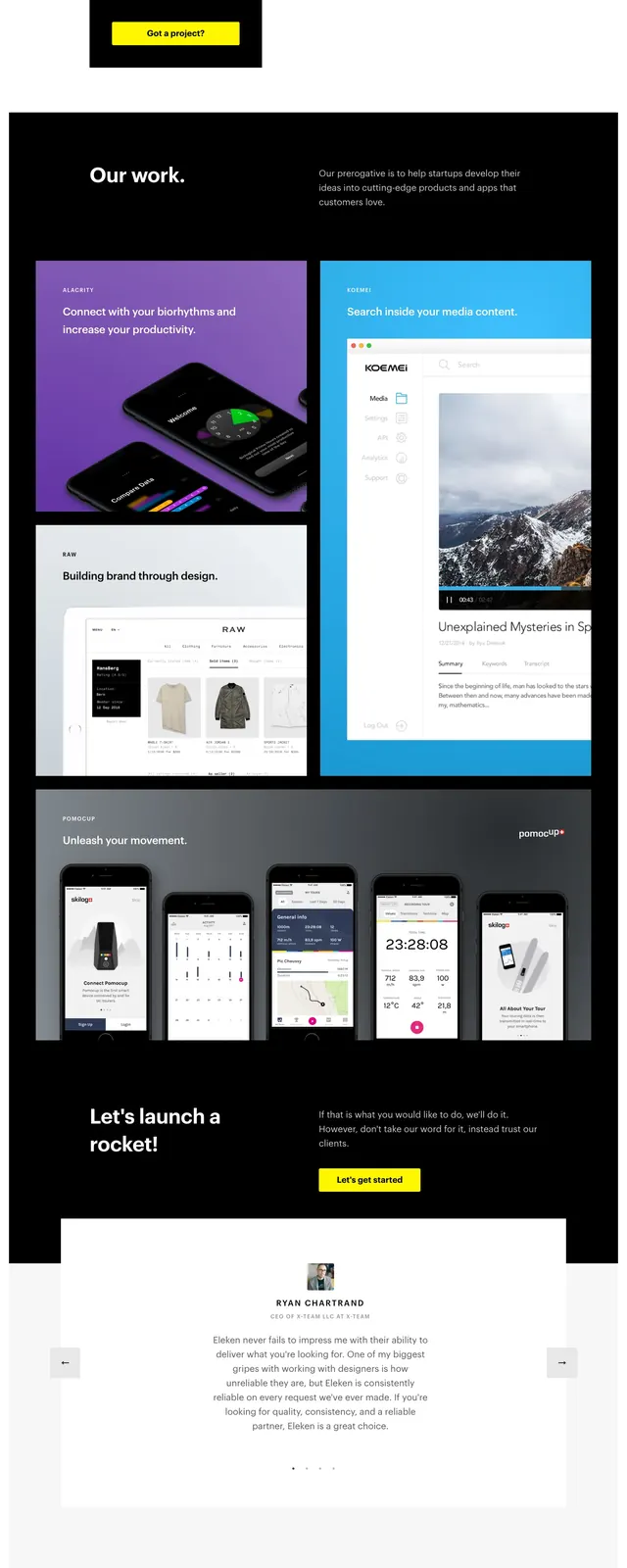
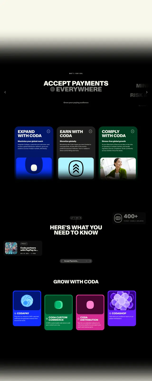
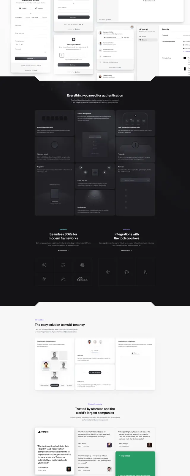
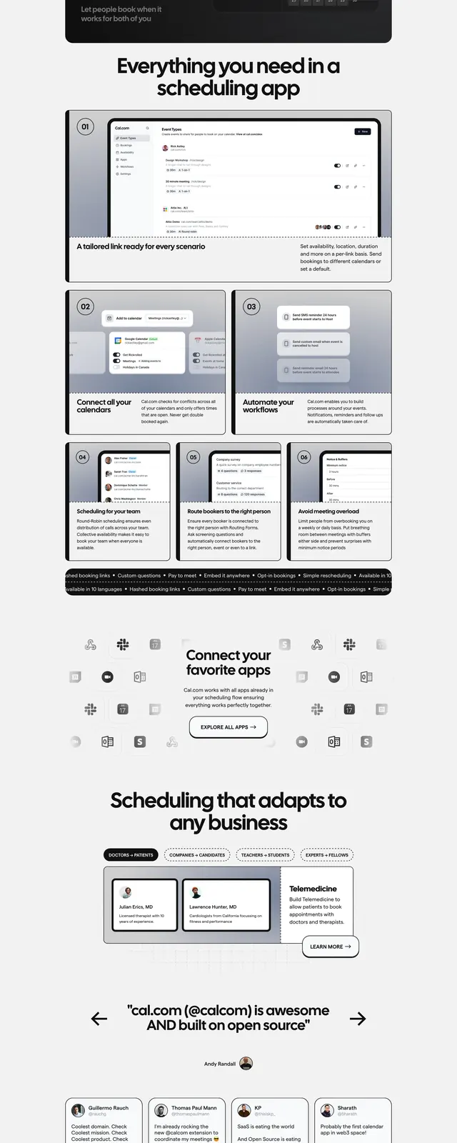
The page opens with a simple top navigation, a small badge, and a large headline set in bold oversized sans-serif type. A calendar preview card sits beside the hero copy, followed by a rounded domain-style input and call-to-action buttons. Below, the layout shifts into a dark feature panel, multi-card feature sections, integration logos, testimonial cards, and a final signup CTA above a structured footer.
Key takeaway
The design relies on strong contrast, generous spacing, and big typography to make a scheduling product feel clear and premium. Reusable patterns include the rounded input CTA, modular cards, and the mix of light hero content with dark feature blocks.
Reuse notes
Useful as a reference for SaaS hero sections that need a direct value proposition plus immediate product preview. The card system and section rhythm can be reused for features, testimonials, and conversion-focused CTAs.