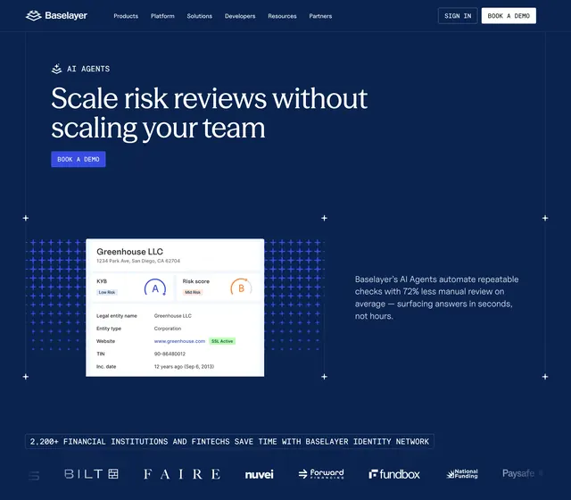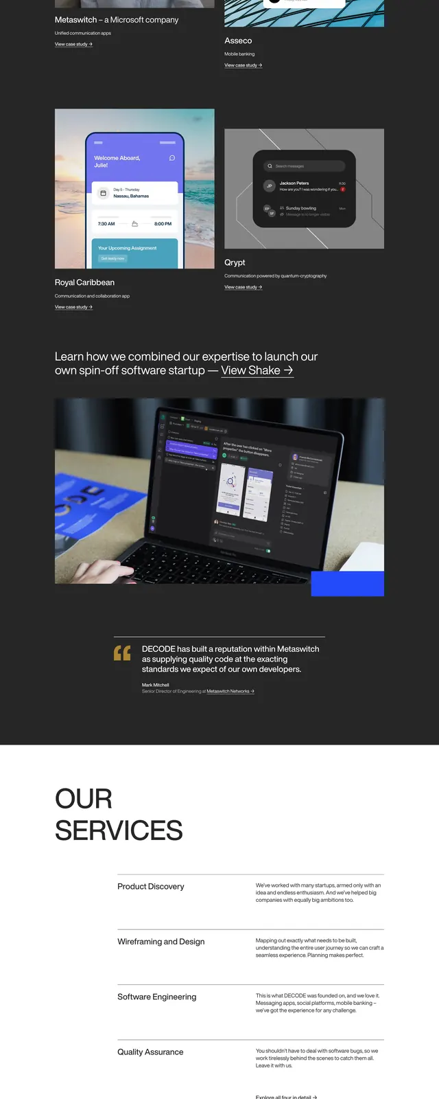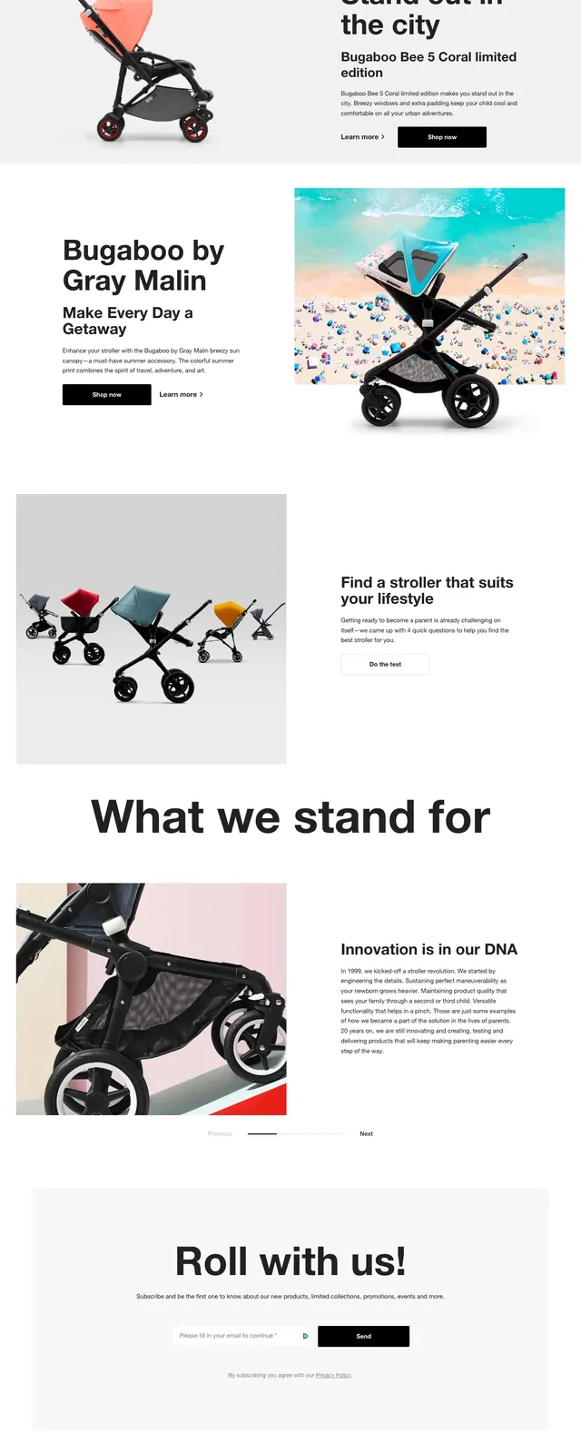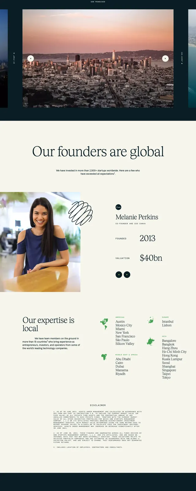
Preview image. Unlock full-res
A minimal, ocean-themed landing page for CargoKite that pairs oversized typography with aerial photography and sparse content blocks.
Summary
A minimal, ocean-themed landing page for CargoKite that pairs oversized typography with aerial photography and sparse content blocks.
Visual description
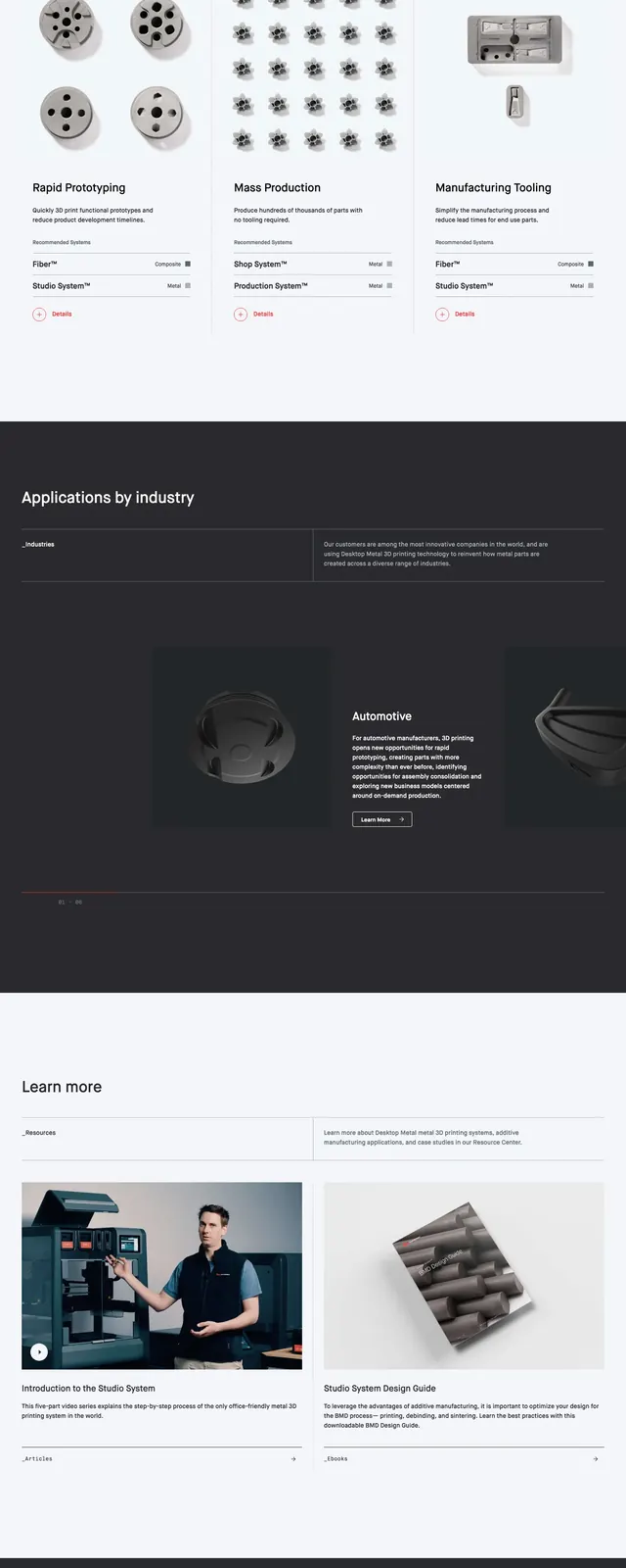
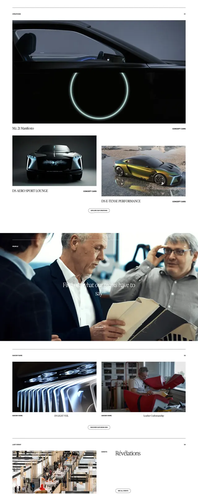
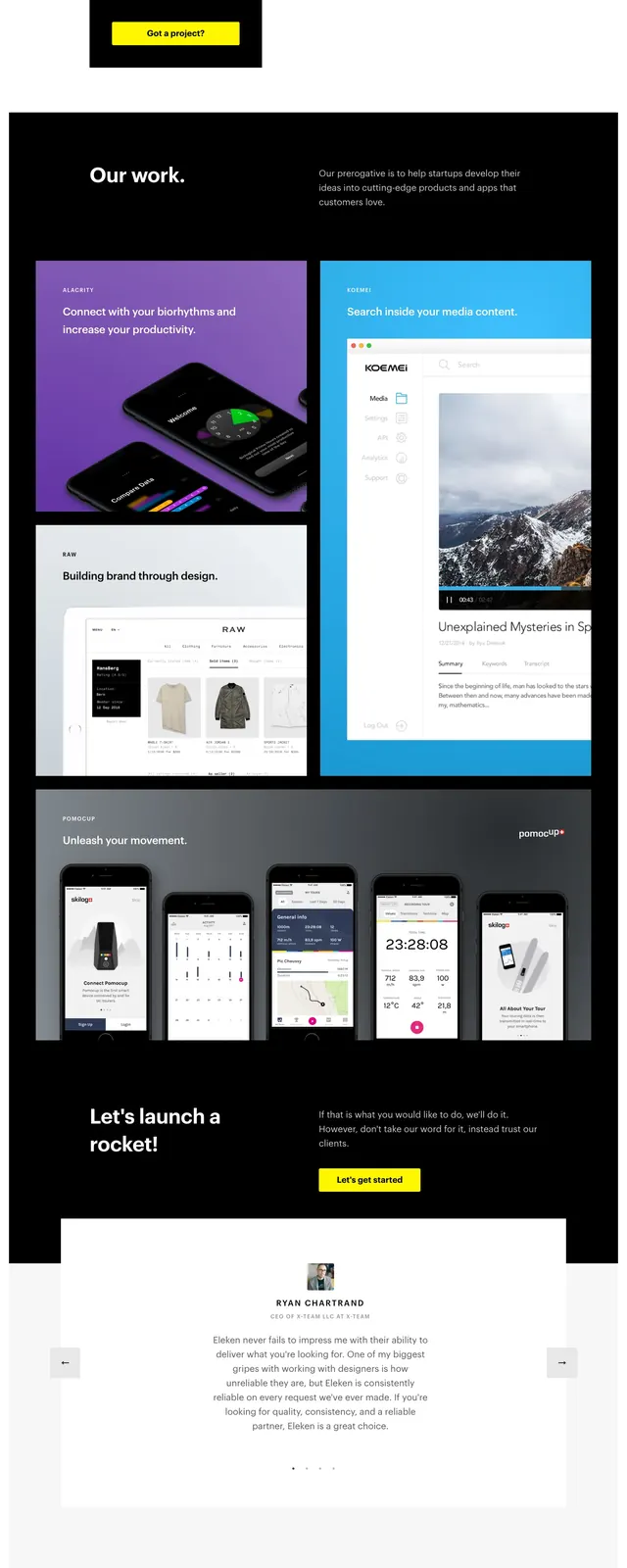
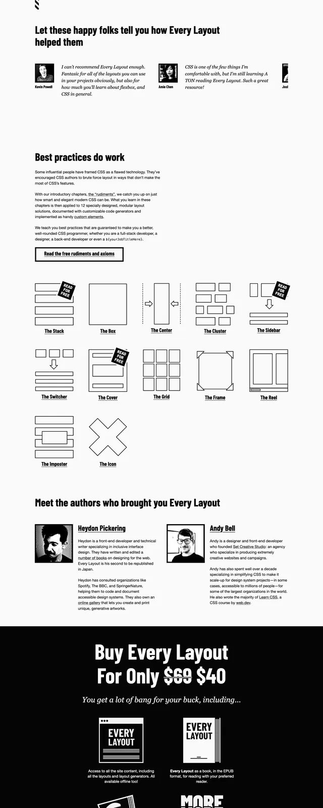
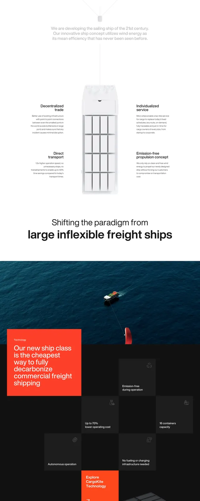
The page opens with a full-bleed dark ocean hero featuring a small cargo vessel, a red kite element, and a large left-aligned headline. Navigation is thin and understated, with a bright orange call-to-action button in the top right. Lower sections switch to a white background with a large editorial about section, a minimal image-and-text layout, an oversized statement divider, a wide ocean technology image, an FAQ list, and a dark newsletter signup card above a clean footer.
Key takeaway
The design relies on strong contrast between expansive maritime imagery and restrained typography to communicate innovation and scale. Its structure feels editorial but practical, with clear reusable blocks for hero, about, FAQ, and newsletter content.
Reuse notes
Reuse the hero treatment for sustainability or transport brands that need a premium, modern feel. The page is especially effective when paired with aerial photography, thin navigation, and one vivid accent color.