Preview image. Unlock full-res
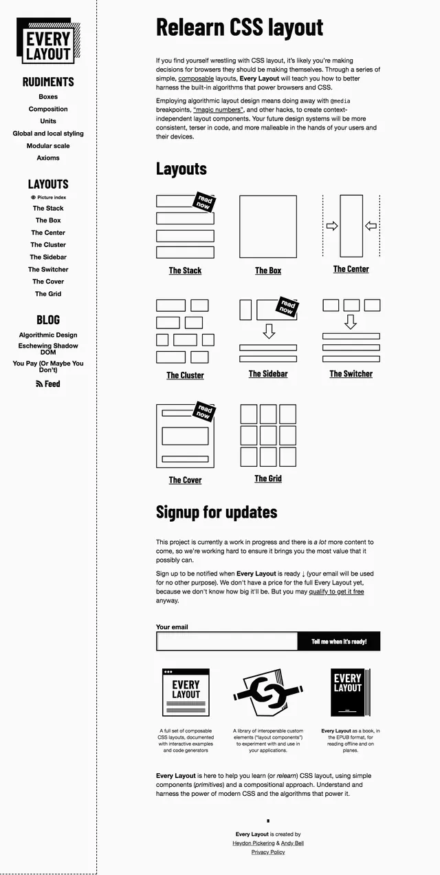
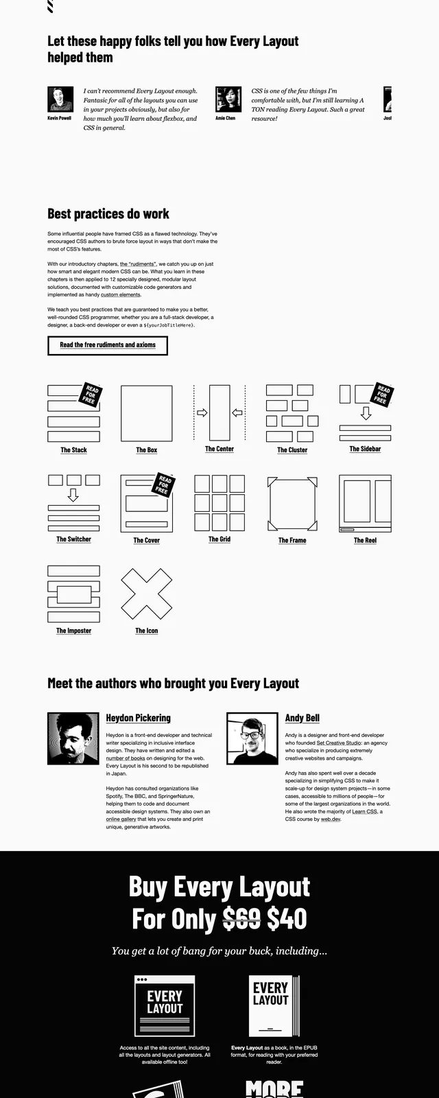
A stark black-and-white landing page for the Every Layout book with bold typography, simple forms, and a diagram-heavy educational section.
Summary
A stark black-and-white landing page for the Every Layout book with bold typography, simple forms, and a diagram-heavy educational section.
Visual description
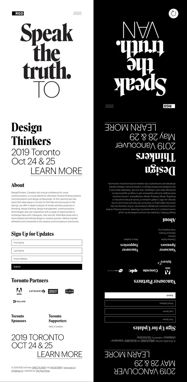
The page uses a stark monochrome palette with thick black borders, sparse whitespace, and heavy sans-serif headlines. The top section is a split hero with a book cover on the left and a large marketing headline plus purchase CTA on the right. Below are stacked content blocks including an email access form, a grid of simple layout diagrams, author bios, and a dark purchase panel with another CTA. The overall composition is highly structured and feels like a print-inspired editorial site translated into a web landing page.
Key takeaway
The strongest pattern is the combination of oversized typography, strict black-and-white contrast, and diagram-based feature explanation. It communicates authority and clarity while keeping the interface intentionally plain.
Reuse notes
Reuse the split hero, monochrome CTA styling, and diagram grid for educational or developer-focused products. The design works best when the content itself is the primary visual asset and decorative UI is kept minimal.